History and the Origin of Azure
Etymology
The color azure is commonly used to describe the bright, clear sky and blue ocean waves. This hue is a hybrid of blue and cyan, seeming lighter than blue but richer than dark blue. The color azure was first used as a hue in 1374 when Geoffrey Chaucer described his book Troilus and Criseyde as ‘broche, gold, and azure.’The name describes the color of the mineral azurite, which forms a pigment deep in color.
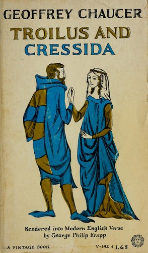
Historians believe that the term azure was derived from the bright blue stone lapis lazuli. Lazuli is a Medieval Latin term derived from the Persian stone’s Arabic word, lazaward. Another spelling of lazaward is lazurium, which evolved into azurium and finally azure.In France, the color was named Azur, while in Italy, it was called Azzurro. Polish folks used the word lazul, whereas Romanians used Azur.
Azure in Nature
Aside from the actual stone that inspired the color’s name, this hue may also be seen in vibrant insects, dragonflies, and numerous birds. Kingfishers, magpies, hummingbirds, and tanagers are among the most well-known bird species with azure detailing.
The color draws attention and makes these species appear unusual and attractive. The azure-blue coloration gives character to these creatures, making them appear dominant or powerful.

Properties of Azure
As previously stated, this hue is a mix between blue and cyan, resulting in a light blue tint. While azure and indigo are commonly used interchangeably, they are not the same hue. The component colors provide an easy method to distinguish between the two. Azure is a combination of blue and cyan, while cyan is a combination of blue and green. Indigo, on the other hand, is a blue-violet combination.Azure is also between 195 and 225 on the RGB color wheel, while cyan is between 165 and 195. In terms of CMYK formulas, azure has the code 100,50,0,0. #007fff is the Hex code for this color. Aside from that, people see Azure as the hue of trust and responsibility, expressing honesty and confidence. Azure also signifies tranquility and authority.
The Process of Lettering Design

This assignment requires us to create our own lettering style. We were to select a color that drew our attention and make a final piece of the word. When we choose a specific word, we had to explore its etymology. What are the roots of the word? and what does that imply? These elements have to be developed in an excellent design of lettering in any Adobe software. In the first phase of the assignment, I planned to write in cursive and planned to come up with various ideas for the writing of the word while I was doing the designs, It occurred to me that the origins of the term were primarily from Europe, so I managed to create a fancy and elegant style of lettering.
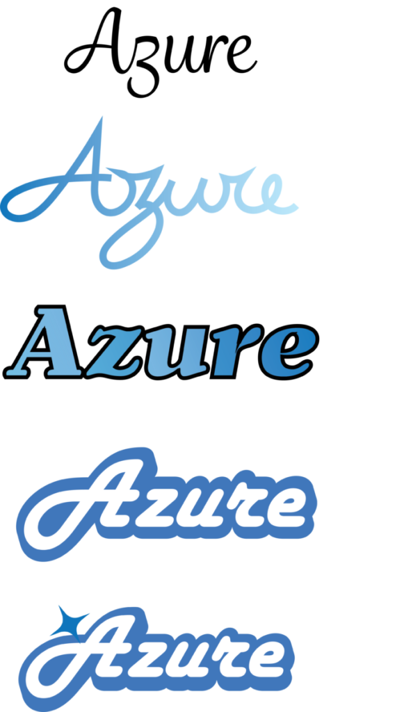
In the Illustrator program, I struggled with cursive when tracing each word. For my illustrator, occasionally the anchor points wouldn’t line up with the words entirely. I did, however, come up with solutions and I connected the anchor points without messing it up. In the course of creating an outstanding word, I also included a gradient in the second phase of my sketch. I thought to myself that the cursive words to me seem more simple. So I decided to change everything and make the words separate from one another. In the final process, I outline the stroke and added a star next to it.
