It was interesting to see how illustrations aren’t just considered drawings. Things such as paintings can even be considered illustrations. I suppose anything that is created by hand, whether it be a painting or a drawing can be considered to be a illustration.
What I’ve learned in my Design Principles I class this semester is that a lot should be considered when designing something. The background can be just as important as the foreground. Color interaction is also something that can effect an image; some color combinations can cause a bright color to look dark or even a dark color to look bright. Color is also subjective; what one person may consider to be a “true” red could be seen by another to not be considered the truest red they can think of. Also, a static image can appear to have movement depending on the placement of objects within an image, and scaling can help create spatial depth within a 2-D image.
I had never been to the Cooper Hewitt Design Museum prior to this trip. I had only initially known it existed because I had happened to walk by it in the summer. After spotting it, I fully intended to go, I just never planned when, until now.

It was very interesting to see the range of items they had. When thinking and studying design, I’ve only thought of it in terms of a digital realm. It’s easy to forget that design isn’t just about posters and web logos. It also has to do with more physical things, such as houses, furniture, and technology.

My favorite exhibit was the Pixar one. I love cartoons and knowing how much time and effort goes into each one of Pixar’s movies, it was interesting to see concept sketches for characters and how the ideas, trial runs and outside inspirations got them to what we know them as today.

Another image I saw at the exhibit that caught my eye was a poster, Salzhaus by Felix Pfäffli. While I appreciate the interesting combo use of colors, the closeness of the letters (tension) made it uncomfortable to read. According to it’s webpage on the Cooper Hewitt site, the poster was “intended to ‘distort, warp and disassemble.'” I believe Pfäffli was very successful in designing his piece.
I would say that that one exhibit I’m looking most forward to seeing is their Pixar one. I’ve always loved their movies and shorts and being able to view some never before seen sketches and such would be really cool. Some people only ever get to see such things if they’re lucky enough to visit/tour this company’s studio.
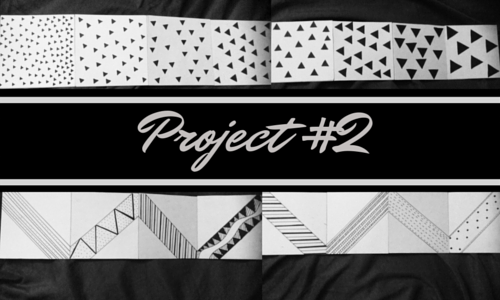
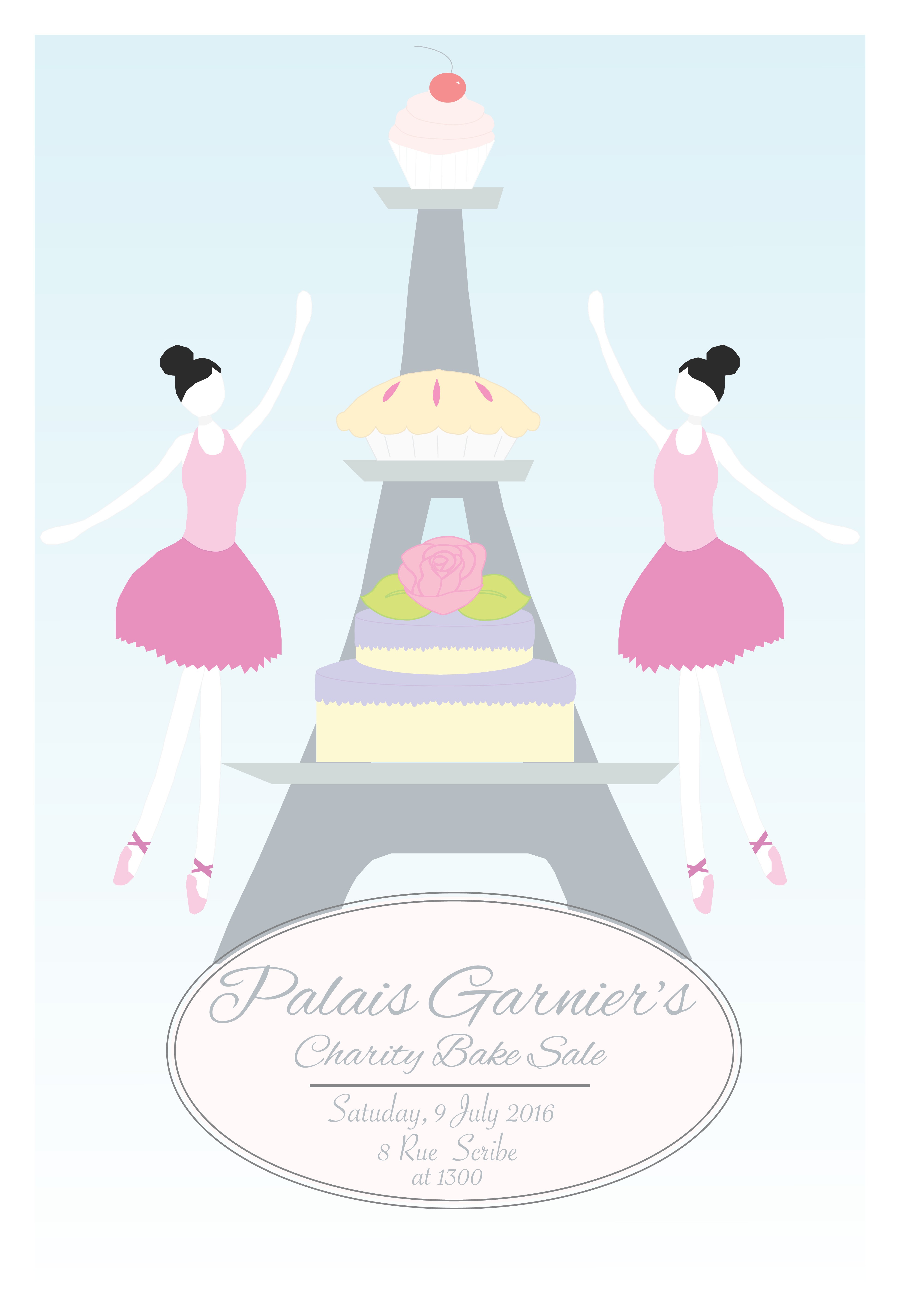
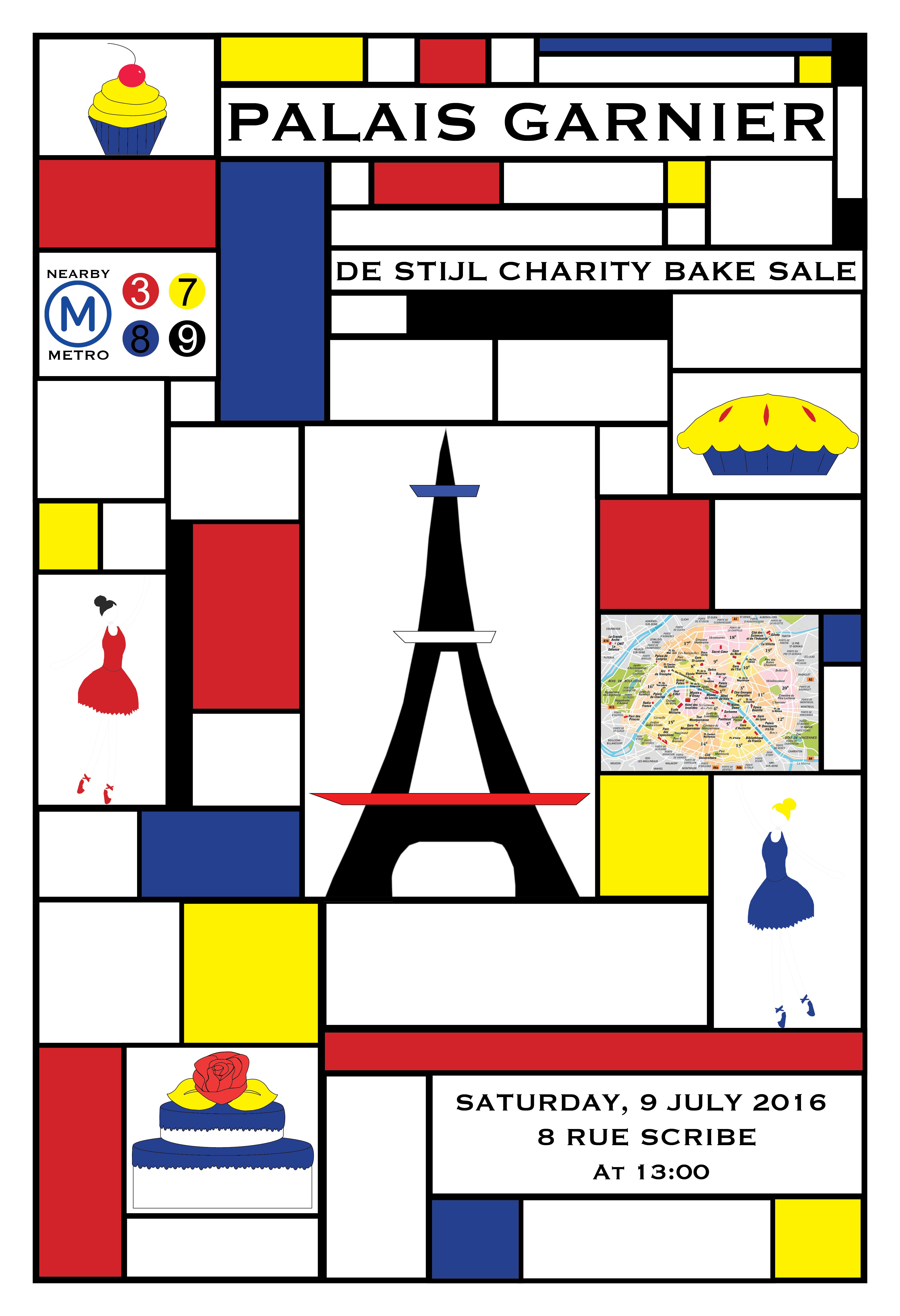
In this project, the goal was to explore movement.
First, we had to choose a song that inspired us. Unable to choose just one initially, I created a playlist of songs on my iPod. The song I ended up choosing was “Very Loud” by Shout Out Loud. We were to listen to our chosen song and create thumbnails of movement in relation to the music we were listening to. We then had to narrow it down and choose two contrasting movements to recreate in our “song books.”
What I learned in doing this assignment is that visually implied movement is best created with diagonals, but can also be done with simple shapes rearranged in a space as well. Also, figure ground relationship with the latter is very important to keep in mind when creating design.
The OpenLab is an open-source, digital platform designed to support teaching and learning at City Tech (New York City College of Technology), and to promote student and faculty engagement in the intellectual and social life of the college community.

