ENTRY 1 – The Fall Semester has Started
Fall semester has started and I am a bit nervous compared to the past few semesters. I am enrolled in my last five courses and while I am excited to be at the end of my undergrad journey, it is nerve racking. I can’t help but look back at the last few years and think how fast time flew by.
When I enrolled in Internship for the Fall 2021 semester, I knew it would be a challenge to find an internship and stay on top of the rest of my courses, but I’m up for it. I’m eager to gain experience and meet new people. Now is the time to take all of the amazing things I have learned and enter the real world.
Before I go ahead and apply to internships, I need to clean up my resume and create an online portfolio. I have some great pieces for my portfolio but, I think I will create some new work to include.
ENTRY 2 – Redesigning My Resume
I have a resume but I took the opportunity to try a different approach. Working in InDesign, I created a new resume. I created a logo for myself in Illustrator, it is very simple and geometric – I chose to stick to black. I’ve gotten positive feedback from my Portfolio professor on it.
Overall, I tried to work with negative space on my resume. I do not have much work experience, so there isn’t much to include in the work experience section of the resume. I think the negative space and layout is easy on the eyes and flows well when reading. Both my Internship professor and Portfolio professor gave me feedback and I was able to tighten things up. The next step will be to clean up my online portfolio and apply to as many internships as possible.
ENTRY 3 – Creating an Online Portfolio
At first, I did not know how I would approach creating a digital portfolio. I am also taking the portfolio course this semester, so I was waiting to see how we will start things. I know I have some good pieces to include, I planned on making some edits to the poster designs, magazine ads and business card designs I have.
I chose to use Adobe Portfolio to create my portfolio. They have some great templates and seem to be easy to navigate. It took me a day or two to understand how to make edits to the templates but I’m getting the hang of it. I chose to stick to a white background of the site and a simplistic look. I want the focus to be on my design assets, rather than creating a vibrant webpage. I uploaded all of my work and will later on make the edits.
ENTRY 4 – Sept 30th: Networking Event – LATINO DESIGN HISTORIES | Design and Political Resistance in Chile: Posters from the military dictatorship (1973-1989)
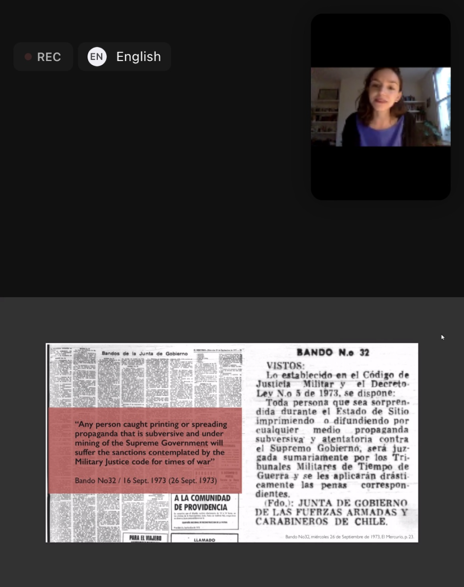
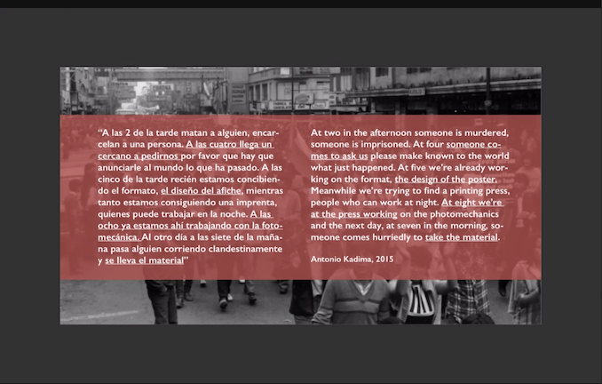
For my first networking event, I attended a Society of Design Arts virtual event, titled Design and Political Resistance in Chile: Posters from the military dictatorship. It was an in depth discussion and analysis of dictatorship within Chile and how the power of design led to imperative messages to be shared. The main focus was the fight for democracy and the intent of using one’s voice – through posters.
Throughout the discussion, we were given insight into various leaders and activist groups, such as the Chicago Boys and the activist workshop, Cultural Center Tallersol. These organizations and groups worked to fight against the mistreatment of those who chose to use their voice and fight for democracy. Through military tactics, people were controlled and punished for fighting for change.
While I enjoyed the historical aspect of this virtual event, I found the presentations to be sort of difficult to follow at times. I understand the presentation was presented in Spanish and I was able to use the translation feature via Zoom but I found myself getting lost at times. Overall, it was a very interesting event.
ENTRY 5 – Redefining My Portfolio and Resume
I received great feedback from both my Internship Professor and Portfolio Professor on my resume and portfolio. There are some small changes I need to make, like alignment and choice of color within my designs. Overall, I am very pleased with the feedback and the progress I have made. I have applied to an abundance of internships on LinkedIn, as well as The Calling All Graphics and the NYPIRG Internship.
I received responses from Calling All Graphics and the NYPIRG Internship, as well from two internships from LinkedIn. The NYPIRG internship was already fulfilled and I chose not to proceed with the Calling All Graphics position, I was not interested in what they were asking for. Aside from these responses, I also was informed of a local business looking for an intern to work online. The business PrintHouse NYC, which was a storefront based in Queens but has now transitioned to online only, is looking for a graphic designer to assist in designing and offering communication services. I was very eager to meet with the owner or manager of this business since working from home will be very convenient with my school schedule. Most of the internships I applied for on LinkedIn were in-person. I got in contact with the manager and lead graphic designer of the business and was able to schedule a meeting via Zoom.
ENTRY 6- Networking Event – NYT x CUNY Design Series: Design at The Times
For my second networking event, I attended the CUNY Design Series on the New York Times. This was a great meeting and I was able to learn a lot from the guest speakers. I enjoyed this event much more than the previous one I attended. Employees of New York Times shared their experiences and gave some great advice on how to enter the industry and make a name for yourself. Each speaker worked in a different part of the company. The panilst included Kate – Design Director, Jordan J. – Marketing Creative, and Luis – Product Designer.
Each person shared what their field is and what they focus on, such as journalism, content creation, storyboarding, identity design and storytelling. The advice that stood out to me the most was that as designers we should not strive to only create something cool and fun to look at but approach our work as problem solvers. Conducting our own research and stepping out of the box will really set us apart from others. This event was great to observe. Getting direct insight into a major company and brand like the New York Times was very interesting and informative.
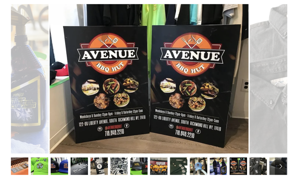
ENTRY 7 – PRINTHOUSE NYC Internship
PrintHouse is a private business that has been operating since 2017. It was originally a storefront business located in Kew Gardens where they offered design services, embroidery, screen printing and wide-format printing. They are in the process of relocating, so they are currently only offering graphic design services virtually. This actually works in my benefit considering I was hoping to intern somewhere where I can work from home due to my busy school schedule. They have a lengthy list of clients that range from small local businesses to major corporations.

PRINTHOUSE LOGO
After meeting with the Lead Graphic Designer, Yuri at PrintHouse I received a response after a couple of days. The meeting went very well and Yuri was very pleased with my portfolio, specifically the one Converse campaign I had created. We discussed how important design is for a brand and company, why I chose to major in design and what I hope to gain as an intern.
I received the offer to be a part-time intern and gladly accepted. Yuri let me know what kind of work I can expect to be doing and how I will be in contact with various clients, as the company creates a lot of flyers, social media posts and logos for other local and major businesses. They are willing to work around my school schedule. I should expect to meet with them about 3-4 times a week via Zoom. So far, the experience has been very positive and easy going. I’m very happy I was able to receive an opportunity like this after being delayed in finding an internship spot.
ENTRY 8 – Starting at PrintHouse
Yuri and I meet via Zoom every couple of days to discuss the design requests that have come in and what he would like for me to work on. We usually meet on Mondays, Wednesdays and Fridays. If needed we have short meetings on any other day, especially if he wants to discuss any of the designs I worked on. Yuri was telling me he used to get a lot of business card design requests when his storefront was opened since local people would walk by.
The first project I worked on was laying out business cards for clients and making edits on existing designs. So far, the cards I have worked on were for other small businesses or people who are just starting out. For example, this couple requested a design for their hookah rental business that they started together. We went through some ideas together through email and then I shared my ideas with Yuri. The couple left most of the design aspects up to us. I knew I wanted to incorporate a dark aesthetic for the cards, after speaking to the client. I created 3 designs for Yuri to see and then he gave me feedback and told me which one he thought worked best. At first I was nervous to hear what he would say but it actually went pretty well when we were discussing what my designs.


I’m still getting used to designing for actual brands and clients as this is all new to me. I obviously am used to working with classmates or alone and coming up with concepts that I think work best. So far, I am enjoying the experience and I am learning a lot, especially when it comes to communicating with people and asking questions.
ENTRY 9 – Working & Staying on top of things
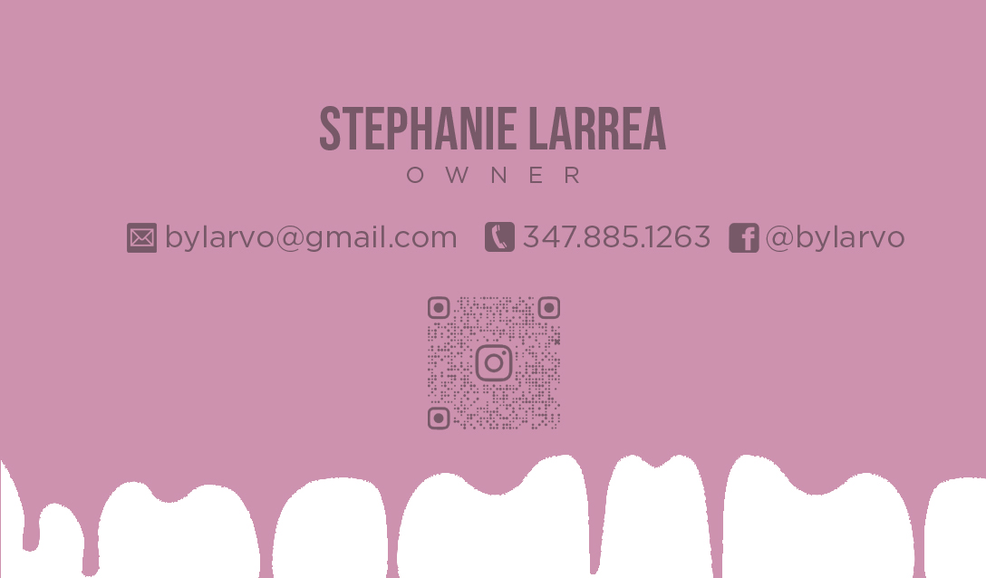
Assignments in all 5 of my classes are starting to pick up and I am working on posters and signage for Yuri at PrintHouse. This semester I find myself designing a lot of branding assets in all areas. I’m taking package design and identity design which is obviously all about branding and then with my internship we help a lot of small businesses maintain a consistent feel throughout all of their assets, whether it is signage, posters or business cards etc. Below are some of the final business cards I created for various clients. As expected, each client had some requests that wished to change. Nothing was too major, for example Stephanie wished to drip one the back of her card too. I originally had it with a solid background.
I met with Yuri this week and he informed me that he would like for me to work on this menu brochure for a local Indian restaurant. He said he created merch for them in the past, so they were familiar with PrintHouse and the owner requested menu designs. I have some time to work on the layout of the brochure since the restaurant’s menu consists of a lot of items. While on Zoom, Yuri and I looked at some menu brochures to make sure I had an idea on what to layout and prepare for out next meeting.
ENTRY 10 – Nassau County Museum Exhibit Blue
For this blog I chose to focus on the Nassau County Museum Exhibit Blue. I found this exhibit to be the most interesting because it showcases how powerful the color blue is and the many ways in which it can and has been used to evoke different emotions. The exhibit includes art created from a range of years, from 1902 to 2020. I chose to focus on my three favorites – Pablo Picasso’s 1902 Buste de Femme, James Casebere’s 2018 Blue House on Water, and Jeffrey Gibson’s 2014 Deep Blue Day.
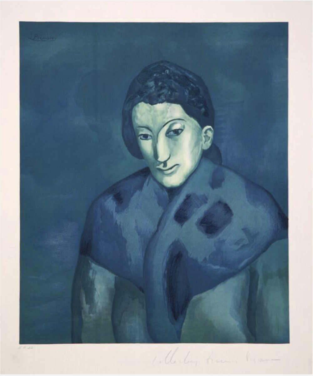
Pablo Picasso, Buste de Femme (1902)
Pablo Picasso, Buste de Femme (1902)
This piece by Picasso is a lithograph that is seen as a portrait of a woman, a sad woman I should add. It was created as a part of his Blue Period, where he created pieces that reflected poverty and sadness. He uses a collection of shades of blue to portray this woman that seems to be frozen in time. There is no sense of movement.
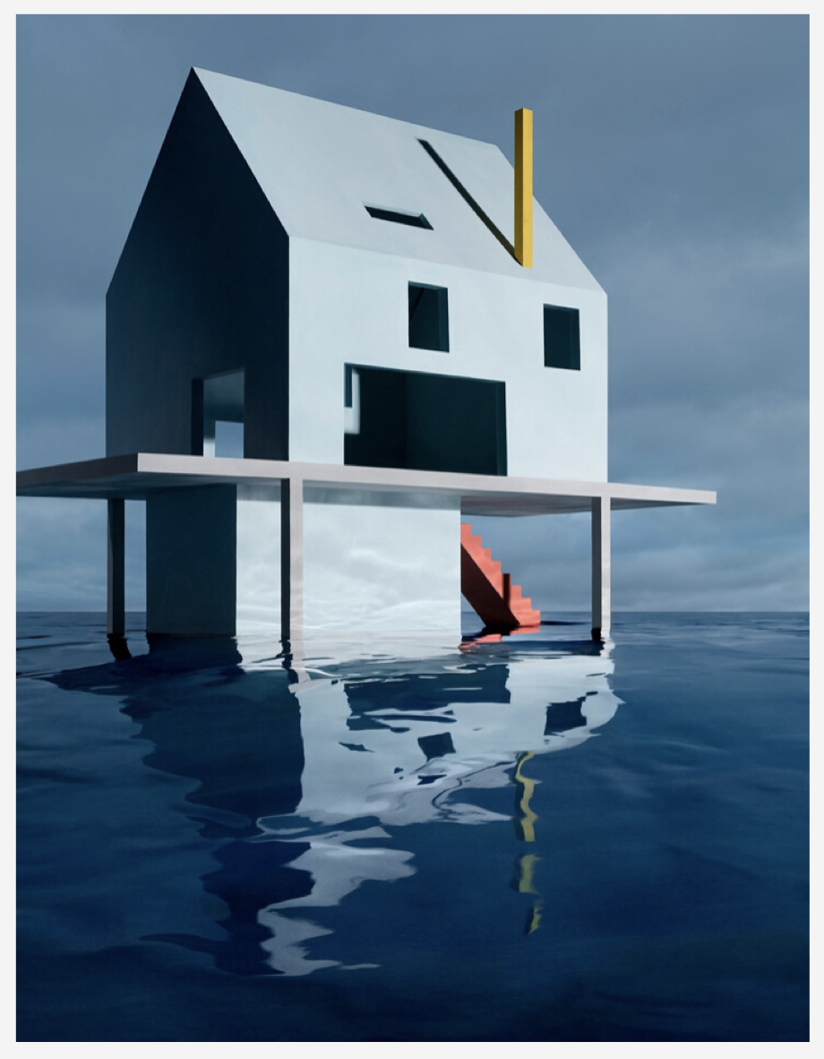
James Casebere Blue House on Water (2018)
James Casebere Blue House on Water (2018)
I chose to focus on Blue House on Water because I found it fascinating that Casebere placed his piece in real water. Made of styrofoam, plaster and cardboard, the piece is 60.5 by 47 inches. A very geometric based piece, it is meant to reflect on the current times and the era in which climate change continues to have a lasting impact on our lives. Casebere’s use of blue throughout this work is smart and accurate, in ways to depict the idea of water and the seriousness of the idea. Climate change is real.
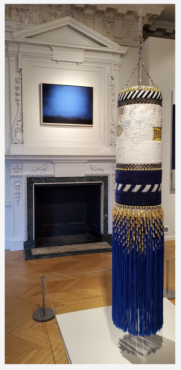
Jeffrey Gibson Deep Blue Day (2014)
Jeffrey Gibson Deep Blue Day (2014)
Jeffery Gibson’s Deep Blue Day piece is a very detailed vinyl punching bag consisting of recycled wool, beads, fringe and repurposed painting as well. It’s size is 49.5 x 15 x 15 inches. Made up of blue, white and yellow, the punching bag is very detailed and fancy looking. The beading adds a high quality feel to the piece. The repurposed painting reflects on what a punching bag is used for, as it the material looks worn and distressed. The inspiration behind Gibson’s piece is experience with anger and frustration. Therapy sessions led to him creating this piece as a direct representation of emotions.
ENTRY 11 – Working at PrintHouse
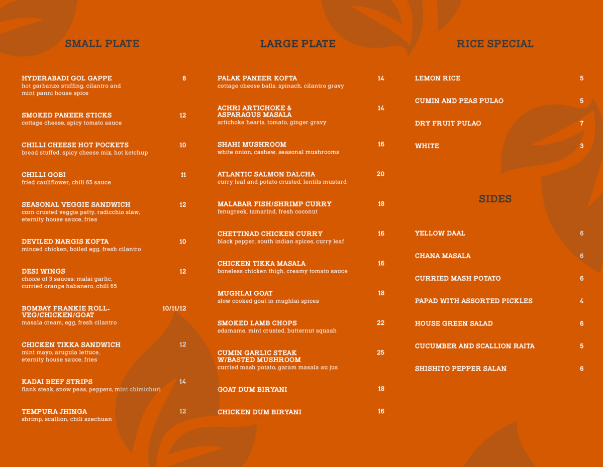
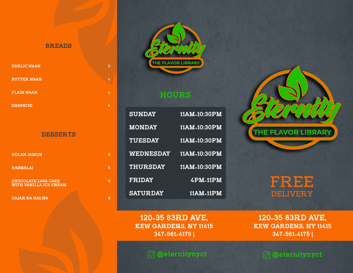
This week I worked on finalizing the brochure for the local Indian restaurant, Eternity. Yuri went over it to make sure my spacing, kerning, tracking and spelling was correct. We emailed the client and they actually requested to see the background in green and orange. Besides that, they did not have any major edits, which I was happy to hear.
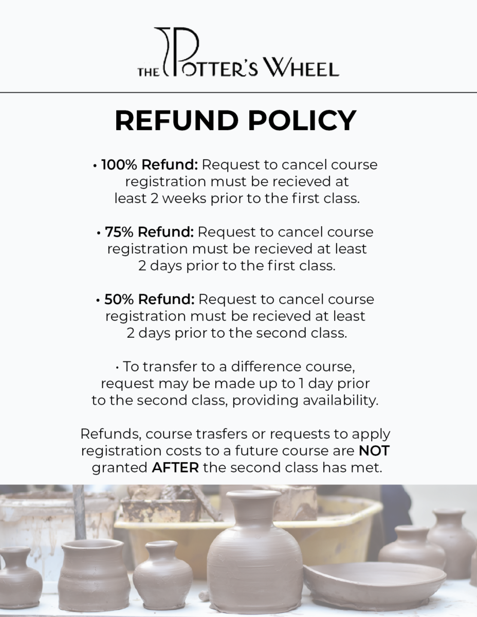
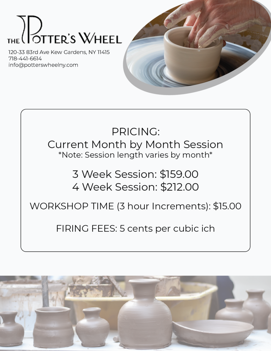
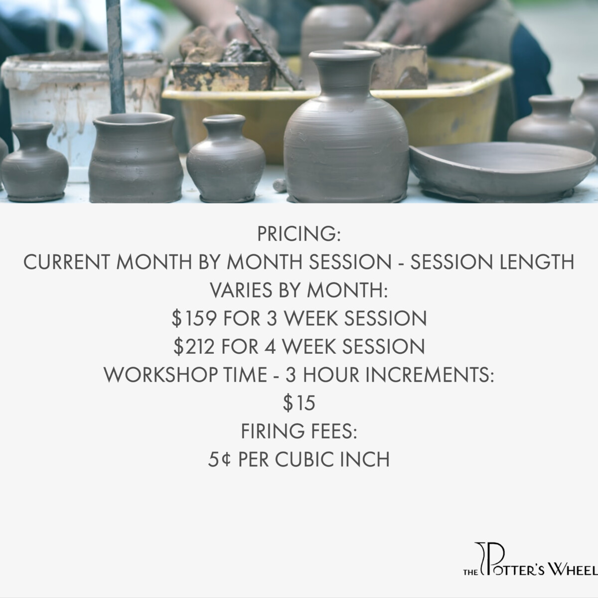
I also worked on updating the signage for a pottery studio located in Queens called Potter’s Wheel. The owner is very nice and requested a more clean and legible look for her price list and policies. This was a quick and easy project, as always I showed Yuri my work and he reviewed it for any errors or changes he thought I should make.

