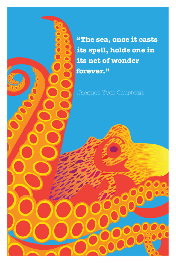
The Octopus

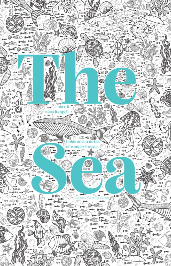
The Sea
Link to RGB PDF download here
Link to CMYK PDF download here

Digital Book Students design three posters and four social media postings for an art gallery show (PET PEEVES). This project Introduces the use of a typographical grid and the importance of visual hierarchy. Why use a grid? Why follow a format? What are the differences between a grid and a layout? Through visual hierarchy, we will explore scale,…
Digital Book Exposes the student to the creative and sometimes more playful aspect of type and lettering. What are the differences between creating lettering and using existing typefaces? How can we achieve a message using an existing typeface, or how can we, in contrast, experiment with material and resources to create playful lettering? Click here…
I went to visit Whirls and Twirls By Sol Lewitt at Columbus Circle. See my photos below!