
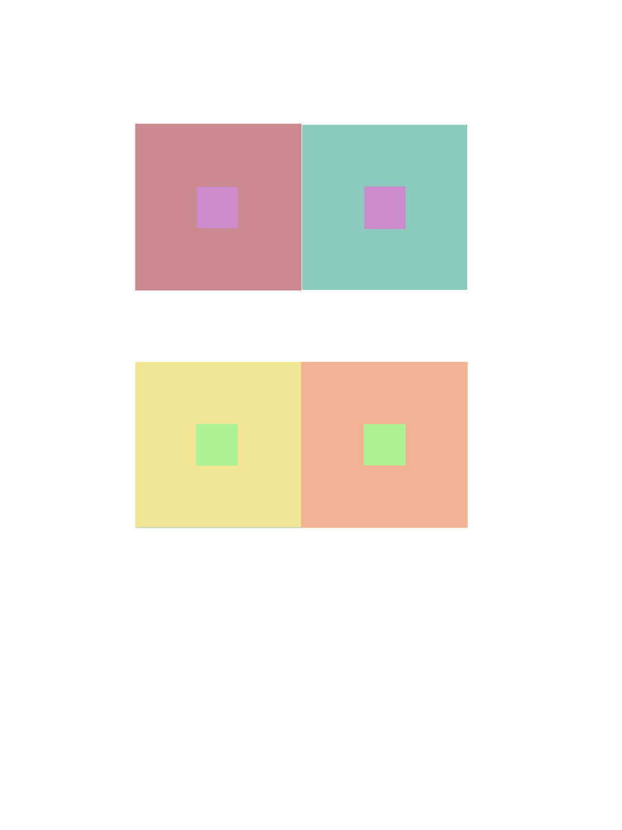
Two color
Tint

Shade
Fall 2017 | COMD1100_LC08 | Prof. Spevack
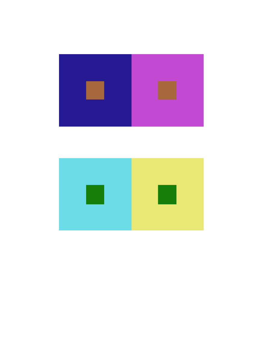
Two color
Tint
Shade
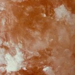

The tint example was found on a rock salt in my house. The pinkish-orange color of the salt gets lighter in different parts and this is an example of tint which is when a color gets lighter with the addition of white.
The color progression example was found on a bottle. The light blue and the yellow-orange fade and blend into each other and this is an example of when two colors mix as they progress into one another.
The shade example was found on Vision’s sweater. The deep green color of the sweater gets darker in in the shadow and this is an example of shade which is when a color gets darker with the addition of black.
Time spent: about 1 hour
For my pieces, I used manga (japanese graphic novels) from my bookcase to showcase the color progressions. I’ve always loved the colors in cover art of any manga, but now that I’m seeing them in a different light, I appreciate them even more now!

Shade Progression (Black to Orange & Pink)
Using volume 6 of Shaman King, I’m demonstrating the shade progression of black to color. You can really notice the progression around the middle of the character, where the black is blending into the pink and just behind the orange foliage.

Two-Color Progression (Burgundy to Brown)
Volume 8 of Death Note; the dominant burgundy color progresses to the sub-dominant values of brown, which exhibits a 2-color progression.

Tint Progression (Lake Green to White)
And volume 4 of Death Note displays a tint progression with the blue-green lake color progressing to white.
20 minute work
When I used the Color Interactions application I couldn’t really understand the concepts but after reading the various articles I grasped the basic concept. I observed that a color placed with it’s complement makes the complement of the center color show slightly. I also noticed that working with compliments with the outer colors can make the center color look like a different color entirely.
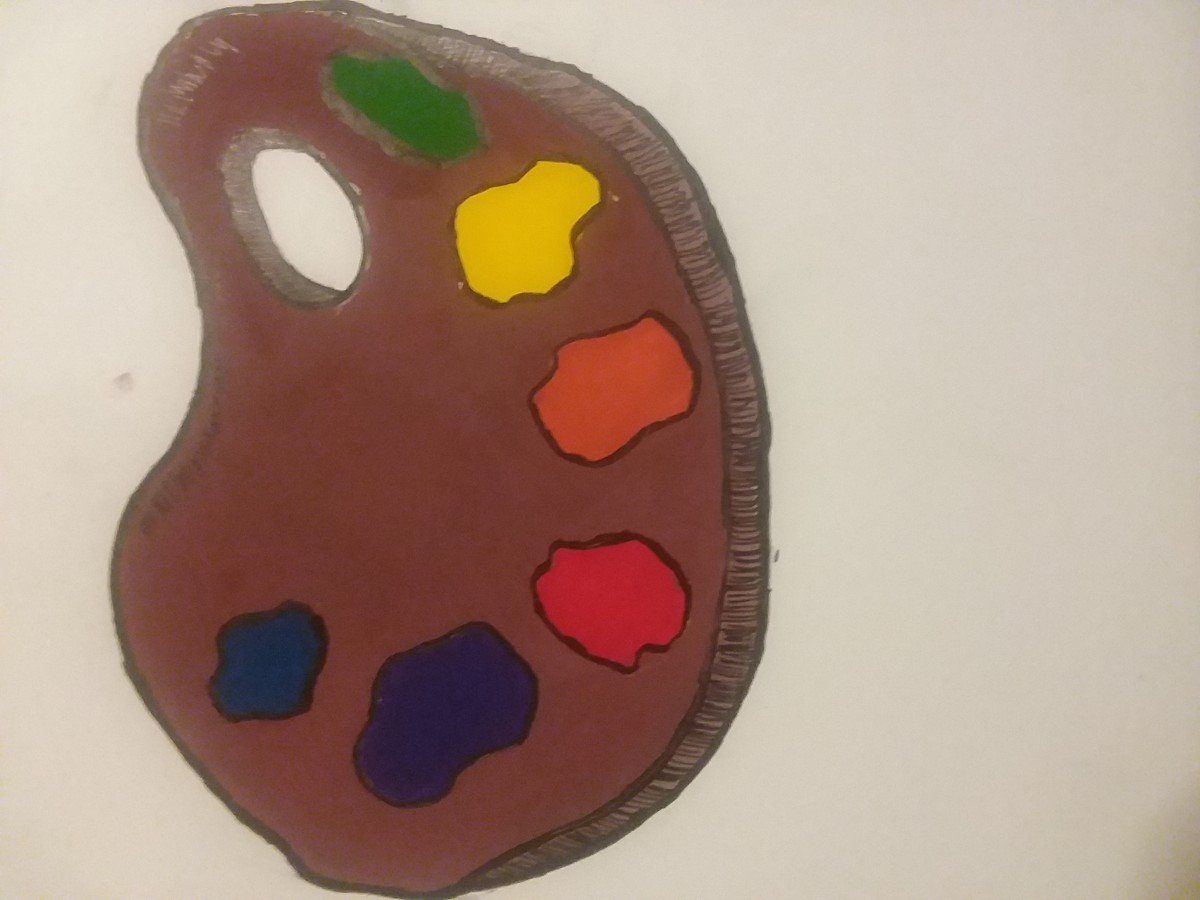
Mahogany Color Palette
This is a very simple color wheel. My thought process was something that contains all colors and I immediately thought of a palette. I chose the dark brown color because I used to have an art teacher who always bragged about having a palette he made himself out of mahogany wood. (dont’ know if it’s something to brag about) All of the colors were mixed, none were pre-made. Something interesting about the paint was I got that red by combining Rose Tyrien (Magenta) and Flame Red (A really reddish-orange) and that shade of Blue was made with Turquoise Blue (Cyan) and Ultramarine Blue. (a VERY dark blue)
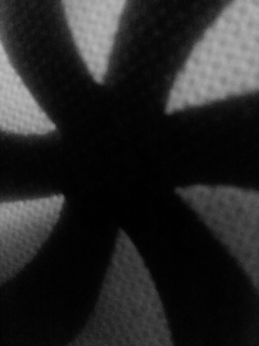
Ambiguous Figure/Ground Relationship
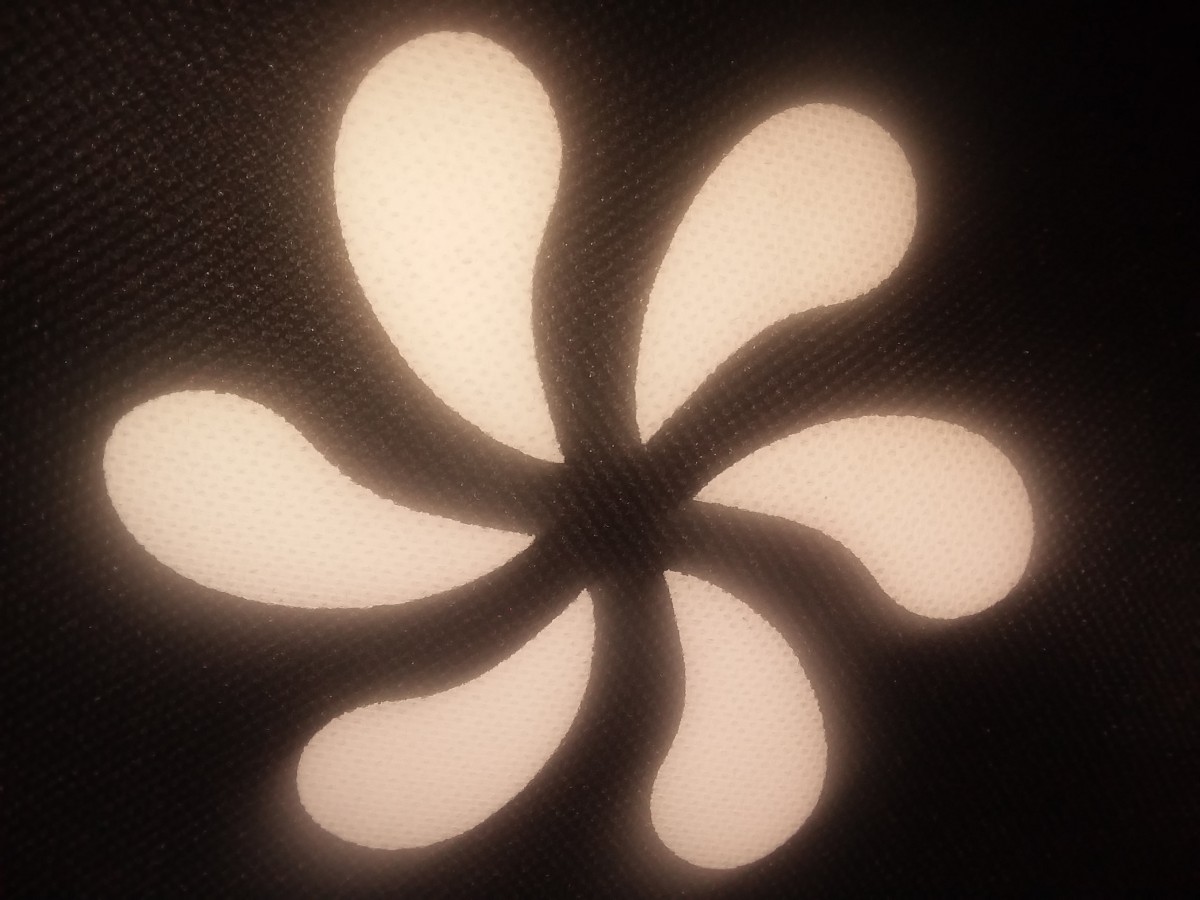
Obvious Figure/Ground Relationship
I took these pictures a while ago, but if I had to create a story for where they came from and what they mean, I’d say these are logos originated with some sort of religion but was adapted to fit onto the object in the picture. It looks like a lotus and upon researching the significance of lotuses, it’s often associated with divine beauty. The picture itself has an obvious figure/ground relationship, the lotus shape is the figure and is seperated by the black background. The second picture has a great ambiguous relationship because it’s hard to tell what the subject of the photo is, the white or the black parts of the photo.
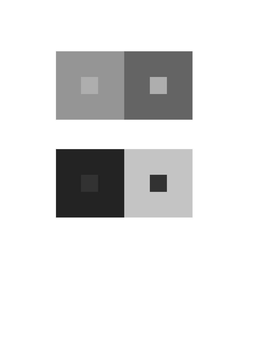
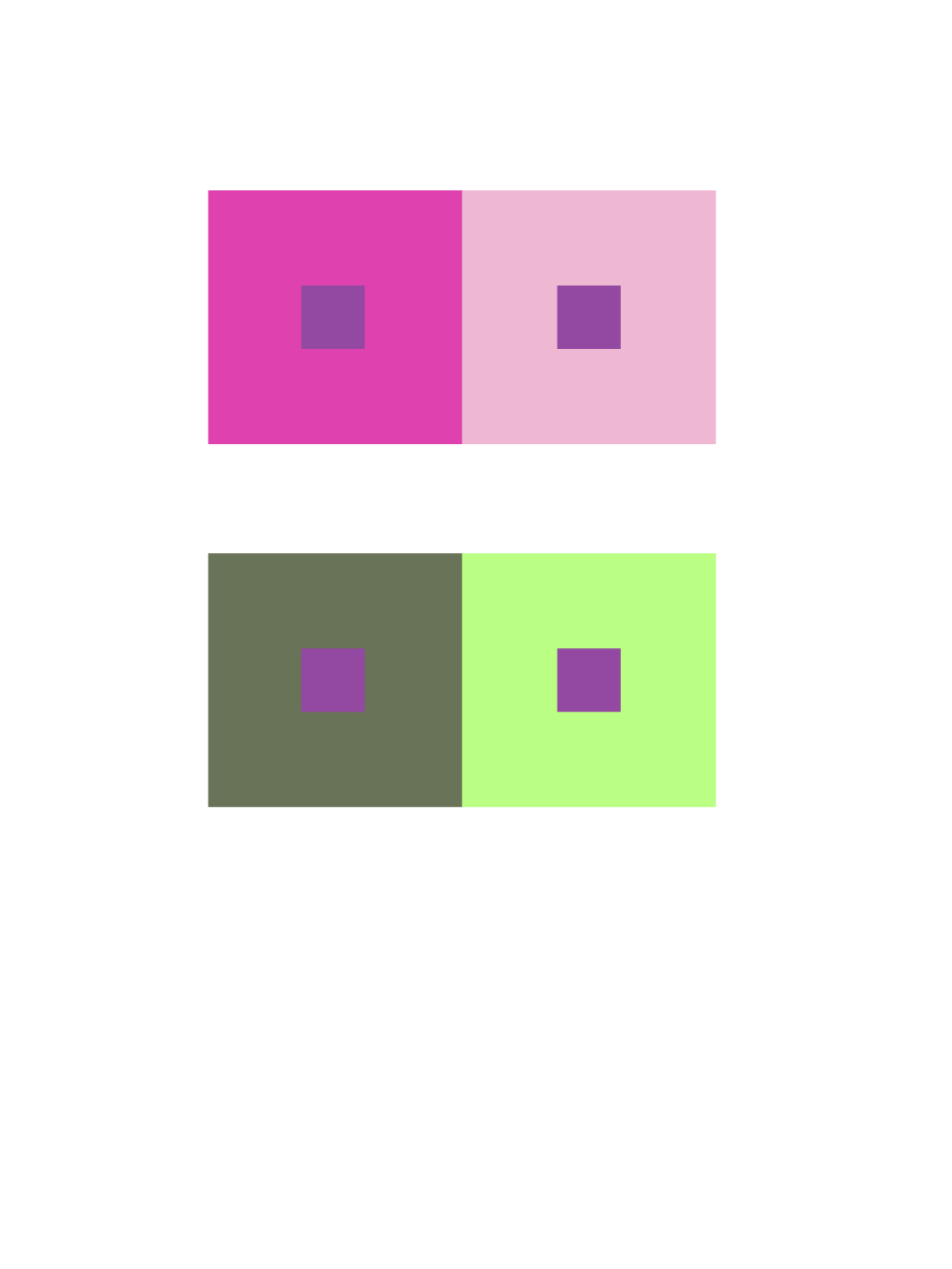
The article” The Magic and Logic of Color : How Josef Albers Revolutionized Visual Culture and the Art of Seeing” on Josef Albers and Interaction of Color gave a detailed description on how one perceives color. He states “In visual perception a color is almost never seen as it really is — as it physically is. This fact makes color the most relative medium in art”. Albers approach to interaction of color was practice before theory. With the class experiment we started with practice, Trail and error. Using the ipads we practiced using colors, some high in value or low saturation. We had to use two colors to make one color either become brighter, lighter or the same in pairs. Some of the colors after adding white, or black I couldnt see how the colors change and with some I could. This experiment really played tricks on my eyes. Using complementary colors of primary colors helped me see more of a change in hue an value.
While doing research on color Interactions and how certain colors can change and create optical illusions depending on the colors used and I think that’s pretty cool. For example in an article I read it states, “First, it should be learned that one and the same color evokes innumerable readings. Instead of mechanically applying or merely implying laws and rules of color harmony, distinct color effects are produced-through recognition of the interaction of color-by making, for instance, two very different colors look alike, or nearly alike.” This is what I was talking about when I said certain colors can create this visual tricks and play with your brain. I think tis whole color Interaction thing is pretty cool and I will definitely take a closer look at in the future.
Value
Value in Color
Hue, not Value
Hue and Value
Time worked: 1 hour
Okay, so I watched the video of Anoka Faruqee’s presentation. Faruqee said Albers wanted his students to see colors in context, as in, compared to one another, because that’s how we see things; there’s no natural range of colors mapped out on a grid—we see them compared to each other in layers or side by side. THIS IS AWESOME!! It’s a great way to really SHOW differences in shades of colors, especially since a shade of any hue would look completely different in someone else’s eyes. I appreciate Albers for teaching in this manner. I get to see even MORE colors. I’m pretty sure I said ‘whoa’ more than 5 times throughout the video, when Faruqee presented the studies of Albers’ students’ works and revealed that the shapes that were meant to look different were actually the same. The conversion of Albers’ guidebook into an app is ingenious.
© 2025 COMD1100 : STUDENT BLOG
Theme by Anders Noren — Up ↑
The OpenLab is an open-source, digital platform designed to support teaching and learning at City Tech (New York City College of Technology), and to promote student and faculty engagement in the intellectual and social life of the college community.


Recent Comments