Fall 2017 | COMD1100_LC08 | Prof. Spevack

Tag: Color Interactions

Color Interaction Pairings: Phase 4

https://openlab.citytech.cuny.edu/spevackcomd1100fa2017/2017/12/11/colorpairings-phase-1-3/

Ā https://openlab.citytech.cuny.edu/spevackcomd1100fa2017/2017/12/10/color-interaction-pairings-phase-2-5/

https://openlab.citytech.cuny.edu/spevackcomd1100fa2017/2017/12/18/color-interaction-pairings-phase-3-7/


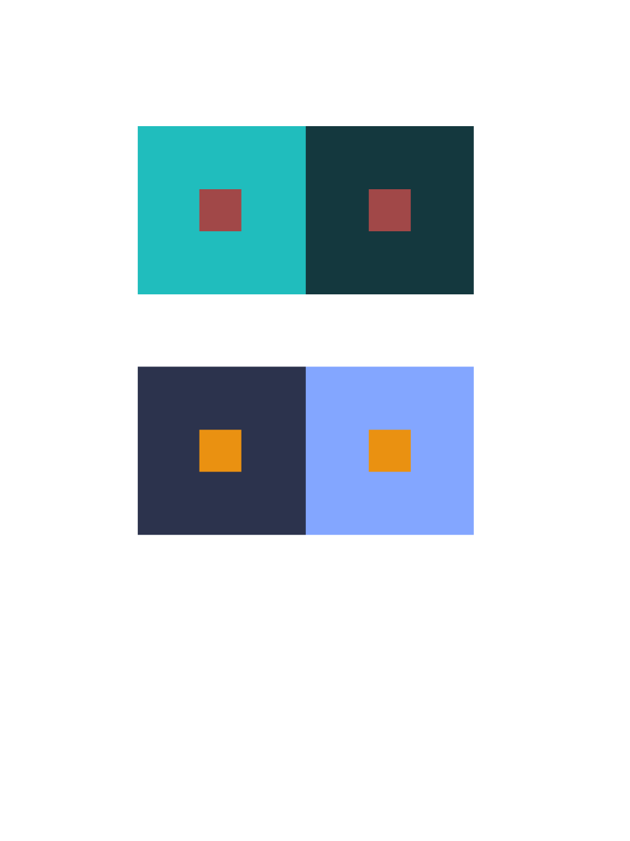
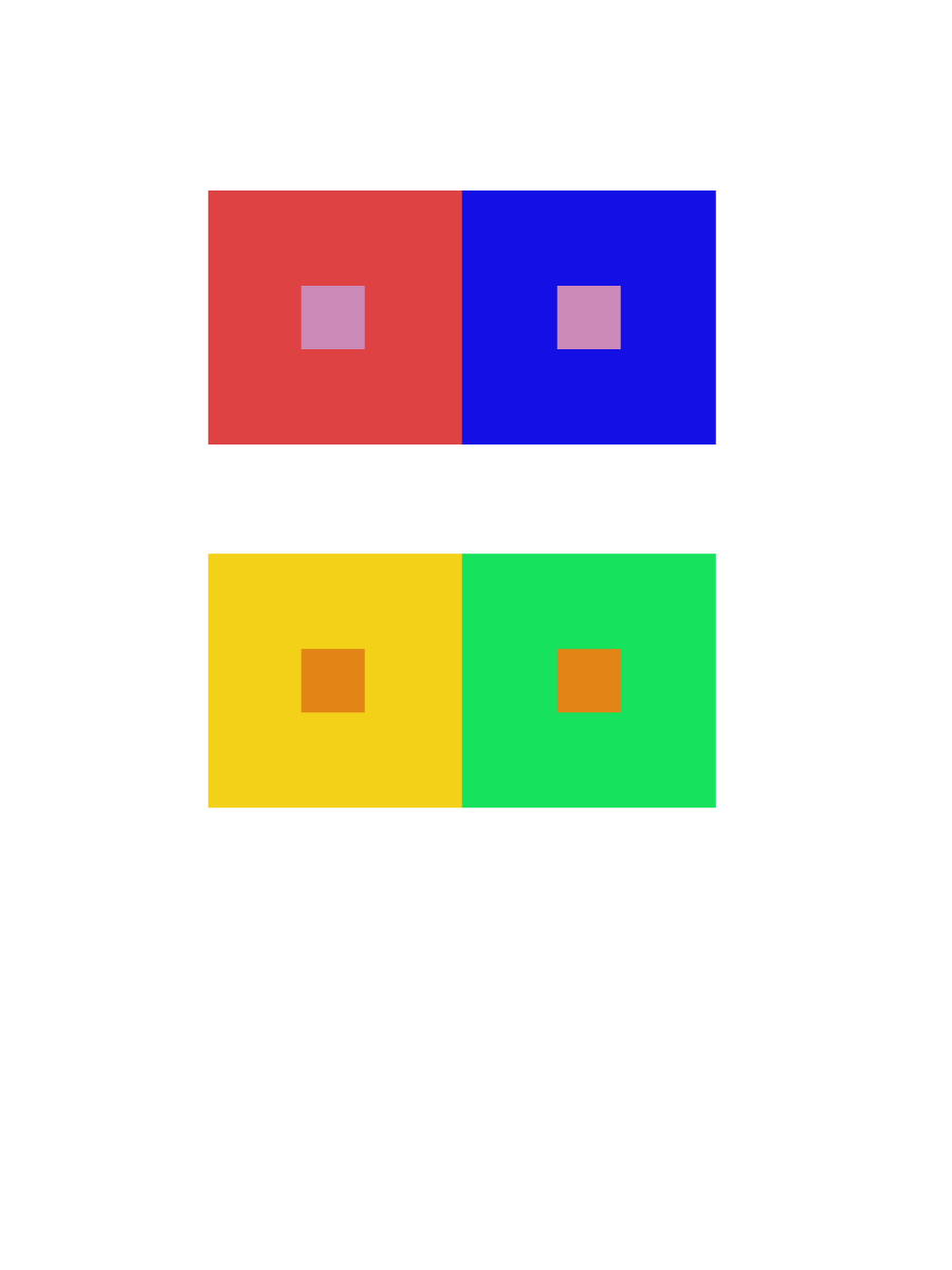
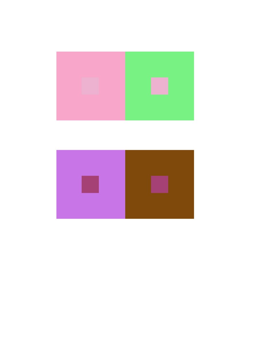
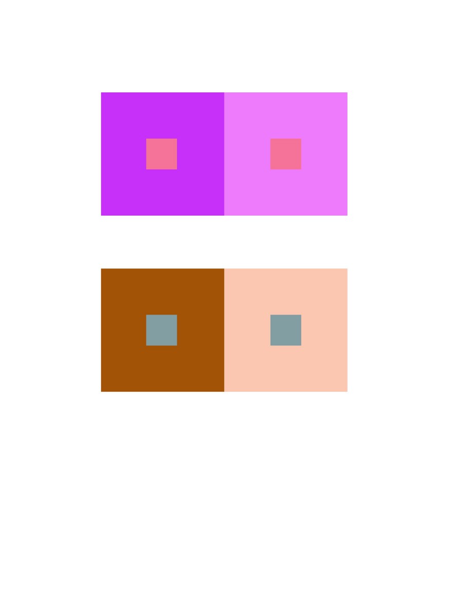
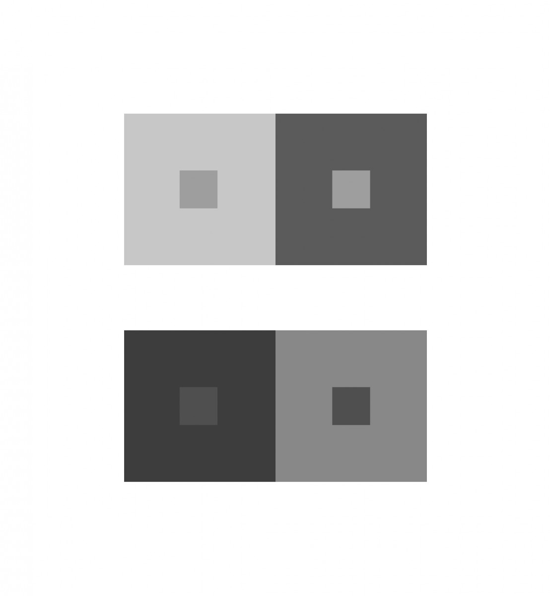
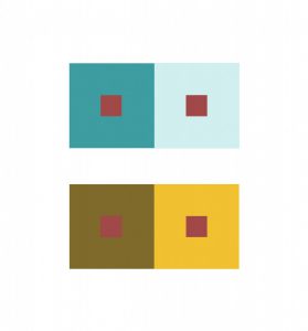
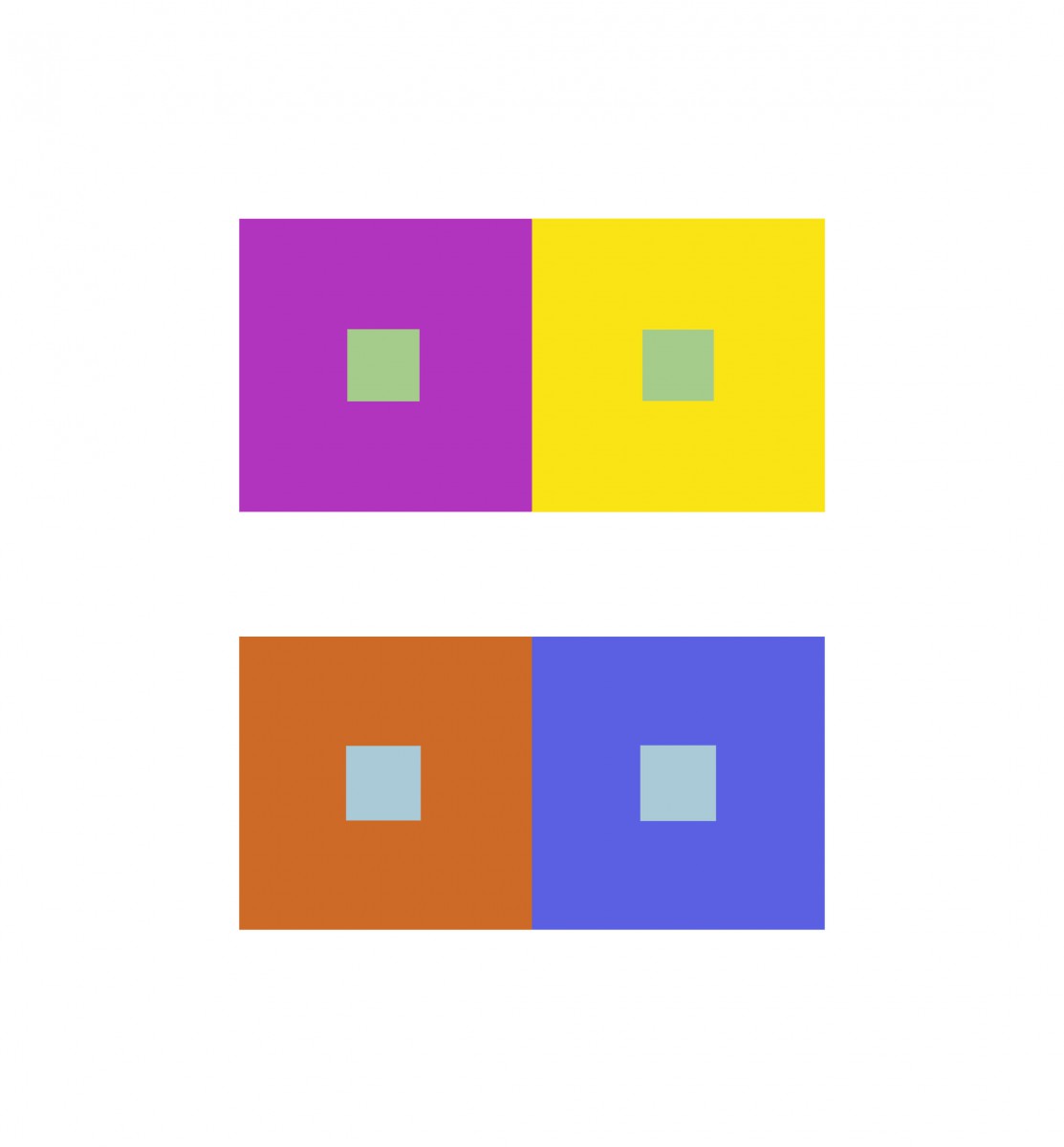
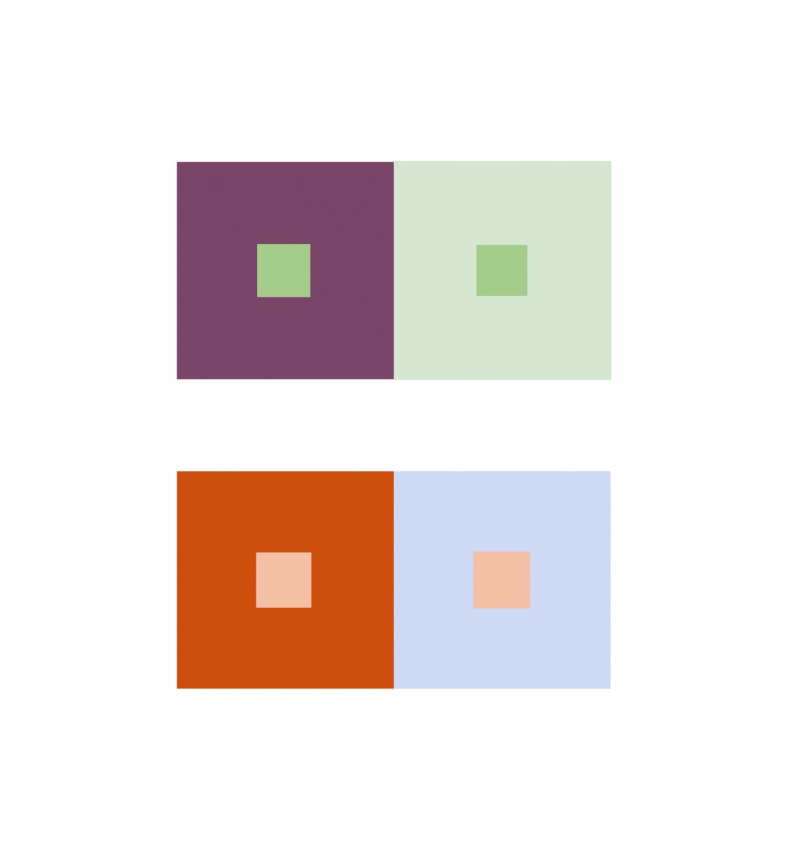
This project made me really use my eye muscles. At first it was difficult to see a change in value or hue. After training my eyes,Ā  and knowing more about the theory of color, it was easier to identify. This skill will definitely help me out in the future projects and gives me a more open mind when it comes to color. Everything isn’t always what it seems, Thanks Professor Jenna.

Color Interaction Pairings: Phase 3


Using red to describe my partners vibrant, confident personality and a lightning bolt because I see her as a strong individual who stands out. She used this deep blue to describe me as strong and stable adding a crown to express that I also stand out. We noticed yet very different people both of us give off a strong energy. We led with that mostly. We altered the symbols color an created a saturated color we both agreed on. Against the primary blue hue background the symbol came off warmer and with the red primary hue background a more lavender hue. Both background hues are pure prismatic hues that aren’t complements but work well with one another and makes it possible to see the contrast of the symbols. Great project!


Hours worked 1 1/2

Color Interaction Pairings: Phase 4

https://openlab.citytech.cuny.edu/spevackcomd1100fa2017/2017/12/11/color-interaction-pairings-phase-1-2/

https://openlab.citytech.cuny.edu/spevackcomd1100fa2017/2017/12/07/color-interaction-pairings-phase-2/

https://openlab.citytech.cuny.edu/spevackcomd1100fa2017/2017/12/11/color-interaction-pairings-phase-3/

Color Interaction Pairings: Phase 1

The article” The Magic and Logic of Color : How Josef Albers Revolutionized Visual Culture and the Art of Seeing” on Josef Albers and Interaction of Color gave a detailed description on how one perceives color.Ā  He states “In visual perception a color is almost never seen as it really is ā€” as it physically is. This fact makes color the most relative medium in art”. Albers approach to interaction of color was practice before theory. With the class experiment we started with practice,Ā  Trail and error. Using the ipads we practiced using colors, some high in value or low saturation.Ā  We had to use two colors to make one color either become brighter, lighter or the same in pairs. Some of the colors after adding white, or black I couldnt see how the colorsĀ  change and with some I could. This experiment really played tricks on my eyes.Ā  Ā Using complementary colors of primary colors helped me see more of a change in hue an value.

Color Interaction Pairings: Phase 1

While doing research on color Interactions and how certain colors can change and create optical illusions depending on the colors used and I think thatā€™s pretty cool. For example in an article I read it states, ā€œFirst, it should be learned that one and the same color evokes innumerable readings. Instead of mechanically applying or merely implying laws and rules of color harmony, distinct color effects are produced-through recognition of the interaction of color-by making, for instance, two very different colors look alike, or nearly alike.ā€ Ā This is what I was talking about when I said certain colors can create this visual tricks and play with your brain. Ā I think tis whole color Interaction thing is pretty cool and I will definitely take a closer look at in the future.