Fall 2017 | COMD1100_LC08 | Prof. Spevack

Tag: Color Interaction Pairings

Color Interaction Pairings: Phase 4

Color Interaction Parings: Phase 1

Color Interaction Parings: Phase 2

Color Interaction Pairings: Phase 3

This project had to do a lot with the illusions that colors can make and I feel like the best part about it was seeing not only what kind of tricks we could play on our own eyes but also the combinations that other people chose and how they chose to pair colors up to make illusions. Something I liked about this project was Phase 3 when we were paired up and had to work together to not only make a color/symbol pair that represented a different person, but create one that fit with ours. It was really cool to see the other people’s images of you represented in color and symbols. I wish we had more time to work with that app during Phase 1. I feel like there was a lot more I could have learned through those apps and I am looking forward to getting them for myself.

Color Interaction Pairings: Phase 4

https://openlab.citytech.cuny.edu/spevackcomd1100fa2017/2017/12/11/color-interaction-pairings-phase-1-2/

https://openlab.citytech.cuny.edu/spevackcomd1100fa2017/2017/12/07/color-interaction-pairings-phase-2/

https://openlab.citytech.cuny.edu/spevackcomd1100fa2017/2017/12/11/color-interaction-pairings-phase-3/

Color Interaction Pairings: Phase 3

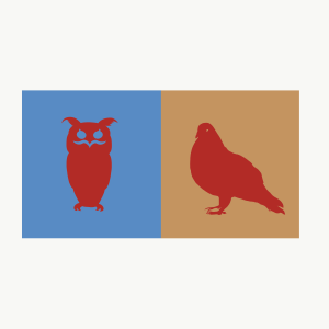
This project was rather quick but it was because my partner and I had very solid ideas of the colors we had in mind for each other. My partner was Ebony and she immediately thought of me as being a bright red for my energetic, outgoing and passionate personality. When she asked me what symbol was a good representation of myself I said the sun, but when she suggested lighting because of its electrifying presence that made you pay attention to it right in that moment, I was both flattered and fully convinced that it matched me way better. For Ebony I has always seen her as a very strong and well grounded person but one that carried themselves with elegance. She still had a very cool and playful personality, so I saw a deep blue-violet as a color that represented all these things. I suggested the symbol of the crown not only because deep blues and violets are usually associated with both power and elegance but also because I felt that it paralleled the lighting bolt in the theme of power. Both colors are very saturated and bold even though one is on the warm side of the wheel and the other is on the cool side, and the symbols both represented a powerful commanding presence, one in a loud, immediate way and the other in a firm and authoritative way.

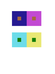
The color interaction of this piece had to do with the a change in hue but not value, for the background colors. The effect on the common color, pink, was that against the red background it appeared to be cooler in contrast while on the blue it appeared to be warmer. This is because the very prismatic hues create the illusion of the icon having the “filter” of their complementary color. Against the red, the lighting bolt appears more green/cool. Against the blue, the crown appears more orange/warm.

Time spent: 1 hour
Color Interaction Pairings: Phase 4

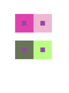
This project was a great experience! The idea of comparing colors on top of each other, as found out through learning about Josef Albers’ studies. Albers’ studies were then converted into an iPad app, and from the presentation I watched in Phase 1, the app proves to educate future artists about the interaction of colors. Through Phase 2, we learned how to turn one color into two through the use of an interaction between different colors.

Phase 3 was fun to work on, especially when bouncing ideas off of a partner. Through an interview with my partner, I learned how to emulate an idea through the use of color and personifying the color by comparing it to a personality.


Color Interaction Pairings: Phase 3

Shawn and Marcel


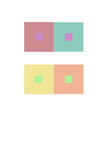
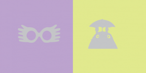
From Shawn’s calm, low voice, and mellow, sleepy personality, I perceived his color to be a blue chromatic gray. Shawn’s came up with an orange chromatic gray as a joke of my hatred of orange.

We shared the brick red color from capturing the color of his notebook, and turning it into a chromatic gray value.

Time worked: 1.5 Hours

Color Interaction Pairings: Phase 1

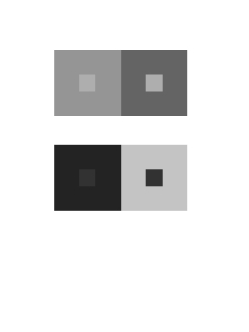
While doing research on color Interactions and how certain colors can change and create optical illusions depending on the colors used and I think that’s pretty cool. For example in an article I read it states, “First, it should be learned that one and the same color evokes innumerable readings. Instead of mechanically applying or merely implying laws and rules of color harmony, distinct color effects are produced-through recognition of the interaction of color-by making, for instance, two very different colors look alike, or nearly alike.”  This is what I was talking about when I said certain colors can create this visual tricks and play with your brain.  I think tis whole color Interaction thing is pretty cool and I will definitely take a closer look at in the future.

Color Interaction Pairings: Phase 1

Okay, so I watched the video of Anoka Faruqee’s presentation. Faruqee said Albers wanted his students to see colors in context, as in, compared to one another, because that’s how we see things; there’s no natural range of colors mapped out on a grid—we see them compared to each other in layers or side by side. THIS IS AWESOME!! It’s a great way to really SHOW differences in shades of colors, especially since a shade of any hue would look completely different in someone else’s eyes. I appreciate Albers for teaching in this manner. I get to see even MORE colors. I’m pretty sure I said ‘whoa’ more than 5 times throughout the video, when Faruqee presented the studies of Albers’ students’ works and revealed that the shapes that were meant to look different were actually the same. The conversion of Albers’ guidebook into an app is ingenious.