Color inventory
Fall 2017 | COMD1100_LC08 | Prof. Spevack
Color inventory
Two color
Tint

Shade
This was my favorite project this semester. Not only was I able to use everything I had learned in the last couple of months in one big project, but I was also given the freedom to do an illustration of my own. The color proportion inventory is an amazing tool to creating and studying color palettes of images and stills and that is definitely something I plan to do more of in my spare time. I wish I had a little more time to do the illustration though because looking back on it I see somethings that I could have changed or even a different image I could have presented that had a more accurate representation of certain proportions. All in all this was definitely the best project in my opinion. I’m very glad I made the decision of continuing into Phase 3.
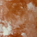
The tint example was found on a rock salt in my house. The pinkish-orange color of the salt gets lighter in different parts and this is an example of tint which is when a color gets lighter with the addition of white.
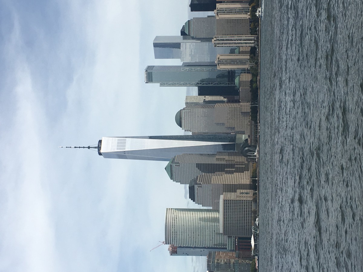
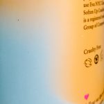
The color progression example was found on a bottle. The light blue and the yellow-orange fade and blend into each other and this is an example of when two colors mix as they progress into one another.
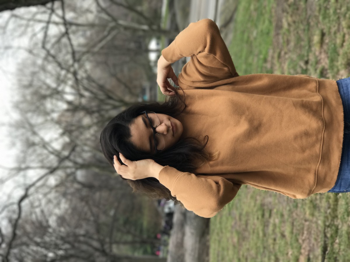
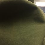
The shade example was found on Vision’s sweater. The deep green color of the sweater gets darker in in the shadow and this is an example of shade which is when a color gets darker with the addition of black.
Time spent: about 1 hour
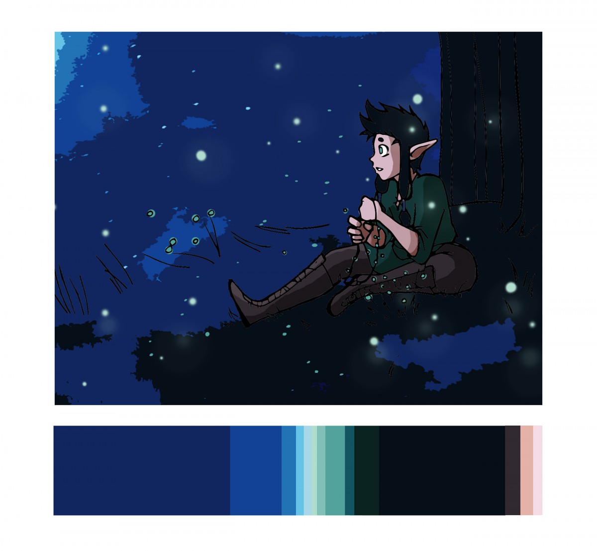
Fireflies by Garnet Garcia
I feel like the most difficult part of this part of the project was keeping the colors proportional to the original image. I had a very clear image of what I wanted to do and where the colors would go, but I found myself having to get creative with how much of each color I used, for example how much skin was showing. I also had to find a away to include the green/mint shades which I accomplished with the fire flies. This project was also special to me because it allowed me to use one of my original characters from my work and incorporate it into the illustration. All in all, it was awesome to see these colors work so harmoniously together in a completely different context.
Time spent: 4-5 hours

Color Proportion Inventory
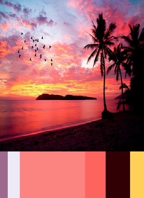
How to Train Your Dragon is one of my favorite movies and this was one of the first the promotional stills when the movie came out in 2010. Despite the movie have breathtaking scenery and stills, I chose this image because it had a strong dominant color and a strong subdominant color and various accent colors that complimented the image very well. I started off with filtering the image to take out details and just leave me with color and it left me with this image:

From this I was able to focus on the colors and from there created a palette.
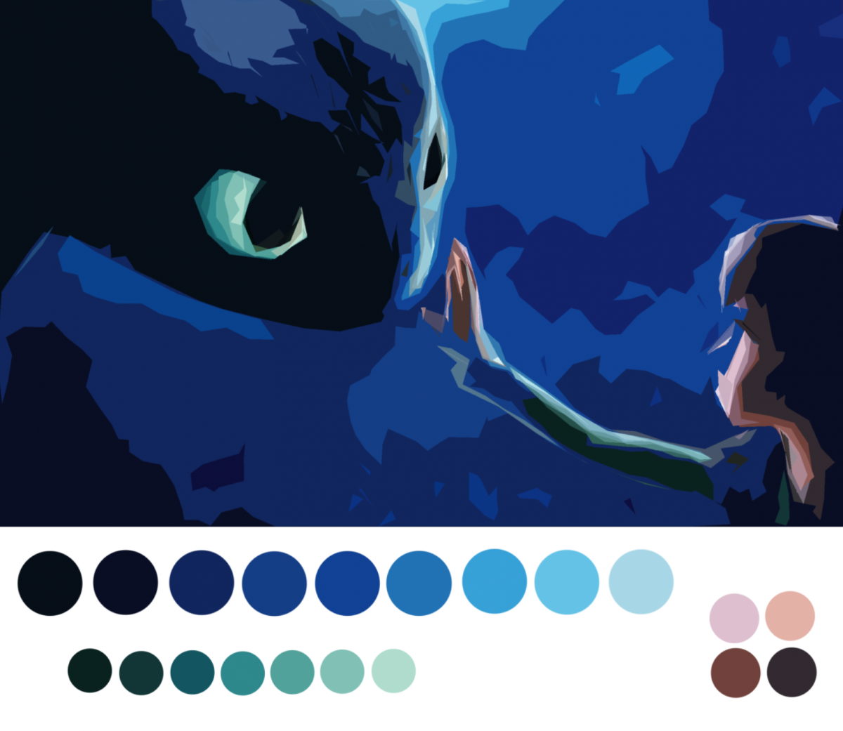
I chose to study out the tints and shades and proportion the circles according to how much of it there was on the image. I then took the colors and set them up in the bar format to create the final inventory.
Time spent: 1 hour 30 mins
First of all, thank you Professor Spevack for your knowledge and patience with the class. I am grateful to have had you this semester, and to have learned so many new things about the artistic world around me. I have learned so many new fancy art words, new ways to look at figures and colors, and new ideas & concepts, which has changed my perception of how to think and use detail, how to assemble a project, and how to use new art tools.
For this project, we were taught how to use colors together—proportionally—in comparison to our last project, where we used colors to compare.
Phase 1 had us looking for progression of colors in nature or within our immediate surroundings. I used the manga books on my bookcase, and got the chance to re-admire the artwork of my older books. Phase 2 was were the extra fun part starts; we captured the colors of an image and created a lengthy title for a rectangle of colors (proportional color inventory). I really enjoyed this part of the project, I even said out loud, “I could do this all day!”
Phase 3 — though optional, it deserves to be done. I created a natural scenery using the same proportions of my image from phase 2. It made me really think on how to execute this piece using the same amount of color as the inventory created.
Through this project, I’ve learned new colors (which is always awesome) and a new way to see a change between colors and shade (black) or tint (white).
*Added note: All this work and creative designing has rekindled my love for art. Thank you!!
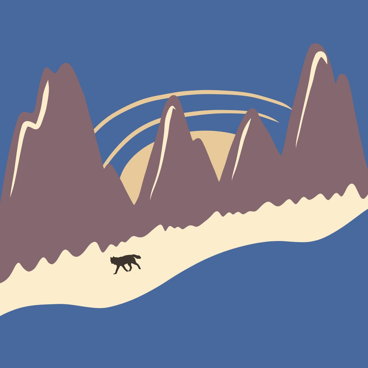
For this piece, I drew a natural scene of a wolf, walking along-side a river, by a mountain range, with a night sky, and the moon peaking behind the mountains.
From the proportional color inventory used in phase 2, I saw water—lots of water—and a night sky. I thought about natural scenaries that included being near a river or a lake, and created an image in my head of a mountainous region using the muted purple. I used the darkest color in my inventory as a silhouette color on the wolf figure, to demonstrate shade progression.
Time worked: half an hour
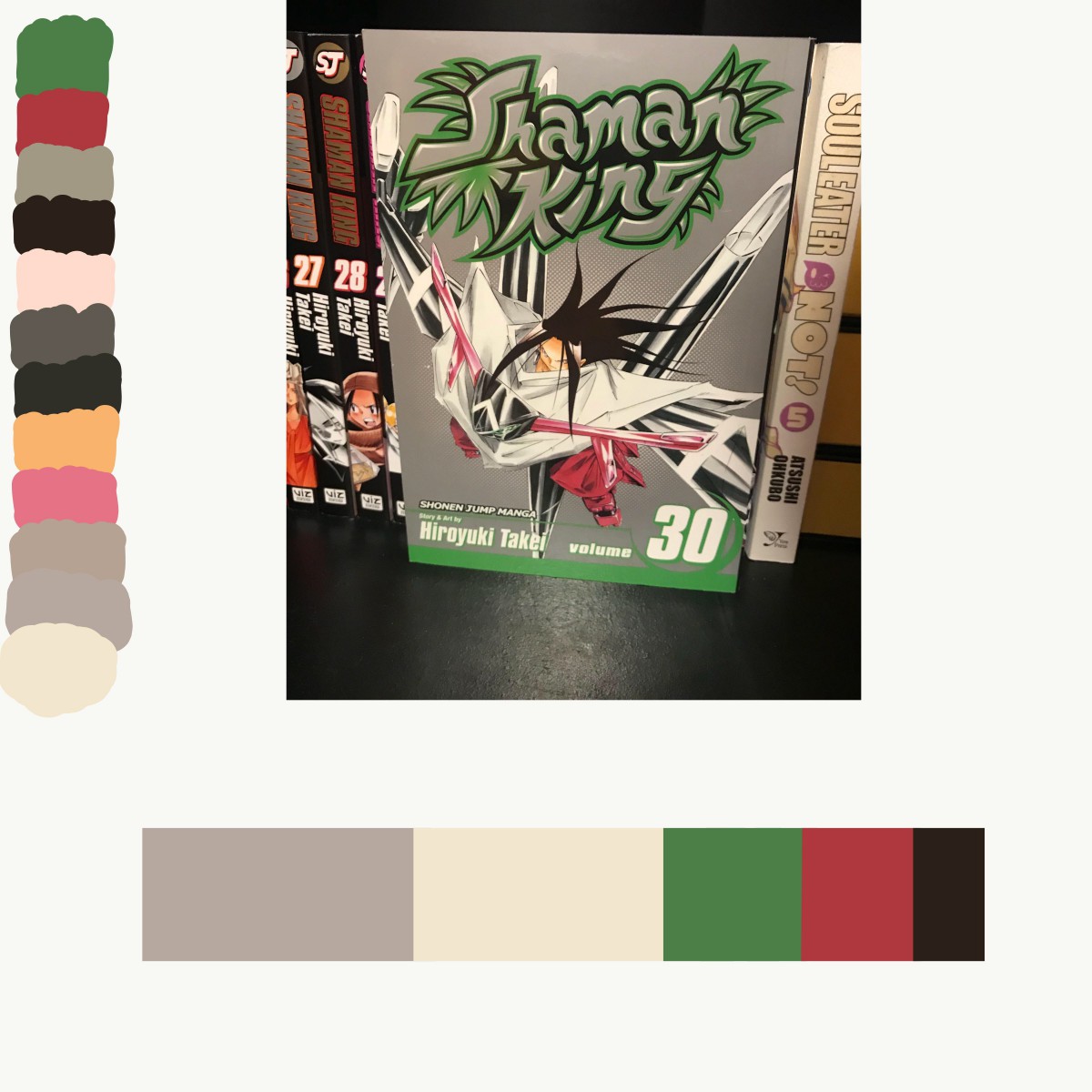
For my largely worded color box, I used volume 3 of Death Note from my bookcase.

Proportial Color Inventory
From this graphic novel, I captured every color I could find in even the closest details, but for my color box I used the 5 most definite colors. From this phase of the project, I went on a whirlwind of “color finding”and created three more pieces (below). I REALLY enjoyed this phase of the project because it gave me a reason to take all my books off the shelves and admire, and capture, the artwork and colors as if they were all brand new. From this step of the project, I learned, and brainstormed, the use of colors I’ve already seen in future artwork; I will DEFINITELY be using all these new colors in future projects!!

Hours worked: more than 1, less than 2
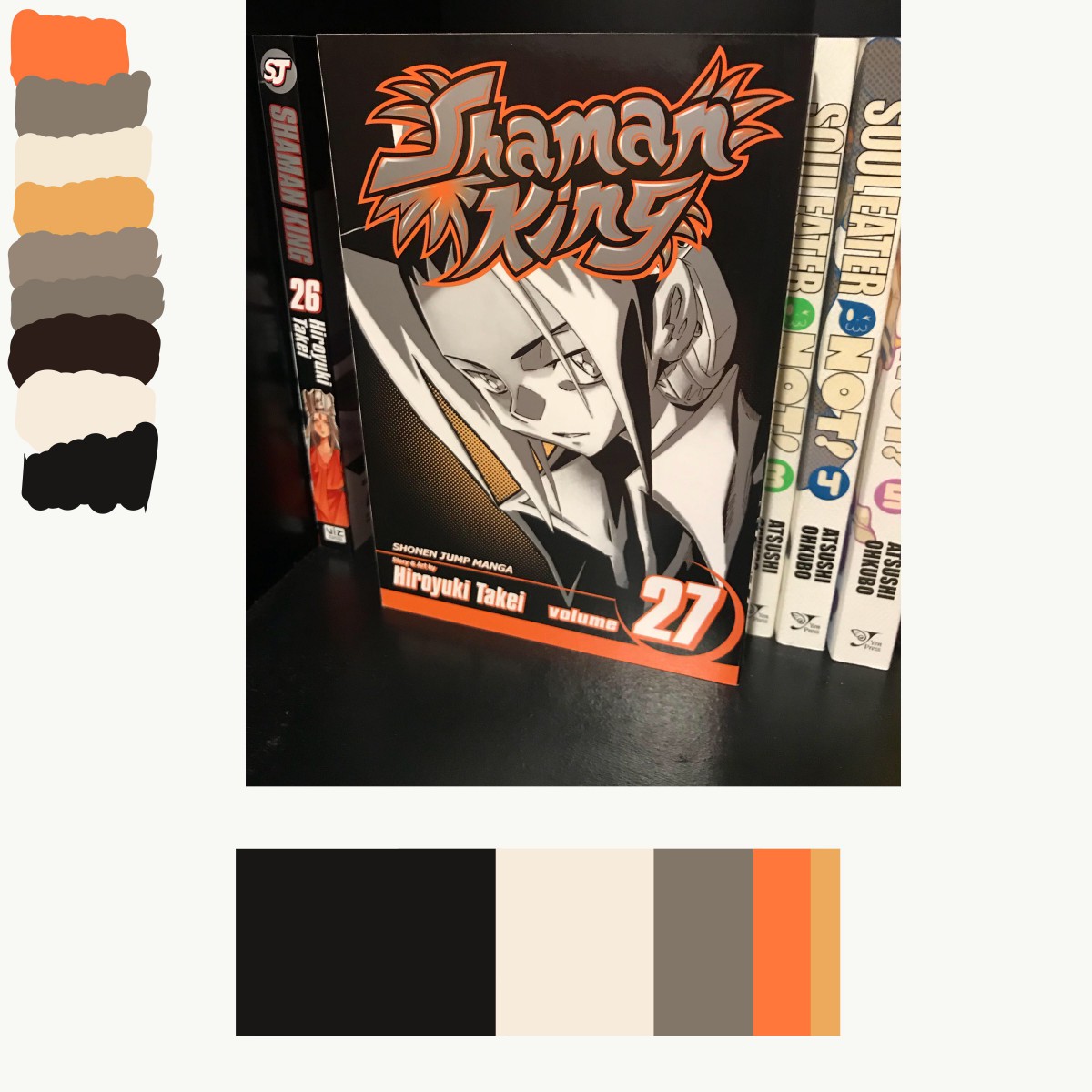
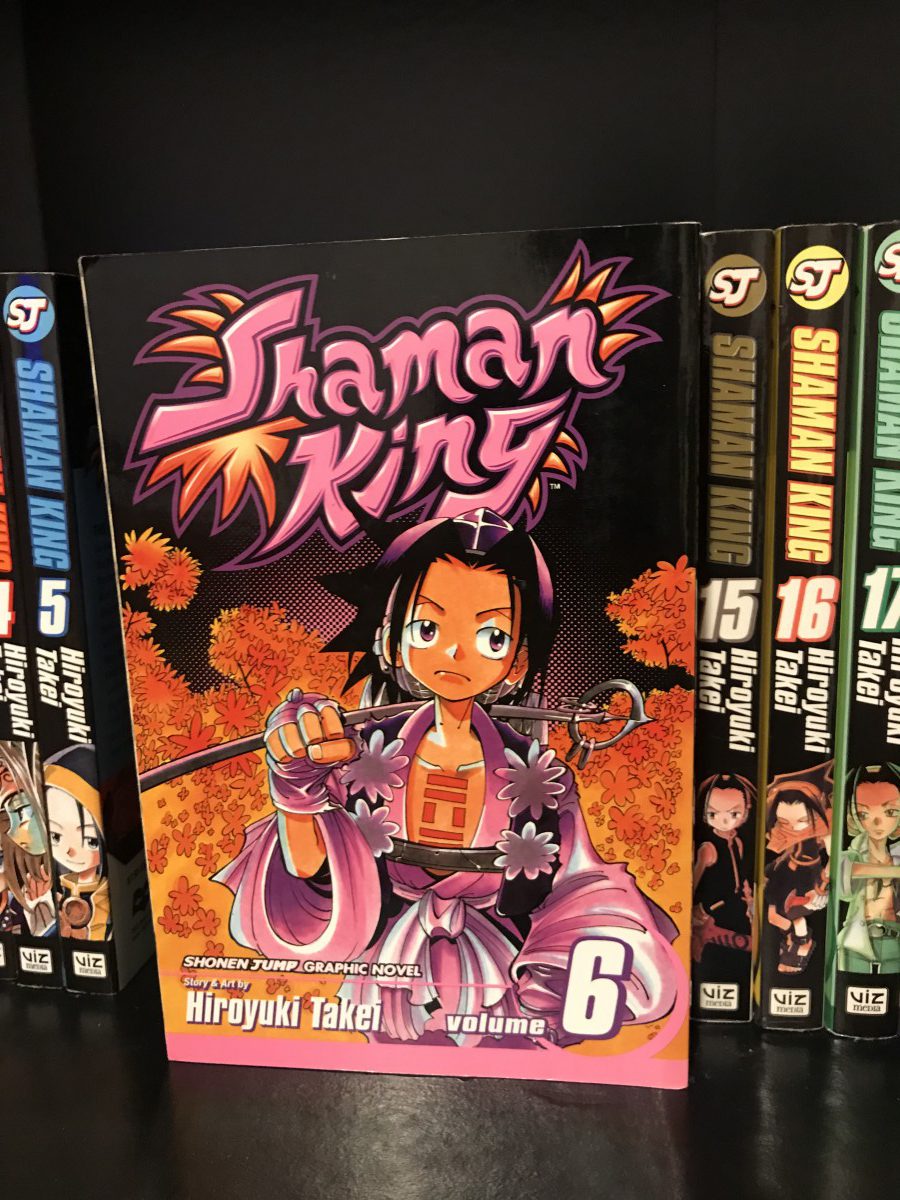
For my pieces, I used manga (japanese graphic novels) from my bookcase to showcase the color progressions. I’ve always loved the colors in cover art of any manga, but now that I’m seeing them in a different light, I appreciate them even more now!
Shade Progression (Black to Orange & Pink)
Using volume 6 of Shaman King, I’m demonstrating the shade progression of black to color. You can really notice the progression around the middle of the character, where the black is blending into the pink and just behind the orange foliage.
Two-Color Progression (Burgundy to Brown)
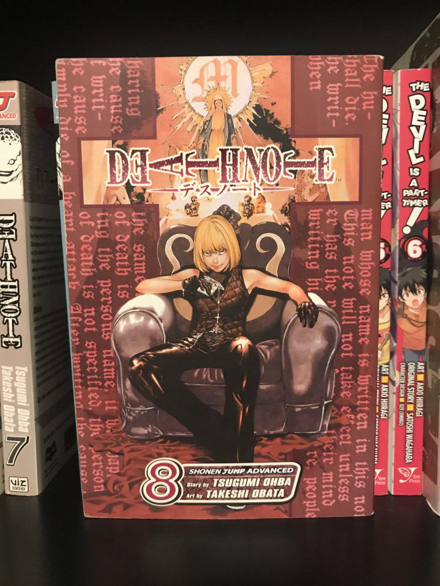
Volume 8 of Death Note; the dominant burgundy color progresses to the sub-dominant values of brown, which exhibits a 2-color progression.
Tint Progression (Lake Green to White)
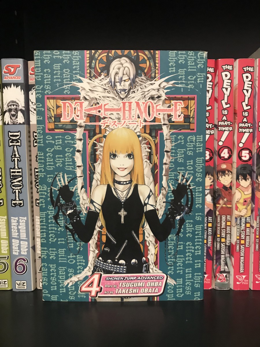
And volume 4 of Death Note displays a tint progression with the blue-green lake color progressing to white.
20 minute work
© 2025 COMD1100 : STUDENT BLOG
Theme by Anders Noren — Up ↑
The OpenLab is an open-source, digital platform designed to support teaching and learning at City Tech (New York City College of Technology), and to promote student and faculty engagement in the intellectual and social life of the college community.


Recent Comments