I really enjoyed this project. I found it enjoyable to walk around and look at the things I would normally walk past. I learned that it is important to pay attention to the world around you and how difficult it can be to take a good picture. If I was to do something differently I would have taken more pictures when I had the time.
Category: COMD1100 Project #1 (Page 1 of 6)
I don’t know how to provide links to the other phases but overall the project wasn’t to bad in terms of time. I finished it pretty easily but next time I have to take more care with the inking pens because I noticed tons of streaking in my inked compositions.
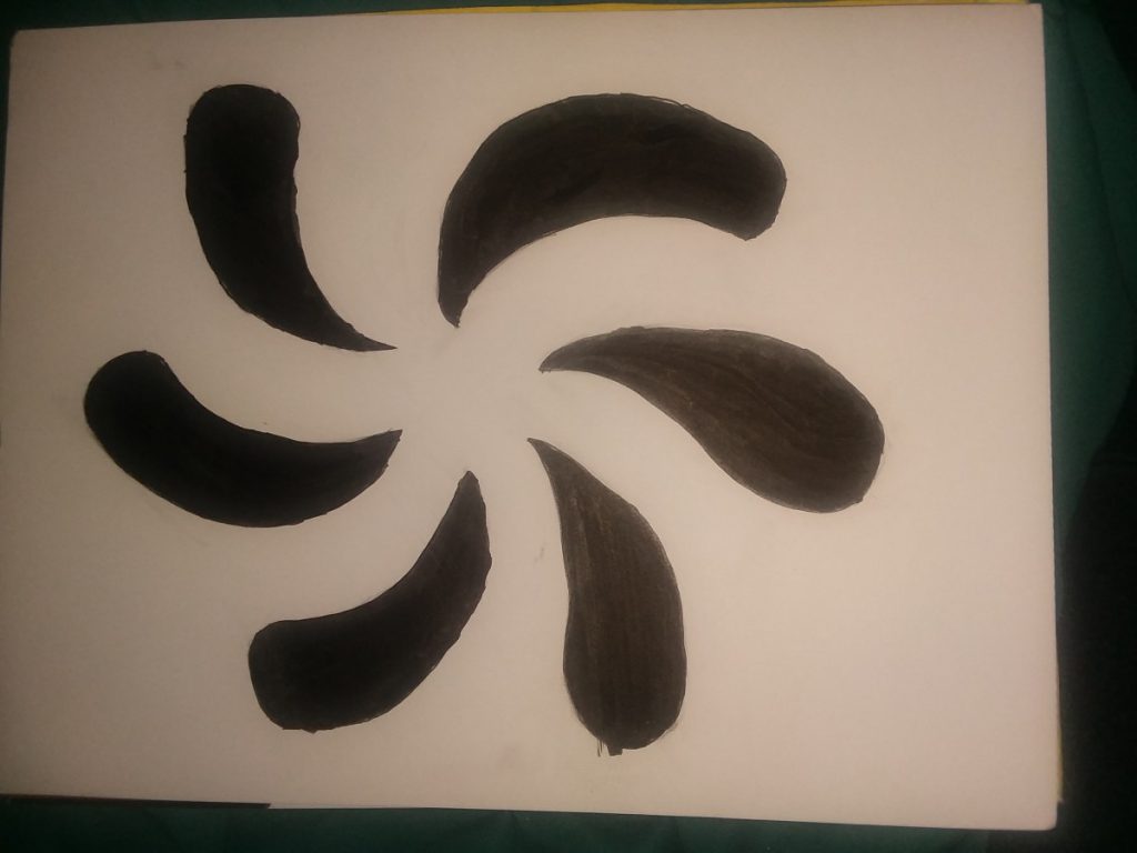
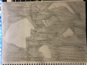
An Inked version of the sketches. These shapes have been the same and are both organic. I inverted the color scheme for my Obvious/Figure Ground because I didn’t have much ink but I wish I didn’t. The logo would better portray the concept of purity if was a white flower. I also undid my initial edit shown in my sketch because I couldn’t proportion it correctly
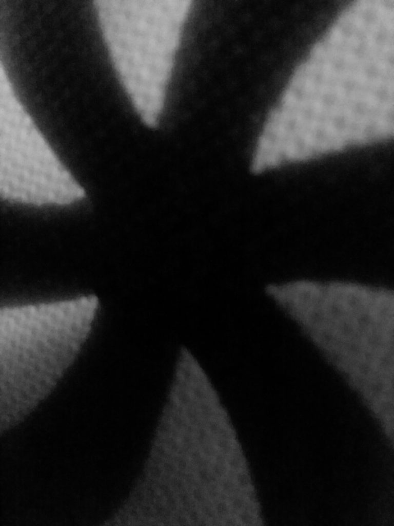
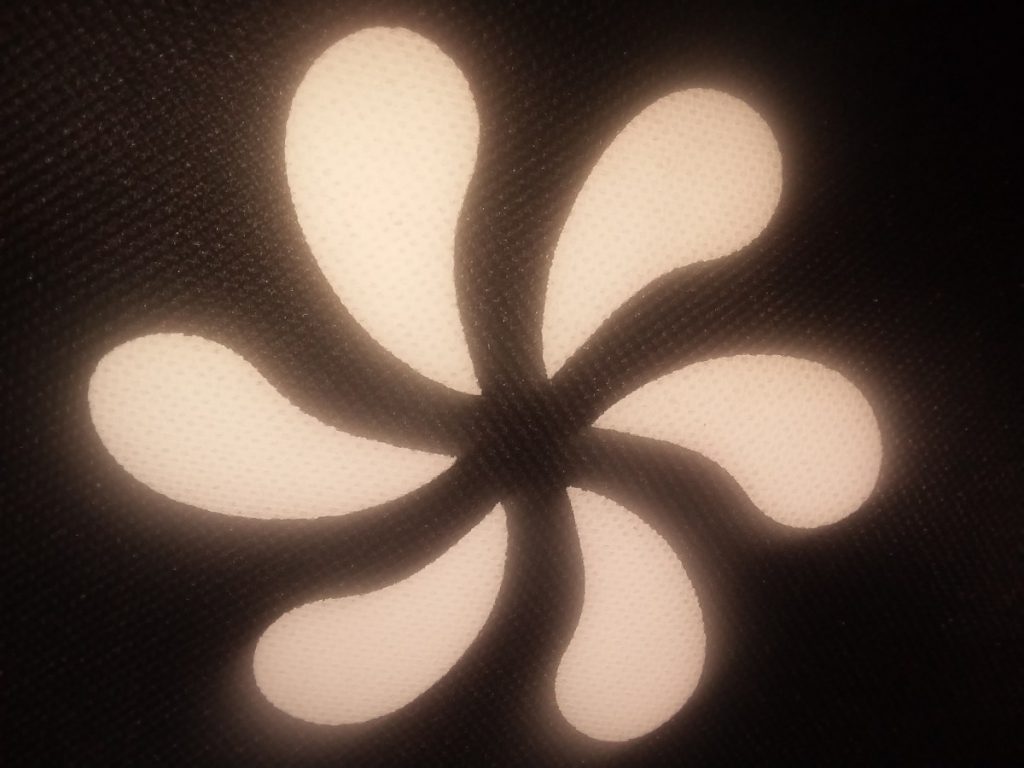
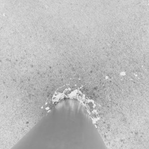
I took these pictures a while ago, but if I had to create a story for where they came from and what they mean, I’d say these are logos originated with some sort of religion but was adapted to fit onto the object in the picture. It looks like a lotus and upon researching the significance of lotuses, it’s often associated with divine beauty. The picture itself has an obvious figure/ground relationship, the lotus shape is the figure and is seperated by the black background. The second picture has a great ambiguous relationship because it’s hard to tell what the subject of the photo is, the white or the black parts of the photo.
So far this semester I’ve learned a lot and accomplished way more than I thought I would and if I’m going to be completely honestly I’m extremely proud of myself. From project #1 to project #3 I’ve had so much fun learning new things and really pushing myself to do the best I can. The strange thing is that these projects actually changed the way I view things for example I was talking with my friends one day and we were Times Square and we saw this really cool billboard and without thinking I started talking about how it was a good use of figure ground relationship and they stared at me with a blank look on they’re faces and it was so funny to me because not to long ago that would’ve been me giving the blank stare. Overall I’m extremely pleased with what we’ve been doing so far and I can’t wait to learn more.
https://openlab.citytech.cuny.edu/spevackcomd1100fa2017/2017/09/14/urban-artifacts-phase-3/
https://openlab.citytech.cuny.edu/spevackcomd1100fa2017/2017/10/18/sound-visualization-phase-3/
https://openlab.citytech.cuny.edu/spevackcomd1100fa2017/2017/11/13/value-added-portraits-phase-3-5/
Our first project “Urban Artifact” consisted of many design principles. We learned to play around with space, ultimately understanding the basics of ambiguous vs obvious figures. We learned about different shapes and how organic or geometric figures can change the entire landscape and emotion of a project. Personally I thoroughly enjoyed project one because the base of it began with our own experience and connection with the initial pictures we took right outside of class. We steadily became familiar with the ground work of graphic design and mapped out the steps to creating a cohesive project.
The history of each photograph is intriguing as there are limitless possibilities on how each snapshot came to be. My favorite of the bunch is the picture of the cigarettes butts with random trash around it. Its clear that the spot these cigarettes were snapped are popular among City Tech students as it was on the pavement on campus property. The image captures both organic shapes like the cigarettes and organic shapes like the crumpled paper towel.
The ambiguous photos capture a lot of the “nature” and organic ground that make up the city sidewalks. You can’t pinpoint exactly what is in the small patches of rock and dirt but there’s a ton of garbage, sticks, leaves and random organic shapes. Im particularly fond of the ambiguous style in the sense that you can manipulate the imagery with the right imagination to see something different every time.







Recent Comments