Fall 2017 | COMD1100_LC08 | Prof. Spevack
Throughout all 3 phases, I’ve learned to look at colors in greater depths I never knew were possible to reach. Like any muscle, the eye can be trained as well. I’m glad I have learned this skill and will continue to develop it into various layers that will open doors for my creativity and bring great success when I’m out in the graphic design world. Thank you professor!
Article:
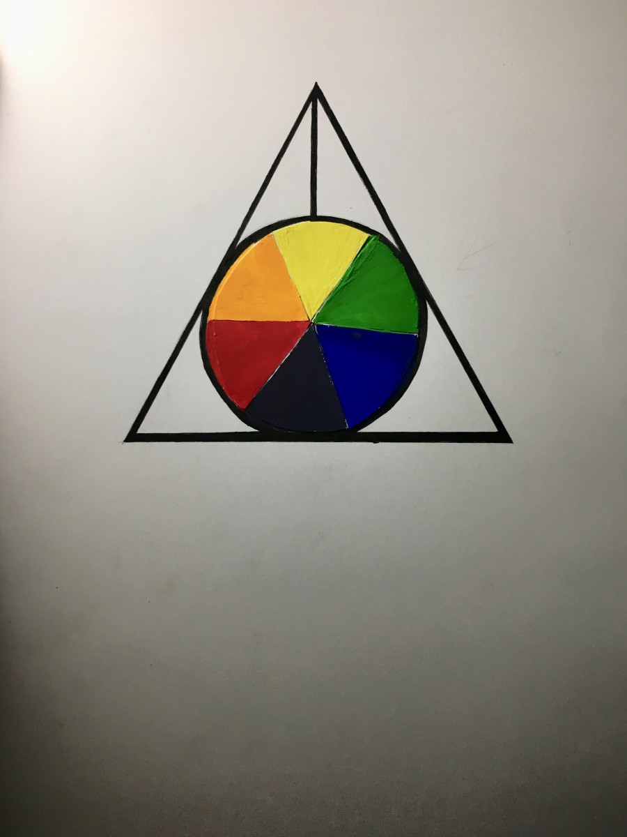
Through my reading I have found Josef Albers to be a man of wonder and mystery with profound understanding and an ever-lasting fascination towards color.
Both quotes hold truths regarding the capability of our vision and how Albers used his to the greatest of his ability, especially when dealing with color.
Video :
In the video, Anoka Faruqee gives an excellent presentation on color interaction. She proceeds to comparing a myriad of colors, ultimately deceiving her audience (and myself included).
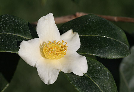
Tint progression – yellow to white
The yellow tint starting from the middle of the flower to its delicate white petals depicts a simple example of tint progression.
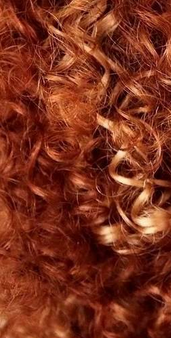
Two Color Progression – Auburn to gold (blonde)
This funky colored wig serves as a perfect example of two color progression, as auburn strands slowly turn blonde (or golden).

Shade progression-black to blue
The glare from the opposite vehicales high-beams provided a coincidental outer space look, naturally providing black to blue shade progression.
h.w. – 93 minutes

With eccentric glasses to the left (her perception of me)
& a quirky Totoro silhouette serving as my symbolization Darlene,
this color interaction serves as a perfect representation regarding both Darlene’s and my personality.
Hours worked: 1
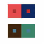
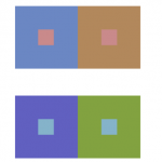
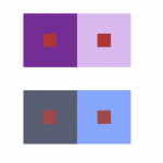

Muted
Chromatic Grays
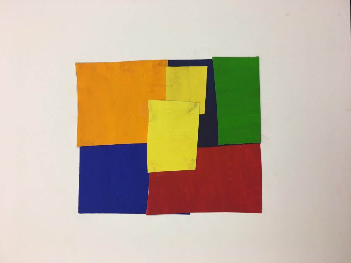
Prismatic
Through this saturated experience, I have learned a great deal not only how to mix colors but to easily detect distinctions between such categories: prismatic, chromatic grays, and prismatic colors. Primary colors don’t require any mixture, giving me the pure vibrant yellow blue red orange and green seen above. By adding white to primary colors aided in the lightening & muting of the color, thus resulting in the rich angelic pastels displayed. And finally, chromatic grays, oh how much paint was wasted. (kidding, but not really!) Though my least favorite experience, due to it being the most challenging, the trial and error made it into more of a game. Mixing bigger portions of complementary colors with primary gave me less lively yet serene tones.
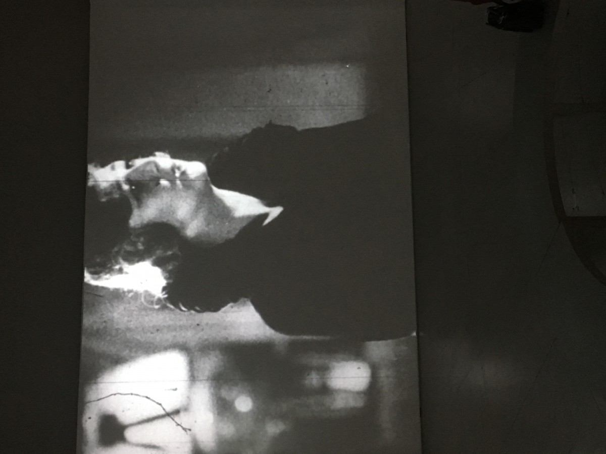
In 1930, Sergei Eisenstein, pioneering filmmaker, released a 20 minute black and white montage film titled Romance Sentimentale (Sentimental Romance). Like the some of his other work, Eisenstein made this with original 35mm film and empathetic intent.
Total eclipse of the Heart
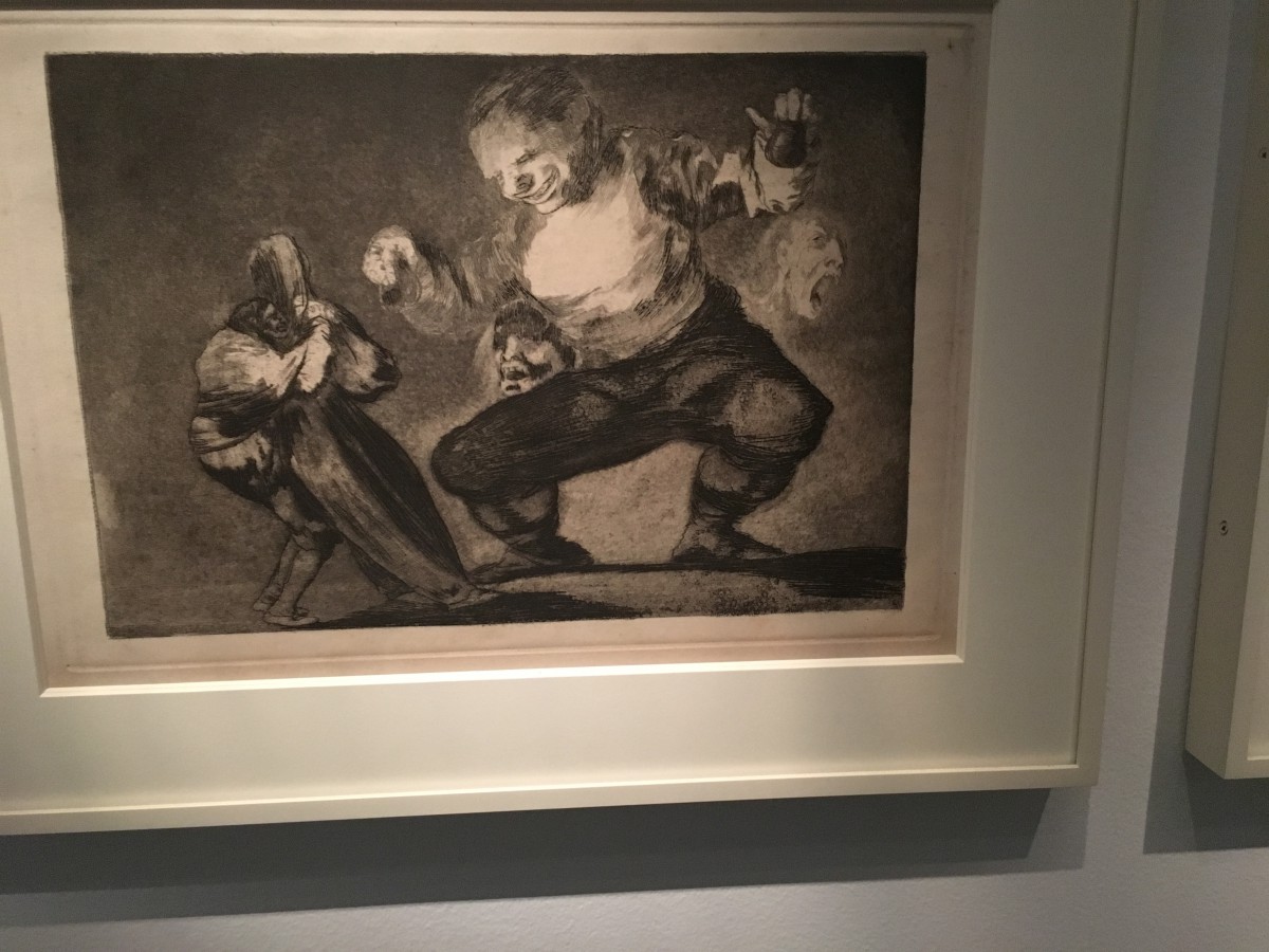
The piece below , After Vice Comes Fornication (1813-1820), was created by romantic painter and print maker, José de Goya y Lucientes with use etching and aquatint.
Devil’s test
Similarities :
1. Looks of hopelessness and fear
2. Low-key range of value
3. clear focal points
Differences :
2. Goya’s setting is on the battle field while Eisenstein has a more romantic, “sentimental” setting
3. Goya’s piece has a dominant subject contrasting with a smaller one while Eisenstein’s doesn’t
3. Eisenstein has a more realistic piece while Goya mixes fantasy with the sad reality of war
Feelings evoked:
 HK Narrow
LK Broad
Hours worked: 3
© 2024 COMD1100 : STUDENT BLOG
Theme by Anders Noren — Up ↑
The OpenLab is an open-source, digital platform designed to support teaching and learning at City Tech (New York City College of Technology), and to promote student and faculty engagement in the intellectual and social life of the college community.


Recent Comments