Fall 2017 | COMD1100_LC08 | Prof. Spevack

Author: MARCEL (Page 3 of 3)

Field Trip to BRIC

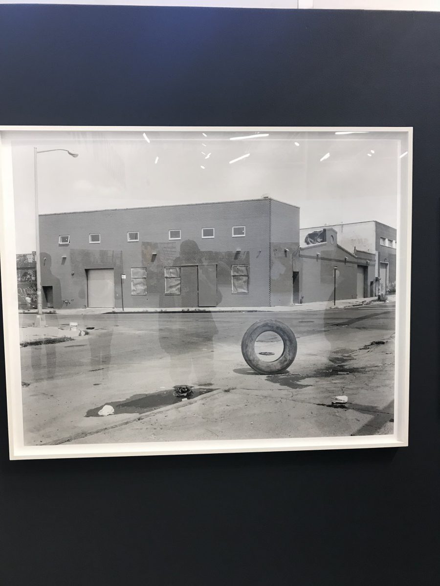
Real, Ingraham Street and Knickerbocker Avenue, Bushwick, Brooklyn, NY, 2012 (by Sergio Purtell) — medium: silver gelatin print mounted on Dibond

This photograph reminded me of the stories my father used to tell me about his time growing up in his home country of the Dominican Republic. I remember this one time, back when I was younger and complaining about being bored, that was when my dad would describe to me the games he would play with a lone flat tire, like rolling it down a hill to chase it.

The barren street reminds me of the image I had seen in my head from my father’s anecdote. The piece, along with the other photographs, create an actual image reference of what I imagined.


Sound Visualizations: Phase 1

Runaway, by Kanye West, always chilled me out and kept me mellow. The vibes of the sounds made me visualize a dance, as it did in the music video. With each pattern, I created lines that emulated the sounds—short and abrupt, rippley, wavey, curvy, echoing, and buzzes. The consistancey in the singular bass is where I got the spiral from. The buzz patterns (lightening bolts) were my favorite sound because they were short and reverbed in my headphones. The pings of the piano sounds were visualized as stars, in my head. The wavy/squiggley line was the dancey pattern from the short movements of the sounds. After really listening—and having to visualize and draw—I started to understand the thought process of the music video and why the director made the choices he did in order to create the piece and why Kanye produced the sounds he made.


RUNAWAY — KANYE WEST (FEAT. PUSHA T)

Urban Artifacts: Phase 4

From this project, I’ve refined my skill to pay attention to little details and see things in a different manner using new vocabulary. My experience working on this project has shown  me the work standard in the creative field; meeting deadlines, showing progress and the steps taken to present the progress, and patience. From the beginning process in phases 1 & 2, the idea of brainstorming and doodling/sketching is heavily enforced; one must plan a rough draft before proceeding to the next phase of the project. In the developing phase—phase 3—the work is finally created, and presented, in a clean and organized manner, which we learned how to do with every little detail of the process; I would consider the develop phase as the presentation phase, as well.

From my experience working on this project, I’ve learned the differences between ambiguous and stable figure/ground relationships in everything we see. In my project, I feel like I could’ve been more patient with the inking process and utilize a protective garment to prevent my canvas from collecting finger smudges from leaning my hand on the wet ink. Another part of the project I would’ve improved on is keeping up with deadlines.

Links: PHASE 1 – Discover, PHASE 2 – Define, PHASE 3 – Develop

Urban Artifacts: Phase 3

Inking on Bristol – Obvious F/G

Inking on Bristol – Ambiguous F/G


Throught the project, we are taught the differences between figure & ground and how their relationship—through their difference in ratio—can create an ambiguous or an obvious figure. An ambiguous figure has many shapes, an even ratio, and makes the viewer see more than one image within the presentation. An obvious figure is more of one versus the other; it has an uneven ratio and can definitely show the difference between figure and ground.


Hours Worked: 4

Newer posts »