Fall 2017 | COMD1100_LC08 | Prof. Spevack

Author: MARCEL (Page 2 of 3)

Saturation Studies: Phase 3

My partner and I chose the LUSH piece along with a COOL color temperature. Purple was the first thing my partner said, and I couldn’t agree more. Then, we came up with sensory words to pair up; we thought of words that reminded us of cold temperatures or shades of periwinkle and violet. From the list of sensory words, we paired three band names—”silky glaciers” our favorite and “breezy mint” accompanied by “tangy waves” were the runners up. We decided upon a European location, and Germany was our choice because who WOULDN’T wanna go to the Mojo Club!

Project #4 only took about an hour and a half (I would love to do another)

Midterm Post

I have to sum up everything I learned from the three projects we’ve completed.

I’m always late, that’s what I’ve learned, but also…


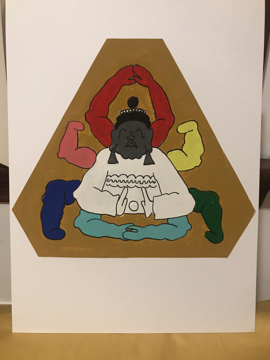
I liked Urban Artifacts

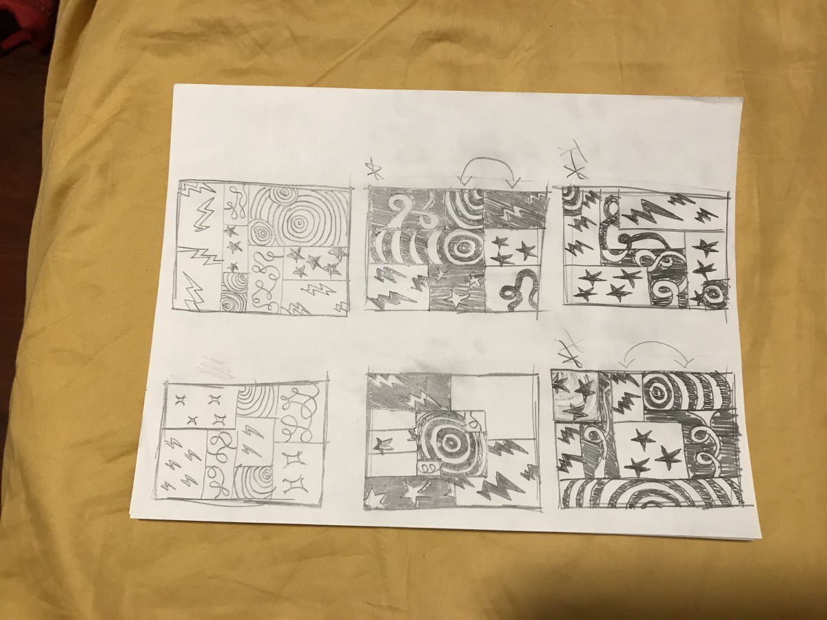
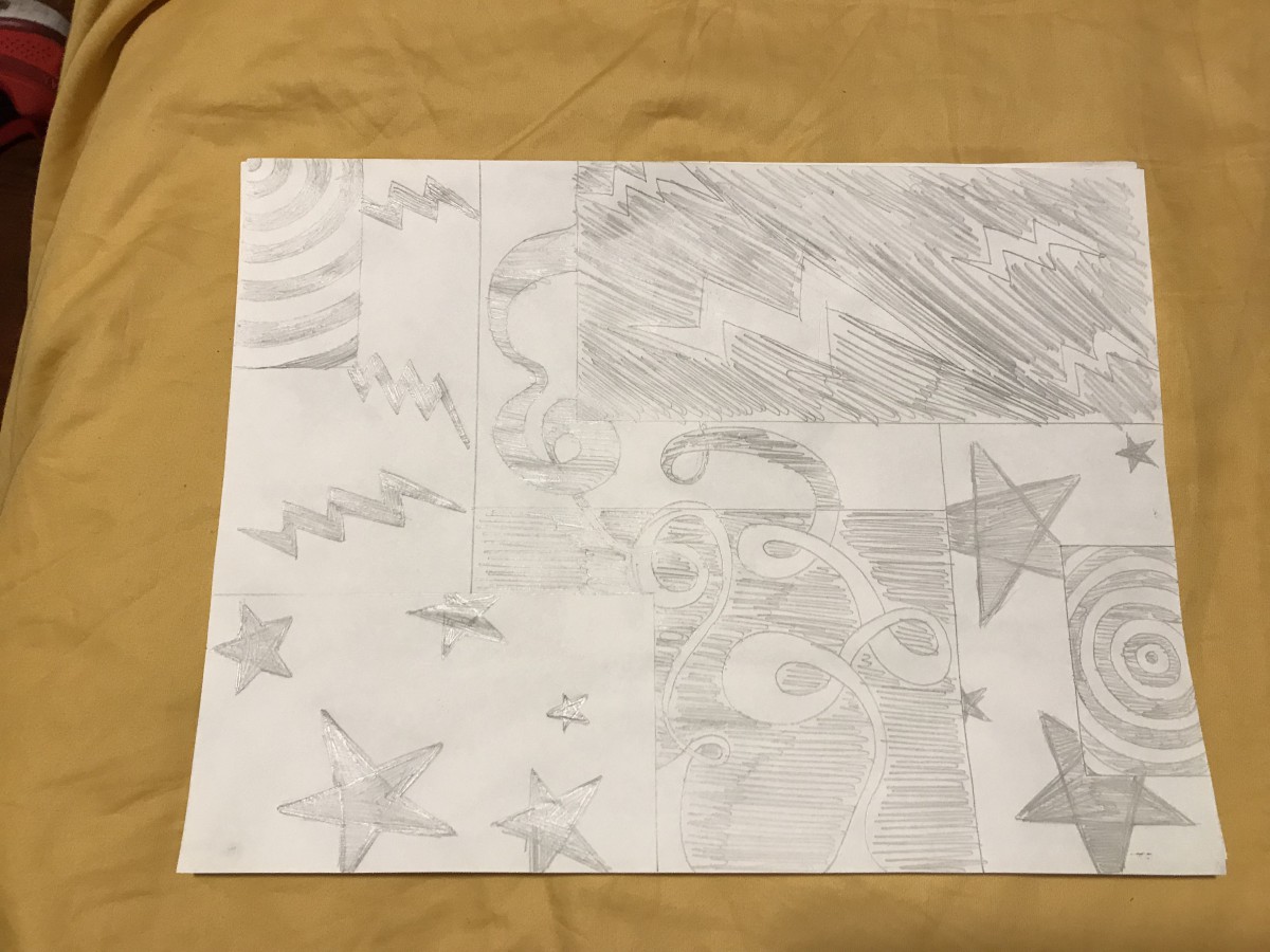
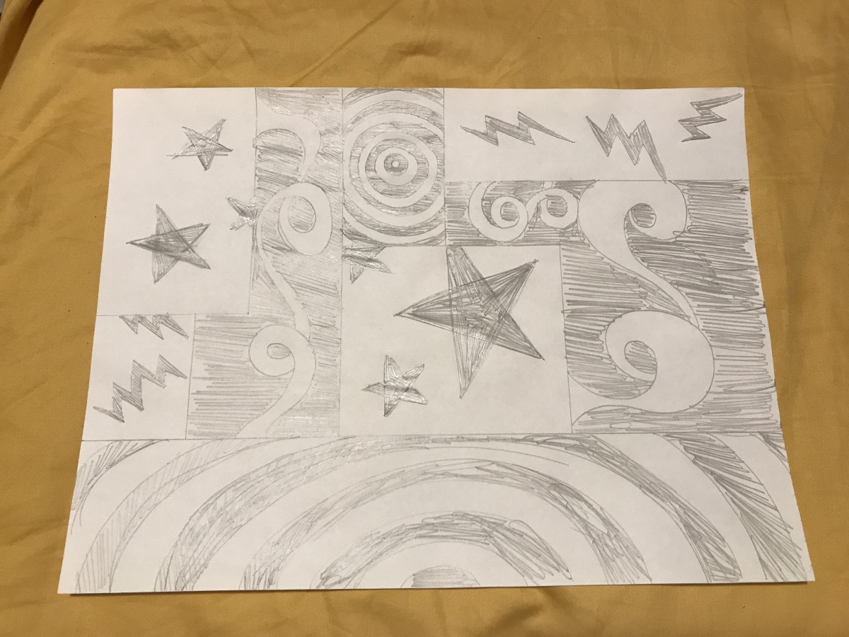
This is where we first started doing work. I had fun with this one. This is where I throw in vocab words so it looks like I’m following instructions; 4-step design process taught us how to be organized and present our work in a professional manner, figure/ground relationship is basically subject and anything supporting it, and thumbnails is just a professional way of saying doodles.


Sound Visualizations was so wavy!!!

I want to do more work like this! The Adobe suite programs honestly intimidate me, but when we started doing this project (!!!) I had so much fun; I wish I could’ve made a whole video for the Runaway song I used.

This project, if you strip the vocab terms and details, was basically listening to music, drawing shapes, and making them move. I COULD DO THAT ALL DAY!!!

More vocab. I picture Staccato and Legato as two people; staccato is short and runs as fast as they can, and legato has long legs and takes their time to take a step. Boom! Explained (drops mic)


(picks mic back up)

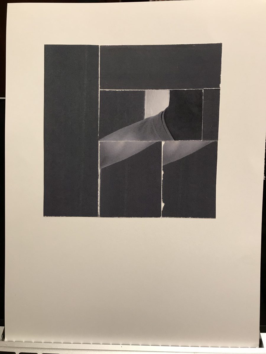
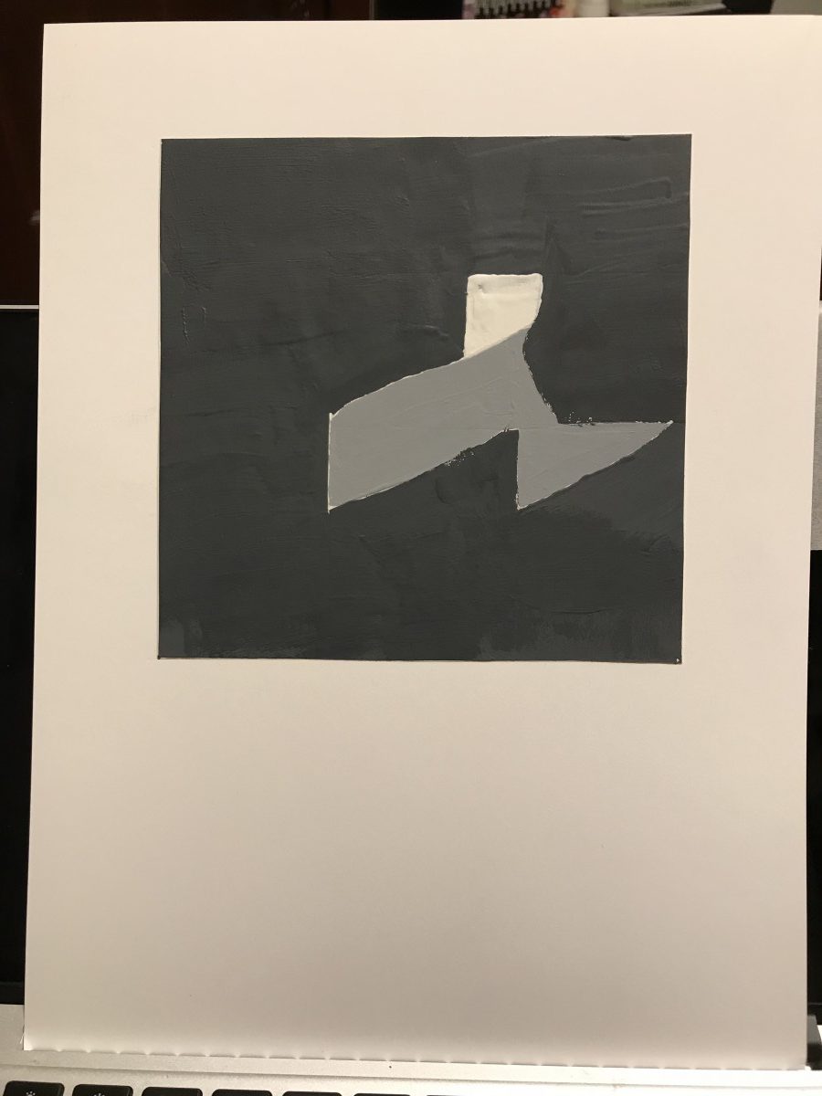
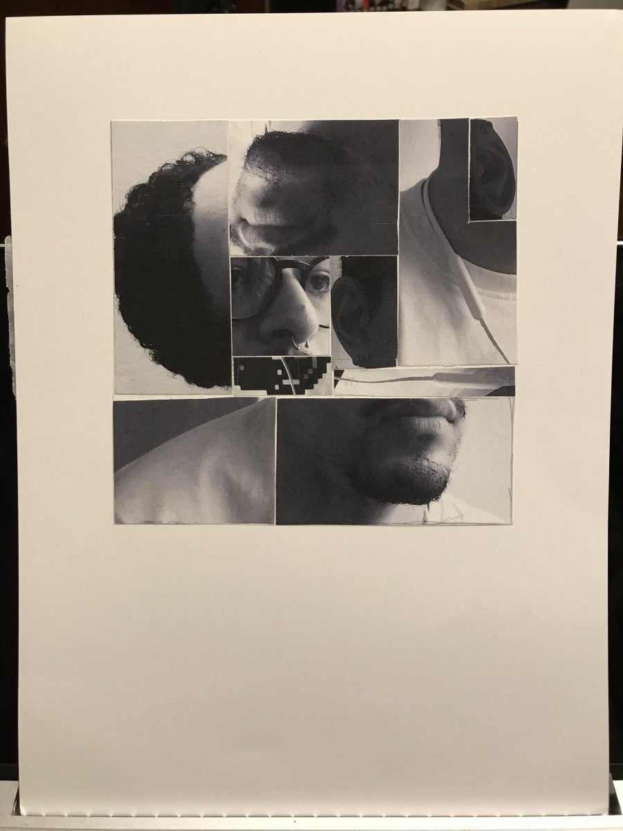
Grey is STILL grey in Value-Added Portraits

I really JUST explained it in the previous post. I wanted to come back as a dog in the next life. I changes my mind because of this project. Cool project IDEA, but grey is still just grey to me. It’s very neutral. Apparently, professional artists have provided even MORE vocab to explain grey.

First, I wanna call out the guy who made ‘WHITE’ the ‘KEY’ in black/grey art; is he LOWKEY racist (pun completely intended)?

I kinda like this set of vocab, it sounds artsy. Lowkey and Highkey are the differences between the amount of light in a grayscale piece. We learned spectrum and I got so excited, but then Professor Spevack showed us greyscale and I died a little inside. A broad spectrum is where everything in the whole spectrum is included, and narrow is where only a few shades are included. Monochromatic is the use of a single shade of either black, white, and/or grey, whereas chromatic is the use of multiple shades of B, W, and/or G.


I learned I’m bad at keeping a steady hand when painting.

I feel like we were working in the dark ages with all of these colourless projects! I did learn a lot from these projects; photography, drawing with microns, listening intently to music, seeing figures, doodling as homework, photoshop’s features, and grey.

I’m excited for colour.

Value-Added Portraits: Phase 4

Value-Added Portrait: Phase 1

Value-Added Portrait: Phase 2

Value-Added Portrait: Phase 3

Grey has never looked more grey in my life. I’m glad I don’t see in only grey.

This is how you know artists are crazy; IT’S ALL GREY!!!

Wow!! Lemme put this one white little spot here and make everything else dark! We’ll call that lowkey. Flip it around and that’s highkey! And since their focal point is all alone, it’s a narrow spectrum.

Hold on, what if it’s mixed up of all the greys, you ask? That’s broad spectrum.

It’s all grey to me.

Value-Added Portraits: Phase 3

Lowkey

Lowkey-Painted

Lowkey pieces created from the dark greys of the photograph taken, cut from parts of the neck to the right shoulder, and major use of the dark walls.


Broad

Broad-PSD

Broad piece created by mixing up parts of the face, such as, the hair, ears, mouth, and nose, with the nose as the focal point.

Value-Added Portraits: Phase 2

A lowkey narrow piece.

The focal point is the white in the middle.

Lowkey


—————————————————————————

A lowkey broad piece, put together randomly.

The nose is the focal point.

Broad

Value-Added Portraits: Phase 1

Lowkey Value


My subject is a lamp I have posted on the corner of my room, by the window. The low light of the rainy day clouding the sky made it possible to create this effect. From the light source, on the right side, you can see the formation of the lamp which creates a highlight around the edge of the bulb sockets. The shadow starting to form from the pole of the lamp, makes the third bulb socket almost disappear into the shadow.

Highkey Value


The subject of this piece is the white paper bag. This piece demonstrates a narrow range of highkey value because of the predominantly white piece and background, with slight gray and a darker, close-to black floor. In this piece, you can differentiate the subject from the background from the majority of the highlight directed at the subject itself.

Sound Visualizations: Phase 4

I’ve learned how to use keyframes in order to move and change the shape of objects by converting them to smart objects. The hard part about this project, for me, was cutting up the music and trying to match it up with the movements of the smart objects. I really enjoyed putting the work into this project. I wish I was able to make a video for the whole song I used without cutting it into a short clip.

Phase 1

Phase 2

Phase 3

Sound Visualizations: Phase 3

The animation was honestly really tough because I really wanted to blend and mix properly so things sounded fluid, but in the end, I’m fine with how it turned out for my first piece of animation. From this project, I’ve learned to master timing and patience. The thing that really stuck to me was the fact that I worked on this for over 7 hours just trying to get all the work to play out smoothly. I only used the instrumental for this piece of Runaway by Kanye West, but I used two different versions of the song to mix together. (Also, I have no idea why that left corner of stars is darker than the rest of the drawing…)

Enjoy!

« Older posts Newer posts »