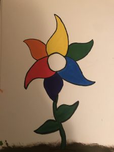
At first my intention was not to create a flower but after I drew the design of the color wheel, it gave me the idea that this looks like a flower. So I drew a stem, leaves, and soil for the flower to rest in. Painting this color wheel has helped me learn the basics of gouache paints because I learned that gouache dries very easily so I often saw myself painting over and making new layers.
Author: Mike (Page 2 of 3)
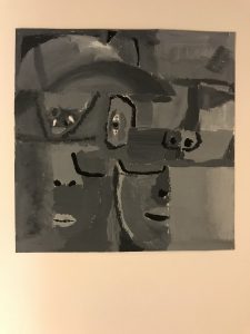
In this project i’ve learned how to use gouache paints, i’ve learned new techniques for painting itself, and what it means to have value and tone, also the difference between value and tone. While working on my lowkey broad range painting, I noticed i’ve only been working with two colors but that just tells you how many different possibilities you have when experimenting with color and B/W. Using my skills in photoshop, I was able to make a better more stable version of my Broad collage.
https://openlab.citytech.cuny.edu/spevackcomd1100fa2017/2017/11/15/value-added-portraits-phase-1-9/
https://openlab.citytech.cuny.edu/spevackcomd1100fa2017/2017/11/15/value-added-portraits-phase-2-9/
https://openlab.citytech.cuny.edu/spevackcomd1100fa2017/2017/11/25/1524/
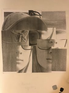
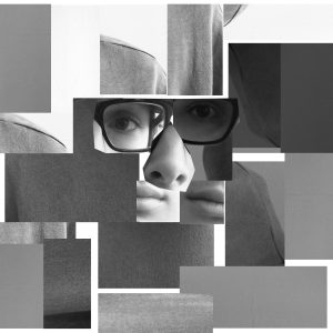
For my lowkey composition I cut only pieces of my face and tried to create a distortion of my own. I set my eye in the middle as the focal point.
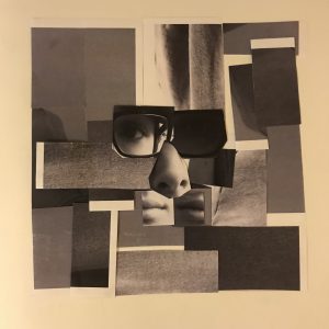
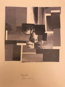
For my broad composition, I cut pieces from my whole body and placed them around a smaller version of my distorted face.
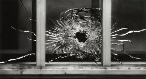
Robert Longo
untitled (bullet hole in window, January 7, 2015)
Charcoal on mounted paper
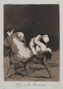
Francisco de Goya y Lucientes
They carried her off! 1797-1798
Etching and aquatint on laid paper
Both of these compositions share the same intent when it comes to sending a message. Francisco de Goya uses the emotions in people to reveal social, cultural, and political complexities for example the girl being carried off is to be described as bizarre and macabre imagery. Robert Longo explores new levels to express emotion, instead of using people he uses an extremely close up image of a bullet hole that happened during a terrorist attack in January 2015. What I like about this image is that Robert Longo can use something that’s so brutal and turn it into something that’s artistic and beautiful.
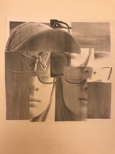
Narrow Range HighKey
My collage is a distorted version of my face, being surrounded by other parts of my body. The main focal point is my nose because it’s the lightest shade on the page and the rest of my face helps the viewer to travel the page.
Broad Range LowKey
The second collage is another distortion of my face with the white image next to my eye as the focal point. I tried to approach a more abstract situation to represent the distortion of my face. Even though this is narrow range, I made all the boxes bigger because each image helps direct the viewer to the focal point.
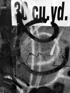
Low Key Image
The subject of the image is a wall down an alley way that is covered in spray paint. The focal point of the image is the sign in the top right corner that says “30 cu. yd.” The reason that this is the focal point is because it’s the only large white object of the image and the spray paint is a good display to help take your eye across the page.
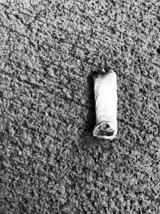
High Key image
The subject is a cigarette bud that is on the floor near our school amongst many others, but this one caught my eye because it was the only one on the floor at the time and it was near a spot where I normally wouldn’t see a cigarette on the floor. This is a high hey image because the main subject is white against a light background.
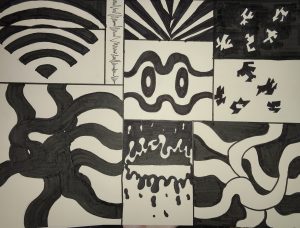
To be honest, I’ve been using Photoshop since freshman year of highschool and it wasn’t until we started this project when I realized it had the ability to create animations using layers and keyframes. I’ve also learned many things on top of that including how to use and combine audio in Photoshop, and how to use draw images being inspired by the sounds of staccato and legato. The hardest part of the project for me would have to be creating the layout grid because it was hard to understand the structure of the grid itself.
Here is the link to my animation.
During the process of my composition/animation, I combined both legato and staccato to try and approach a more balanced situation. I think the animation itself presents the combination in a way that’s more visual. Hearing both the songs (Queen – Another One Bites the Dust) and (Summertime) best gives you the perspective of both sound styles into the animation itself.
Time Spent: 5 1/2 Hours
Under the Influence
Juan Miguel Marin
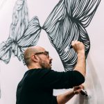
Under the Influence is a site-specific performance and installation by Juan Miguel Marin who has pre-recorded Brooklyn soundscapes and conversations. These recordings will act as a departing point for the artist, who will paint the mural while listening and meditating on the sounds. The end result is a spontaneous visual representation of the Brooklyn soundscape, imbued with the energy and diversity of the city.
I can relate to this composition because i’ve worked on similar projects in my classes, where I listen to the sounds of music and take what I listen to and try and rework it into a composition. I chose this piece because the visuals itself give you mixed feelings of nostalgia but once you read about the mediums of the project. You can relate to the artist into what he’s trying to accomplish. I haven’t actually listened to the soundscapes but i’m sure it’s exactly what you would see in the composition visually.



Recent Comments