Fall 2017 | COMD1100_LC08 | Prof. Spevack

Author: Mike (Page 1 of 3)

Color Harmony: Phase 4

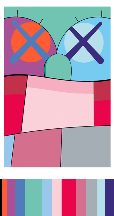
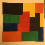
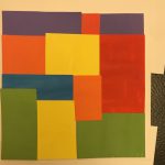
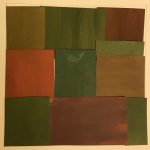
This project was the one project that really helped me out a lot in terms of understanding color. Especially phase 2 because I got to learn how to create a color inventory and understand what it meant to separate color. Also phase 1 taught me about color progression and the way color sits next to each other in different ways like tint or shade.

https://openlab.citytech.cuny.edu/spevackcomd1100fa2017/2017/12/16/color-harmony-phase-1-2/

https://openlab.citytech.cuny.edu/spevackcomd1100fa2017/2017/12/17/color-harmony-phase-2/

Color Harmony: Phase 2

This is a composition by one of my favorite artist KAWS. He experiments with a lot of different cartoon characters and a large array of colors, he is known for drawing an “x” over the eyes over commercial characters and characters of his own. I thought this piece would go good with this project because it deals with color harmony and color interaction a lot with usually 2 complimentary colors standing next to each other, and of course the large amount of color inventory in the photo.


Color Harmony: Phase 1

Two Color Progression – Red to Purple

The head of the monster represents the red color , with the purple pants as a complement to the primary color of the picture.

Shade Progression – Black to Orange

The inside of the hand is bright orange but as it spreads out it leads to a darker shade eventually to black

Tint Progression – Blue to white

The focal point of the picture is the blue circle on top, but it has a white circle surrounding the blue and leaves you with an all white background.

Hours Worked – 70 mins

Color Interaction Pairings: Phase 4

During this project, i’ve truly understood the logic of color and how they interact with each other when standing next to one another. Phase 2 was the phase that helped learn the most in this topic, i’ve always come across those optical illusions where the relativity of color is shown. And now that I got to experience how to make one of those, it helped me learn a lot about color.

https://openlab.citytech.cuny.edu/spevackcomd1100fa2017/2017/12/16/color-interaction-pairings-phase-1-5/

https://openlab.citytech.cuny.edu/spevackcomd1100fa2017/2017/12/07/color-interaction-pairings-phase-2-3/

https://openlab.citytech.cuny.edu/spevackcomd1100fa2017/2017/12/14/color-interaction-pairings-phase-3-5/


Color Interaction Pairings: Phase 1

During my research I’ve conducted a chuck full of information containing color and the logic behind it. Josef Albers said “In visual perception a color is almost never seen as it really is — as it physically is. This fact makes color the most relative medium in art. ” This means all colors are visually different but physically the same, If you were to see a blue stop sign the only difference is that it would visually strike as a difference but if you hold it near a red stop sign you wouldn’t be able to tell the difference especially with your eyes closed.

Color Interaction Pairings: Phase 3

My partner and I Caleb Alwood, configured our icons according to our mind sets. I found Caleb’s mindset to be small and condensed but very smart and has a lot of potential. He found my mindset to be very free flowing and easily influenced like a beach wave.

Saturation Studies: Phase 4

During this project i’ve learned so many different implements of color, how they’re arranged, which ones look good sitting next to each other, and the many different lessons about hue, saturation, and tone. Project 1 and 2 really helped me learn the difference between hue and saturation it also helped me learn how to mix colors and learn the outcome of mixing colors. Project 2 especially helped me learn the color wheel and what it has to offer learning the complements of each color and what’s adjacent. Project 3 overall helped me learn the basic fonts of helvetica and how to create a swiss style poster using a certain mood of colors.


https://openlab.citytech.cuny.edu/spevackcomd1100fa2017/2017/12/03/saturation-studies-phase-1-4/

https://openlab.citytech.cuny.edu/spevackcomd1100fa2017/2017/12/07/saturation-studies-phase-2-8/

https://openlab.citytech.cuny.edu/spevackcomd1100fa2017/2017/12/11/saturation-studies-phase-3-7/

Saturation Studies: Phase 3

During the process in which we created this poster, we chose three different colors that best represented our band name and our temperature of the project which was cool. We chose the colors Violet, Blue-Violet, And Blue because we felt they best represented the beach waves in california and have a subtle cool feeling on the color wheel. When choosing the font for the poster we chose something that best fit the band name and the composition itself. Overall the project wasn’t impossible but it wasn’t easy either, next time you want to go to a rave. Think California Sushi Wave.

Saturation Studies: Phase 2

With the prismatic collage I’m dealing with primary colors so it’s not as complicated as opposed to muted or chromatic where i’m mixing colors to add hue or saturation. Now the muted colors was fun to work with because it’s interesting to mix primary colors with white and lower the value to create a new color. Lastly the chromatic greys was very intriguing because I’m mixing two complementary colors to create a completely different hue of the original, some colors don’t even come out as the original. For instance, when I mixed blue and orange I received a dark green as opposed to a dark blue or orange.

Color Interaction Pairings: Phase 2


« Older posts