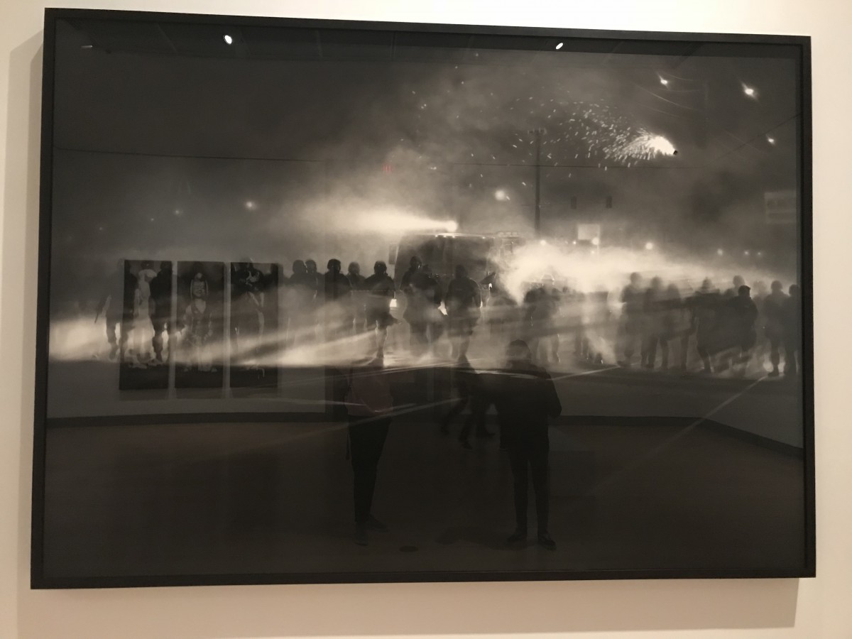
Fall 2017 | COMD1100_LC08 | Prof. Spevack

Author: Dee Jay (Page 2 of 3)

Field trip: Brooklyn Museum

Ferguson Police

Bullet hole

Both of these works were made by Robert Longo, are peices made using charcoal, and are untitled. The one depicting the police lined up was made on August 13th, 2014 and the one with the bullet hole was made January 7th, 2015 as you can see these are both fairly recent peices.

Even though these these two peices represent two completely different problems at two different places in the world one showing the police in Ferguson during the riots and the bullets from the terrorist attack in Paris the use of charcoal in both brings a sense of despair and tragedy that really strikes the person viewing the peice and I think that’s incredible also even tho these peices are separate they somehow seem like they’re connected in a way due to the tragic nature of them both it feels as if the police officers could’ve made that bullet hole if that makes any sense.


Midterm Post

So far this semester I’ve learned a lot and accomplished way more than I thought I would and if I’m going to be completely honestly I’m extremely proud of myself. From project #1 to project #3 I’ve had so much fun learning new things and really pushing myself to do the best I can. The strange thing is that these projects actually changed the way I view things for example I was talking with my friends one day and we were Times Square and we saw this really cool billboard and without thinking I started talking about how it was a good use of figure ground relationship and they stared at me with a blank look on they’re faces and it was so funny to me because not to long ago that would’ve been me giving the blank stare. Overall I’m extremely pleased with what we’ve been doing so far and I can’t wait to learn more.

https://openlab.citytech.cuny.edu/spevackcomd1100fa2017/2017/09/14/urban-artifacts-phase-3/

https://openlab.citytech.cuny.edu/spevackcomd1100fa2017/2017/10/18/sound-visualization-phase-3/

https://openlab.citytech.cuny.edu/spevackcomd1100fa2017/2017/11/13/value-added-portraits-phase-3-5/

Value-Added Portraits: Phase 4

Overall this project has been a great learning experience for me never in my life have I looked carefully at a photo and really examine it to see that all those whites, blacks, and grays are different shades of each other and that even the smallest change in shade makes it a new color. I’ve never really painted before so that was the most challenging part of this project for me but it was fun to sit down and really study these colors and try to match what was in my collage, I look forward to learning more about color.

https://openlab.citytech.cuny.edu/spevackcomd1100fa2017/2017/11/13/value-added-portraits-phase-1-7/

https://openlab.citytech.cuny.edu/spevackcomd1100fa2017/2017/11/13/value-added-portraits-phase-2-7/

https://openlab.citytech.cuny.edu/spevackcomd1100fa2017/2017/11/13/value-added-portraits-phase-3-5/


Sound Visualization: Phase 4

When it came to animating my mashup I thought to myself how certain thing would move around the page and fade in and out. I decided to have my staccato patterns bounce around the page to represent that staccato feel and I decided to make my legato patterns slowly fade in and out to represent a more calmer feel. The two songs I chose were Shockandawe by Miguel (staccato) and Can’t Bring this Down by Bridget Mendler ft Pell (legato). In my animation I worked on trying to get the music to match up to what was happening on screen and I feel like it somewhat does.

Time spent on animation 3 hours.

https://openlab.citytech.cuny.edu/spevackcomd1100fa2017/2017/09/19/sound-visualization-phase-1-2/

https://openlab.citytech.cuny.edu/spevackcomd1100fa2017/2017/09/28/sound-visualization-phase-2/ ‎

https://openlab.citytech.cuny.edu/spevackcomd1100fa2017/2017/10/18/sound-visualization-phase-3/


BRIC Brooklyn Photographs

STEFANIE APPLE
Portrait of Shinji Murakami, 2017
Digital photograph printed on Fujicolor Crystal Archive paper

“I make pixelated works, both two- and three- dimensional, inspired by classic 1980s video games liked Zelda and Dragon Quest.”

While taking a walk through the Brooklyn photographs exhibit in BRIC I saw quite a few interesting pieces but this one jumped out at me the most I’d walk around but always end up coming right back to this one. What really draws me to this piece is the fact that pixelated words are being show and that really reminds me of video games especially the classics. I grew up playing video games and one day hope to design them so this piece was really cool to see.

« Older posts Newer posts »