Fall 2017 | COMD1100_LC08 | Prof. Spevack

Author: Emely Rivas (Page 1 of 3)

Color Interaction: Phase 4

I really liked this project when we create the two pairings describing our personality. How one hue can have two different identities on what hue it is surrounded by. It was challenging trying to figuring out what symbol could represent the personality of my partner, but after all I really enjoyed. I had learned how a color can describe you as a person.

PHASE 1: DISCOVER

PHASE 2: DEVELOP

PHASE 3: DELIVER

Color Harmony : Phase 4

In this project I had learned how to created harmonious color palettes from an image.The color progression when is tint, that goes from white to a color, Shade when goes from  black to a color and two-color progression is a mixture of colors. Also, taking the dominant color, sub-dominant and accent color of an image. I could have done better in taking the dominant, sub-dominant and accent color of an image, I think that was the most challenging part because  sometimes an image could have two sub- dominant colors and its hard to figure it out.

PHASE 1: DISCOVER

PHASE 2: DEFINE


Saturation Studies: Phase 4

This project was really fun. I had learned the levels of saturation as prismatic, purely saturated, Muted, colors that are created by adding white and chromatic grays , created by adding larger amounts of black, white, gray or a complement of a hue. Also, the temperature of a color, cool when they are between Blue/Violet and warm colors like Orange/Yellow. Furthermore, my favorite part of this project was making a color wheel in a eye using primary and secondary colors.

PHASE 1: DISCOVER

PHASE 2: DEFINE

PHASE 3: DEVELOP

Color Harmony: Phase 1

In this picture shows a Tint  a progression of the hue by adding white to the flower.

In this picture shows a progression of the hue by adding black, going from black to yellow.

And this other picture shows a two-color progression, a mixing of colors from beige to orange and red.


Color Interaction Parings : Phase 3

In this group project me and my partner asked question about each other and we came up that we are both easygoing and peaceful so we came up with the muted pink with a lot of white on it representing us. I came up with a owl that describes my partner as a wise person and quiet, a muted green because she likes science and being around the nature and animals, I thought a muted green could be a good description of her.

4hrs

Color Harmony : Phase 2

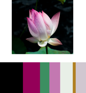
In this composition I used  a magazine of fashion week , the dominant color being the black since is the most used color for the background. The sub- Dominant being the fuchsia since is the color with less proportional area. The progression of a hue produced by the addition of white in the bottom of the flower, described as a shade. And the accent color being the green with a small proportional area. I have learned for this project the dominance of colors when you have the largest proportion of a color most of the time is the background of the image  and progression of a hue produced by additional black or white. the color references could be used in the future, designing a poster or any work can be an advantage in the near future using these techniques.

2hrs

Saturation Studies: Phase 3

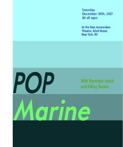
Free study Poster

Me and my partner came up with the name “Pop Marine” because it gives the sense of using blue colors like muted, prismatic and chromatic blues that represents cool colors that we were assigned and even adding a little bit of greenness to the poster and interaction with the colors. Also,  my partner and I came up with “Warm-less Touch” and “Killing Stones” as our back up bands.  And Since I’m a fan of Broadway shows, I was looking up for Broadway theaters, I saw a pretty interesting one where the show of “Aladdin” was acted so decided that is a great place for the Pop marine to perform on a Saturday night.

4hrs


Color Interaction Pairings: Phase 2

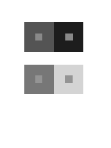
Shifting Value


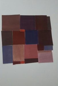
Two Pairs of squares using chromatic grays  alter the way of seen the value of the small square surrounded by 2 colors in both frames,  shifting its value.

As you can the center square of the first two pairs appears darker on the left and lighter on the right.
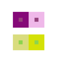
Shifting Value (With Color)

The value is altered by desaturating the colors of a hue creating a muted color

alter the perceived value of the center square.
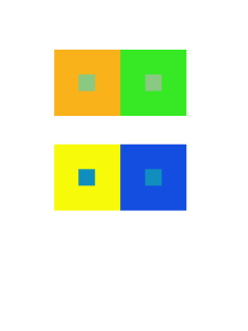


Shifting Hue, Not Value


In these two pairs the background hues will cause the center square to appear as if it’s a different hue by shifting the hue not the value.

As can see in the second pairs the left blue center square appears more brighter than the one in the right, its more like a muted colors.


Shifting Hue and Value

In these two pairs by shifting the Hue and value of the squares. The center square in the fist two pairs on the left appears less saturated  when surrounded by red-blue colors.


3hrs
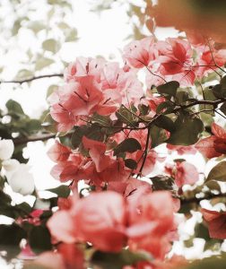
 

Saturation Studies: Phase 2

Prismatic Colors

Purely Saturated colors using primary and secondary colors being the lightest colors are yellow and the darkest is purple. I used the lightest colors to be the focal point the ones that caught the most attention are yellow and blue.

Muted Colors

Slightly Saturated colors that lie just outside the prismatic zone by simply adding white to primaries and secondary colors.

Chromatic Grays

Desaturated colors mixing  complements by adding more of one hue than the other and then adding white to each of the chromatic grays creating lighter values.

I have learned the change in values of a color by simply mixing the primary colors and adding black or white. The saturation of the colors from the lighters colors to the darkest, desaturating the colors.

6 hrs

Field Trip To Brooklyn Museum

Robert Longo 

American, born 1953

Untitled ( Raft at Sea ) , 2017

Charcoal on mounted paper

Private European collection

Francisco de Goya y Lucientes

Spanish, 1746-1828

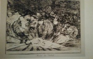
The Truth Has Died ( Murio la verdad ) , plate 79 from

The Disasters of War, published 1863


In both work they tried to send a message throughout the work. Robert Logo’s work by taking this photo a group of people adrift in an ocean gives you a mysterious feeling, perhaps sad or dangerous. Also, what attracts the most  attention is the use black and white in the photo, every person has different feelings viewing this work of art. i think the difference between Logo’s and Lucientes’s work is that logos focus more in expressing his feelings by his photos and Lucientes’s is more like sending a big message. Lucientes’s work is more like a sketch of a woman laying down surrounded by many people looking at her dead with the caption ” Murio la verdad “.

« Older posts