Fall 2017 | COMD1100_LC08 | Prof. Spevack

Author: Ebony Star (Page 1 of 3)

Color Interaction Pairings: Phase 4

https://openlab.citytech.cuny.edu/spevackcomd1100fa2017/2017/12/11/colorpairings-phase-1-3/

 https://openlab.citytech.cuny.edu/spevackcomd1100fa2017/2017/12/10/color-interaction-pairings-phase-2-5/

https://openlab.citytech.cuny.edu/spevackcomd1100fa2017/2017/12/18/color-interaction-pairings-phase-3-7/


This project made me really use my eye muscles. At first it was difficult to see a change in value or hue. After training my eyes,  and knowing more about the theory of color, it was easier to identify. This skill will definitely help me out in the future projects and gives me a more open mind when it comes to color. Everything isn’t always what it seems, Thanks Professor Jenna.

Color Harmony: Phase 1

Shade Progression

Photo of my sons hair goes black to different shades of cool hues, deep purple an blue.

Two color Progression

I found this poster in the school. Its a shows the sun up close.  Sun rays progressing from yellow to orange the further the rays expand.


Tint progression

I took this on 59th street on the side of the time warner building. The buildings create a shade around the skyline. Making everything on the outside of the photo dark an enhancing the blue hues. The contrast from the sunlight makes a tint. Having tge sky go from blue to white.


Did my best at creating photos with progression

Hours worked on 1 1/2


Color Harmony: Phase 2

Using the template provided I created a proportional color inventory. I found a great photo online that gave me progression of tint, and shade. Using my eye to focus on all the colors I saw and to measure out the hues to its closest ratio. The photo gives off cool hues of blues, and lavendar. There is also a warm side created with the orange hues progressing into a fuchsia pink hue.  The dominant color is the blue, and the sub dominant color is the pink. There is shade outlines the outside and make of the body.  With saturated blues and pinks, making a tint around the focal point (the body) The accent color is the saturated blue on the left, with many shades of blue.

Color Interaction Pairings: Phase 3


Using red to describe my partners vibrant, confident personality and a lightning bolt because I see her as a strong individual who stands out. She used this deep blue to describe me as strong and stable adding a crown to express that I also stand out. We noticed yet very different people both of us give off a strong energy. We led with that mostly. We altered the symbols color an created a saturated color we both agreed on. Against the primary blue hue background the symbol came off warmer and with the red primary hue background a more lavender hue. Both background hues are pure prismatic hues that aren’t complements but work well with one another and makes it possible to see the contrast of the symbols. Great project!


Hours worked 1 1/2

Color Interaction Pairings: Phase 1

The article” The Magic and Logic of Color : How Josef Albers Revolutionized Visual Culture and the Art of Seeing” on Josef Albers and Interaction of Color gave a detailed description on how one perceives color.  He states “In visual perception a color is almost never seen as it really is — as it physically is. This fact makes color the most relative medium in art”. Albers approach to interaction of color was practice before theory. With the class experiment we started with practice,  Trail and error. Using the ipads we practiced using colors, some high in value or low saturation.  We had to use two colors to make one color either become brighter, lighter or the same in pairs. Some of the colors after adding white, or black I couldnt see how the colors  change and with some I could. This experiment really played tricks on my eyes.   Using complementary colors of primary colors helped me see more of a change in hue an value.

Saturation Studies: Phase 4


Color Wheel :Phase 1 Discover

Saturation Studies: Phase 2

Saturation Studies: Phase 3


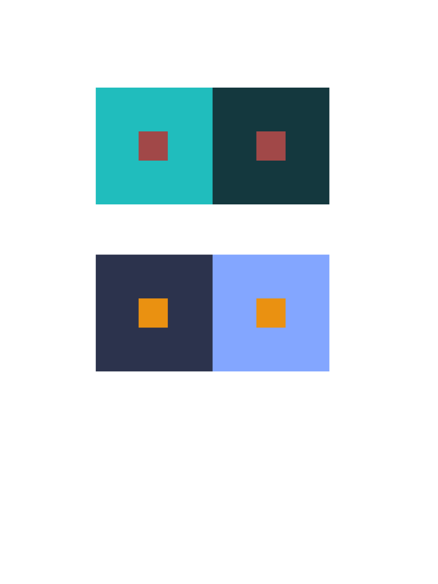
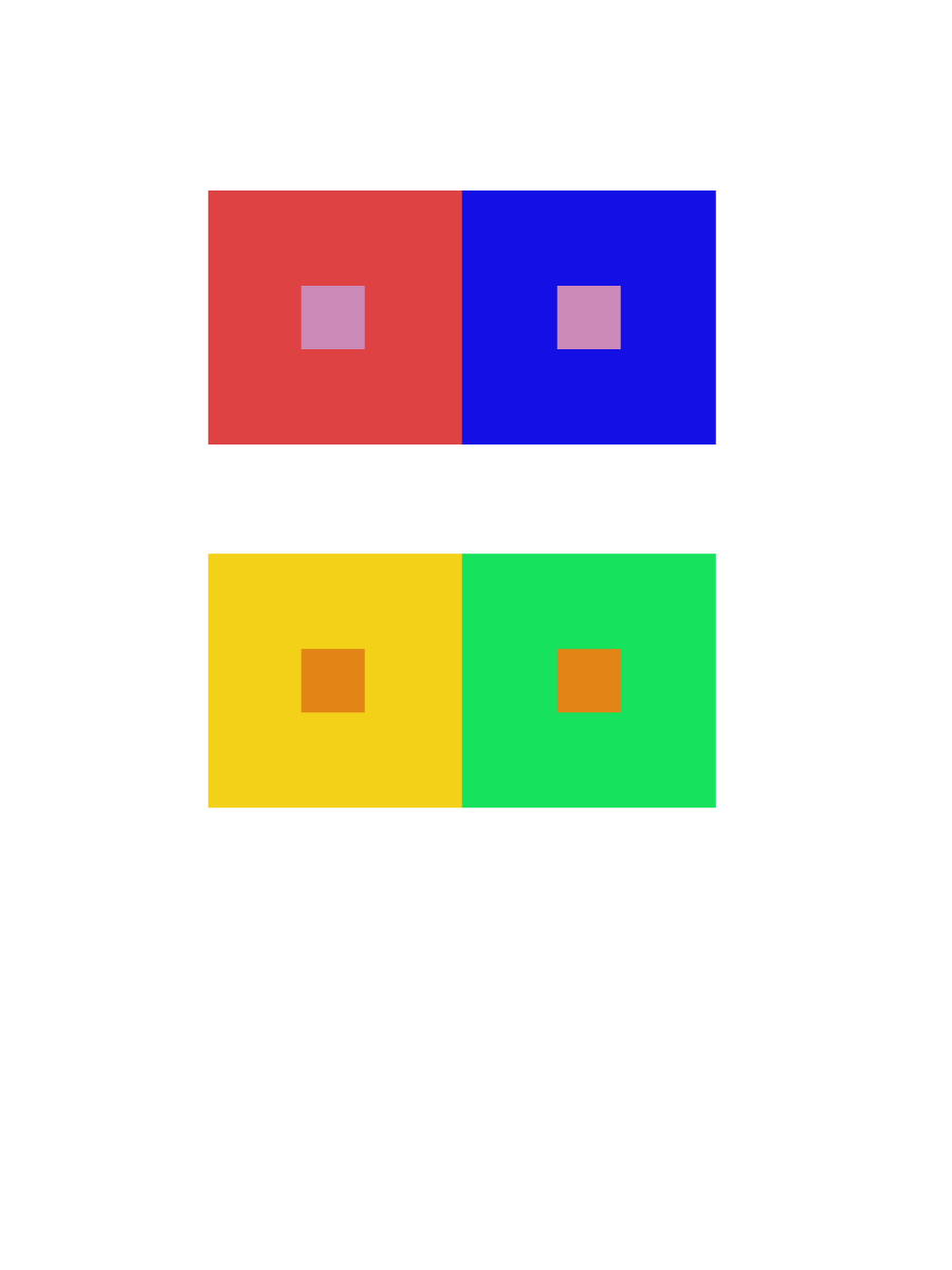
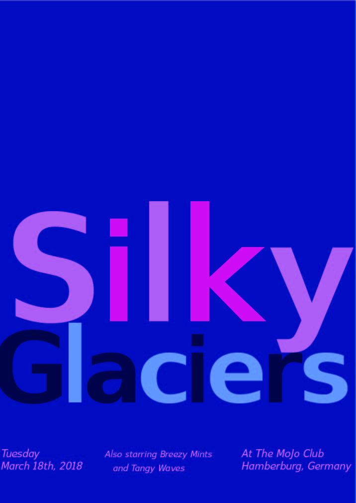
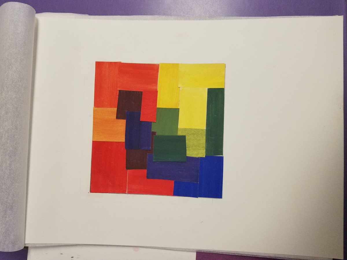
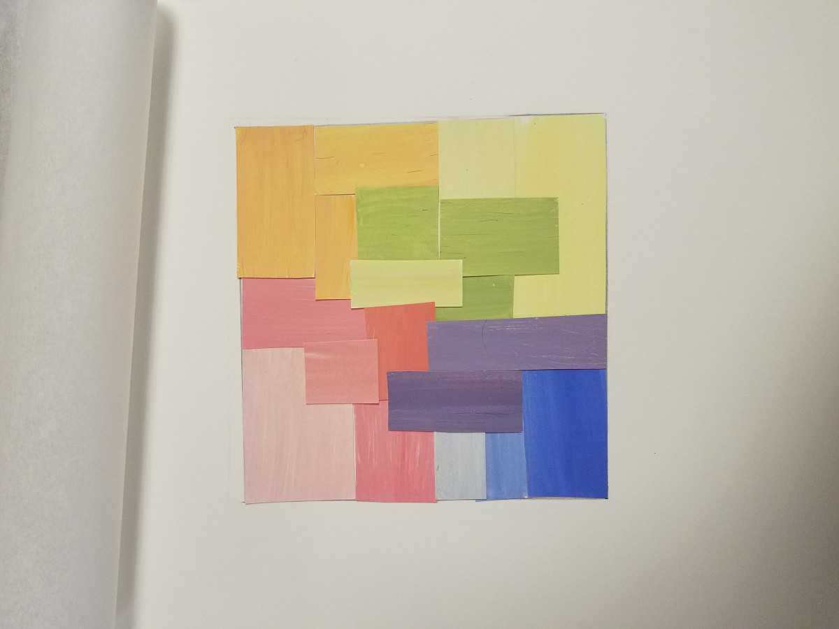
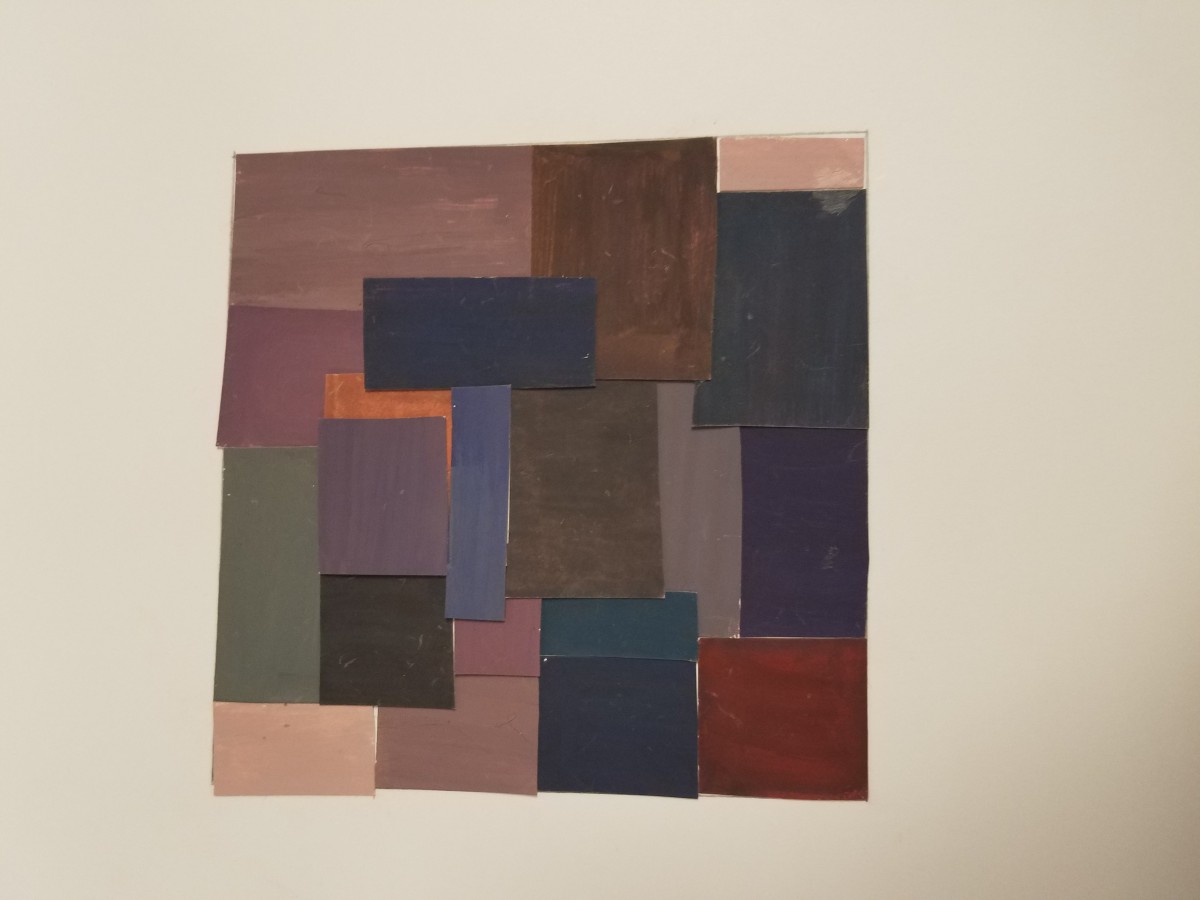
Excited to work with color, I dove right into the color wheel phase. In the next phase I experimented with pure prismatic hues, mixed with complementary hues to form different hues of chromatic grays. To lighten to chromatic grays I added white. Figuring out the ratio of how much prismatic/complementary colors to combine was difficult and took alot of experimenting.  In the next phase I had to execute muted an prismatic hues. I used the pure primary colors red, blue, and yellow to make secondary, and tertiary hues.  This was really easy and fun to do. Making the muted broad range/broad hue collage I added white to saturate the hues. Contrast was created with saturation.  Mounting all of the collages wasn’t difficult at all. With past projects, I learned to use my eye an create a composition that is unified and  flows together. Focusing on the broad range and the values of all the hues I was able to compose collages I was really proud of. The group part of this project I enjoyed the most. Using two cross sensory words and the cool temperature colors me and my partner picked, we had to create a poster for a band name. We  chose the Lush poster template. We came up with periwinkle, and violets because they give off a sense of relaxation an calmness. I chose some blues to coincide with my cool temperature of violets. Using our 5 senses, we agreed on many sensory words that would mesh well with cool temperatures.  We came up with our leading band name “Silky Glaciers” with or runners up bands being “Breezy Mints” and “Tangy Waves”. My partner mentioned Europe, and we jumped at the opportunity to base or location at a awesome club in Germany called the “Mojo Club”.  I look at all colors a little bit differently now. Thinking more into how I’m perceived to see color with the help of the primary hues. 


HOURS WORKED ON 2HRS

Saturation Studies: Phase 3

Freestudy Group Poster


Me an my partner chose the Lush poster and we had to form cool temperature colors. We came up with periwinkle, and violets because they give off a sense of relaxation an calmness. I chose some blues to coincide with my cool temperature of violets. Using our 5 senses, we agreed on many sensory words that would mesh well with cool temperatures.  We came up with our leading band name “Silky Glaciers” with or runners up bands being “Breezy Mints” and “Tangy Waves”. My partner mentioned Europe, and we jumped at the opportunity to base or location at a awesome club in Germany called the “Mojo Club”. Its was the perfect place for our “Silky Glaciers” to perform!


Hours worked on 2 1/2 this was fun to create!

Saturation Studies: Phase 2

Prismatic Color Study


Muted Color Study


Chromatic Gray Study

I learned that there are many different ways to achieve color, just using the primary colors of red, blue, and yellow. If you add white portions of color you began to saturate the color making it lighter.  To achieve muted colors I mixed larger portions of complementary colors. The prismatic colors were straight out of tube an some mixed wirh equal portions to create pure intense colors.

Hours 5Hrs


« Older posts