Overall this project was really fun as well. I enjoyed working in photoshop for phase 2 the most mainly because it really felt like I knew what I was doing. Working with complements eventually led to me being able to make one color look like two different colors which was extremely satisfying. I remember constantly checking if I put the right color in the center only to see that it was the same color.
Author: Caleb Allwood (Page 1 of 2)
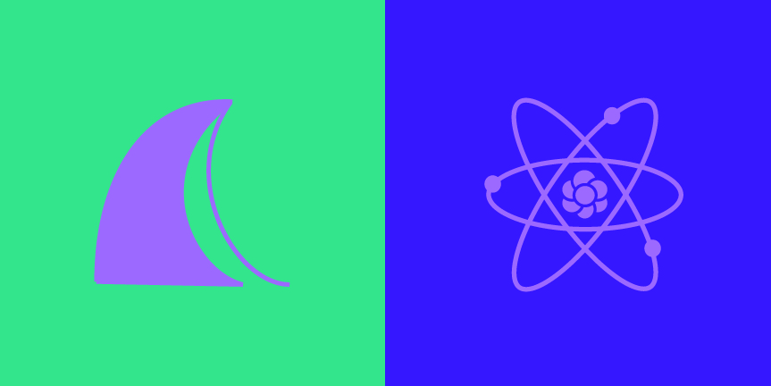
For this project me and my partner Mike brainstormed by listing out our traits and basic info about our lives; where we’re from, our families etc. One trait that followed us both was that we were both creative which we defined as a lighter violet color. Based on my traits I was defined as a blue-violet and I chose a light green for Mike. The background of my icon makes the similar color we chose seem even cooler than it is, and the opposite is true with Mike’s icon where green makes the violet appear much brighter and warmer.
When I used the Color Interactions application I couldn’t really understand the concepts but after reading the various articles I grasped the basic concept. I observed that a color placed with it’s complement makes the complement of the center color show slightly. I also noticed that working with compliments with the outer colors can make the center color look like a different color entirely.
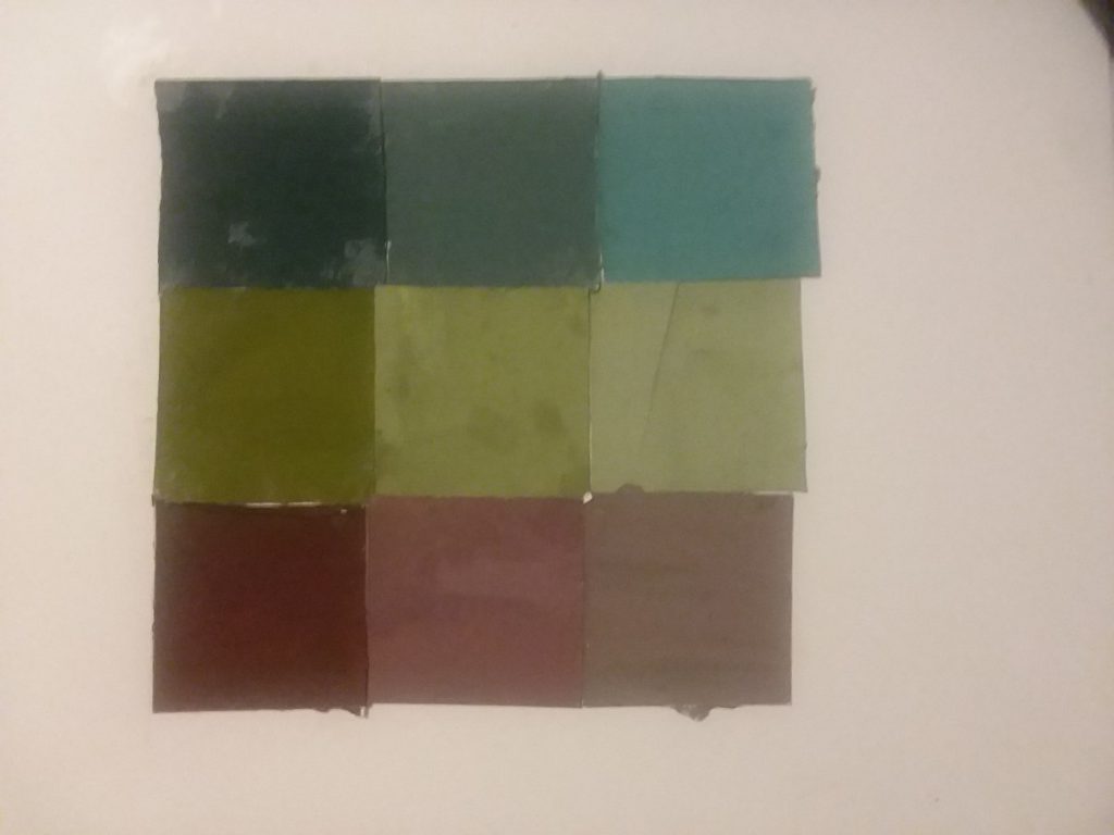
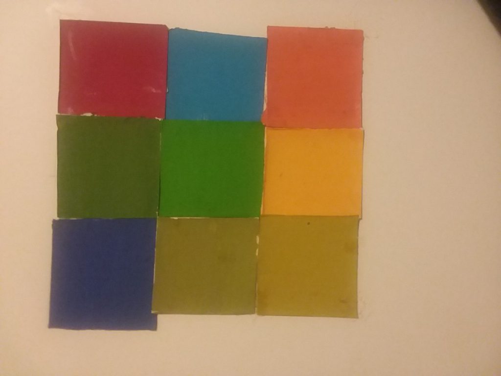
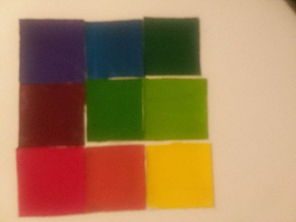
- This project was pretty fun. I’m not the best painter obviously but working with color is way better and more satisfying than working with just black and white and gray. I made alot of mistakes while painting, streaking being the main issue. And mid-way through I ran out of glue so I had to switch to rubber cement. I was extremely careless with the rubber cement, and it made things more messy than they needed to be. The collage itself has other flaws, such as the remaining white space I tried to make 2×2 inch squares so I could have 9 squares in total for the 6×6 composition but I wasn’t careful enough and it led to some remaining space.
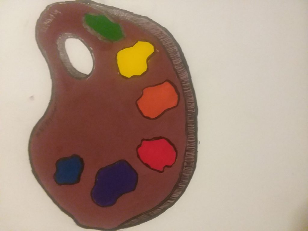
This is a very simple color wheel. My thought process was something that contains all colors and I immediately thought of a palette. I chose the dark brown color because I used to have an art teacher who always bragged about having a palette he made himself out of mahogany wood. (dont’ know if it’s something to brag about) All of the colors were mixed, none were pre-made. Something interesting about the paint was I got that red by combining Rose Tyrien (Magenta) and Flame Red (A really reddish-orange) and that shade of Blue was made with Turquoise Blue (Cyan) and Ultramarine Blue. (a VERY dark blue)
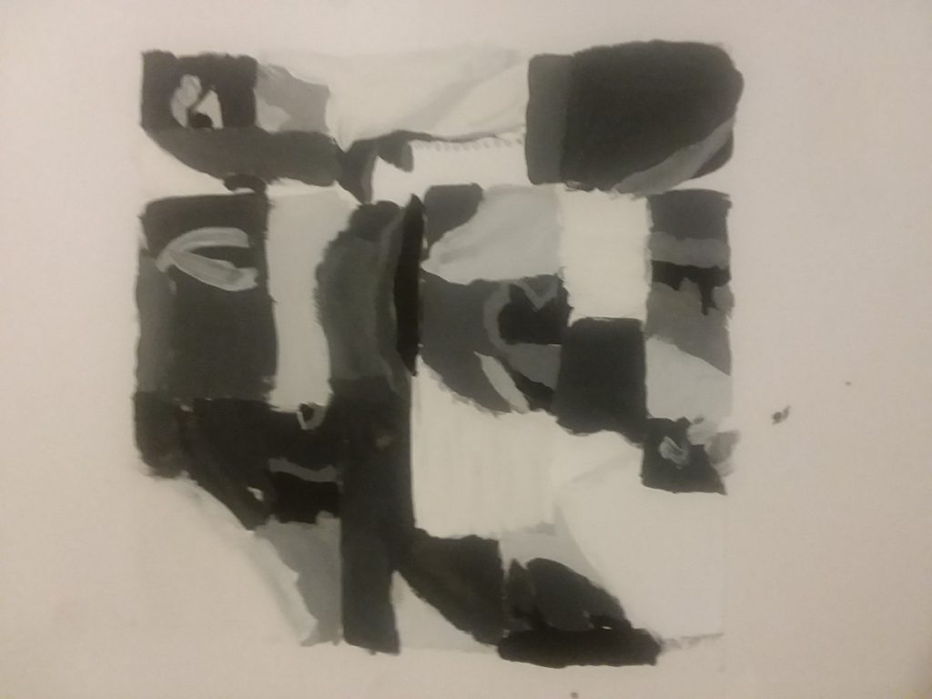
This project was truly challenging for me. I think that was mainly because I wad trying too hard to re-create the intracate details from my collages into paint form, which led to very obvious mistakes since I’m a novice with painting.
I don’t know how to provide links to the other phases but overall the project wasn’t to bad in terms of time. I finished it pretty easily but next time I have to take more care with the inking pens because I noticed tons of streaking in my inked compositions.


Recent Comments