I took a picture of a Mac computer mouse with the light coming through the window. The already white and glossy surface of the mouse was made even more bright against the darker surface of the desk. The image itself is high-key with a pretty broad range. The contrast of the pure white against the darker more decorated desk (because of all of the marks and chips of the surface) creates a pretty good contrast but not one that is too intense. Part of the mouse fades into the shadow and almost flows into the darker values of the desk, allowing a sort of flow between the contrasting values through the mid tones. All in all, I think the lighting was able to make this a much more interesting and dynamic picture.
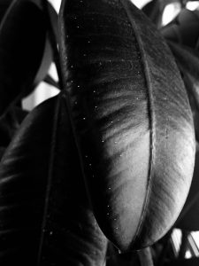
This plant was by the window of the gallery room on the 11th floor. Originally, it wasn’t that interesting of a picture because the greenness of the plant didn’t allow for such an intense contrast or really emphasize the value of the picture. However, in changing it to black and white with a filter I was able to get this really dark black as the main value of the composition. This is a low-key image with a broad range with high contrast with a not a lot of mid tones when compared to the image of the mouse above. One thing I really likes about this picture was how it captured all these little dots on the plant even in the really dark areas of the leaf in the front. It added a nice detail that I didn’t think I was going to be able to include and even though the spots aren’t big enough to create any real change to the value or composition or balance of this picture, I did like how the dots contrasted against one of the darkest areas of the image.
Time spent: 30 mins


Leave a Reply