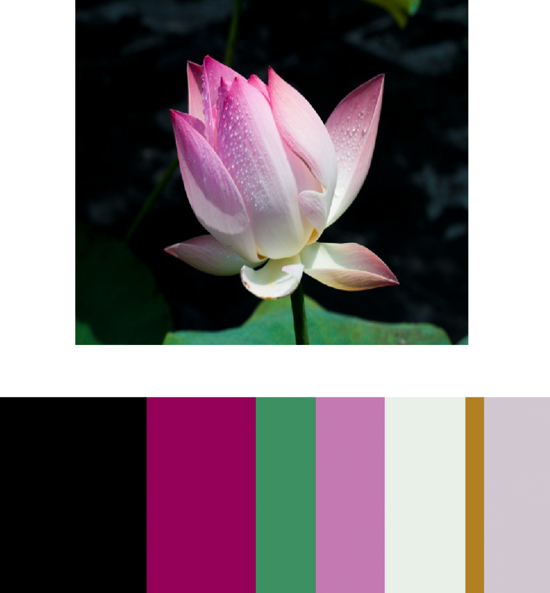
In this composition I used a magazine of fashion week , the dominant color being the black since is the most used color for the background. The sub- Dominant being the fuchsia since is the color with less proportional area. The progression of a hue produced by the addition of white in the bottom of the flower, described as a shade. And the accent color being the green with a small proportional area. I have learned for this project the dominance of colors when you have the largest proportion of a color most of the time is the background of the image and progression of a hue produced by additional black or white. the color references could be used in the future, designing a poster or any work can be an advantage in the near future using these techniques.
2hrs


Leave a Reply