Swiss Poster
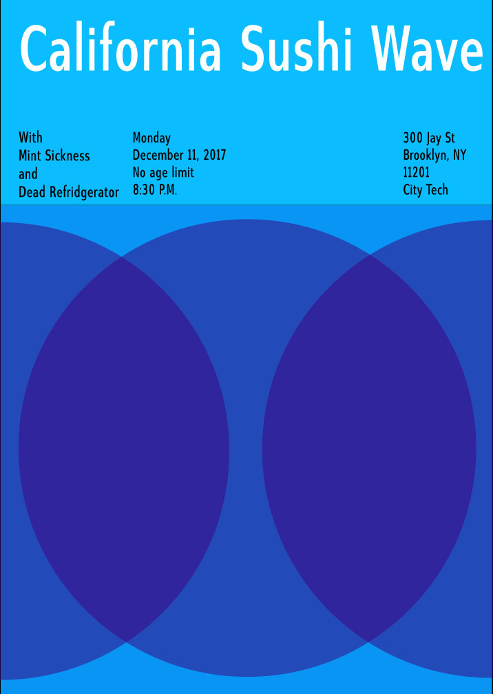
For this project, Mike and I were assigned this poster format and were told our color theme was “cool”. After coming up with a myriad of names for our lead band, we eventually settled on the name California Sushi Wave. Our first name was actually just Sushi Wave but we added the California part later on. California isn’t cool in terms of temperature, it’s typically considered a warm place but we chose it because it is a “cool” place in terms of popularity. People who have never been there typically want to go there so we considered it as a cool place. Our backup bands were our honorable mentions, things we didn’t want to use as our main band name but “Mint Sickness” was really close to being our main band. For that one, we’d probably choose colors closer to green like a blue-green. The colors we chose was blue, blue-violet and violet. We thought these colors fit the theme of cool very well but we also took advantage of the design of our poster. the venn diagram design really lets these colors overlap and brighten up the violet to keep it from being too dark.


Leave a Reply