-
- Swiss Poster
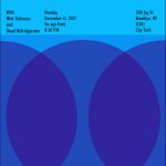
During the process in which we created this poster, we chose three different colors that best represented our band name and our temperature of the project which was cool. We chose the colors Violet, Blue-Violet, And Blue because we felt they best represented the beach waves in california and have a subtle cool feeling on the color wheel. When choosing the font for the poster we chose something that best fit the band name and the composition itself. Overall the project wasn’t impossible but it wasn’t easy either, next time you want to go to a rave. Think California Sushi Wave.


Leave a Reply