I’m panicking a bit because I’m trying to get my internship forms signed but I’m not getting a response from my supervisor. The Google+ community that we have been using has been inactive as well. I sent my supervisor a few messages about the forms an he hasn’t gotten back to me. I tried contacting some other people but only one person replied and they haven’t heard from him either. I tried to register for the website, it was not working properly before and they just got a new server, but I was unable to register. I called my supervisor but I only got his voicemail. I don’t know what else to do.
Author: Steon Nichols
Internship Blog #11
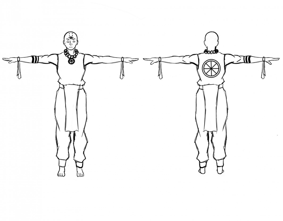
I’m pushing through, the semester is almost over. This week I worked on my 3rd character, a Shoalin monk kind of character like I did with the other 2. This time I decided to research images before I even started drawing to see how that would work out for me. After the research I was able to come up with a few designs relatively quickly. However I felt like doing it that way took away from my own creativity a bit. Instead of creating what I see as a monk, I was creating the “typical” or traditional monk. Because of this I had to rework the design to reincorporate my style.
Internship Blog #10
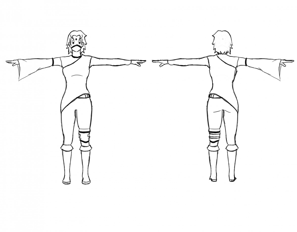
The school work is not getting any easier on my schedule. This week I decided to work on another character with the same level of research as the last week. However I did face the same problems again. I was struggling to mesh my style and how I like my characters to be with the appropriate style. This character is based on a ninja but I did not want her to be a typical ninja. So once again I did a ton of research looking at ninjas. I think I got a pretty good grip on how to make a traditional ninja. After I was comfortable with that I put my own spin on it.
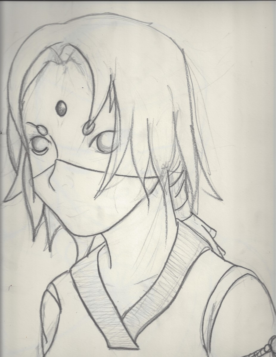
Internship Blog #9
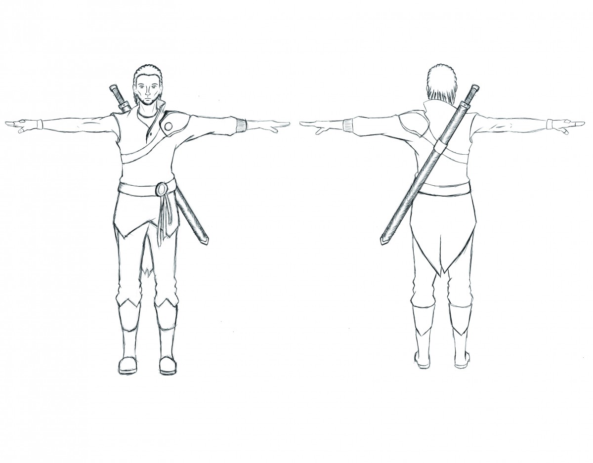
This week was super stressful with work for all my classes but I have been working on my characters in more detail. I sketched out some ideas for clothing. I was having trouble coming up with something that I liked that also fit the aesthetic that The Sacreds was looking for. To help myself, I did a ton of research on knights, squires, swords, and armor. I put all of that together to and ended up settling on a design (as seen below).
Networking Event
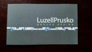 This past Wednesday I went to the Senior Portfolio Review. It was an extremely informative experience. I sat down with a couple people, professor Prusko being one, and got great advice on both my portfolio and career path.
The specificity of the advice given on my portfolio was very useful. Things like the order of my pieces, how to sell specific pieces, and how to display these pieces. Professor Prusko also advised me to make 3 different portfolios so that each one could be more specialized.
I took a ton of notes and some some business cards. I came into this event nervous because I never think my work is good enough. I left feeling full of knowledge and reassurance about the my work and my career path.
App review
Throughout the semester I have been using the Flipbook app. It has been an effective way of keeping up with the topics I am interested in. My favorite part of the app is the amount and variety of genres there are. When I first started using the app I spent a very long time scrolling through the genres and picking things i would be interested in. After completing that part, I was happy with the amount of different articles there were in each of these genres. Even when an an article of the same topic was repeated, it was not the exact same article. However, there are some things that I dislike about Flipbook. There are times when I would go to an article and it would have to take you to an external link in order to read some of, and at the worst, all of the article. Other than that one annoyance, I enjoy Flipbook and i still use it.
Another app that I found useful is Bamboo Paper. This app essentially turns your phone into a paper notebook. It can be used to take notes or draw. You can add photos to pages and draw or write on them. The app comes with 2 pens that are available for writing, sketching, and coloring. 4 more mark making tools are available to be bought, a pencil, a brush pen, a watercolor brush, and a crayon. Each are available for $0.99. There are even different types of canvases that can be bought that are made for specific uses. For example, marker, artist, and writer canvases. One great feature of this app is being able to sync your notes to Wacom Cloud letting you view your pages from any web browser. Something to take note about this app is that to get the true experience you should use a stylus. Drawing or writing with your finger defeats the purpose of this app.
Cooper Hewitt Visit
The field trip to the Cooper Hewitt museum was an interesting experience. As a whole the museum was surprisingly modern. The incorporation of the pens as a way to save pieces for later viewing is a concept that I feel should be introduced into all museums in some way. I found myself always looking for the save points my pen in hand. This was especially true in one exhibit in particular.
The first exhibit I went to, and my favorite content wise, was the Pixar exhibit. As an Illustration / Animation major I was surrounded by inspiration from one of the best animation studios there is. There was a wide selection of work that varied form concept art of characters and environments to videos showing the process of creating one of their character’s iconic hair. The digital table added to the immersion into the genius minds at Pixar. The stream of artwork was captured my attention for longer than expected. I stood and watched as concept art flowed past me fishing out my favorite pieces by simply dragging them into my personal collection.
One of my favorite pieces form this exhibit was an illustration from the movie “A Bug’s Life” (as seen below)
This concept art titled “The Offering Stone” was was created by Pixar Animation Studios and created by Tia W. Kratter and Nat McLaughlin. Dated in 1998, this work’s medium is acrylic on board. Not only is this work effective as a form of conceptualizing the feel of the movie it also is a visually engaging work of art. Though very symmetrical, the structure displayed in this image has so many interesting details that it gives your eyes enough places to travel to which benefits the overall appeal. The pastel colors grant a child friendly and lighthearted feeling. However, once outside of the Pixar exhibit the fun loving and lighthearted feeling transitions into one that is more mature with pieces reflecting that maturity.
Another interesting piece that caught my eye was a poster that had a strong message (as seen below)
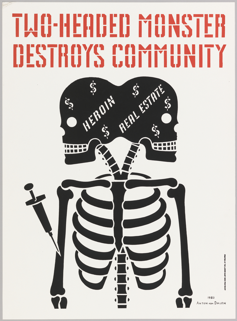
This poster titled “Two Headed Monster Destroys the Community” was designed by Anton van Dalen. It is dated 1983 and its medium is screenprint on white paper. The graphic nature of this poster helps to display the message easily. The dark color of the skeleton contrasts well with the light grey background and makes it stand out well. The bright red headline in a bold stencil styled typeface puts the message at the forefront delivering it without any interpretation needed.
to the simplicity of the Two Headed monster poster this poster titled “Blowing in the Mind / Mister Tambourine Man,” (as seen below) is composed of intricacies.
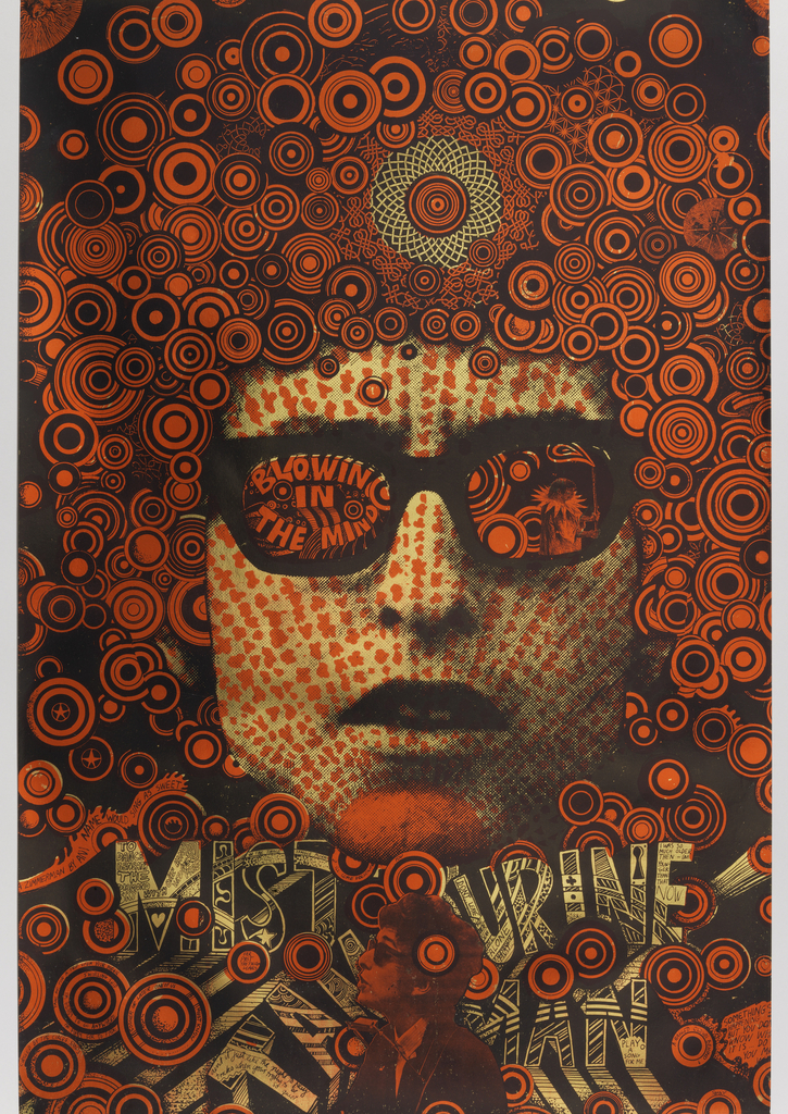
This poster was designed by Martin Sharp and made for Big O Posters Ltd.. Its dated 1968 and its medium is lithograph on wove paper. Along with his music, Bob Dylan is known for his curly hair. This was a clear inspiration for Sharp. The barrage of circles of different sizes and thicknesses give an implication of his iconic hair and at the same time symbolizes the creativity that flowed from his head. These rusty orange circles are highlighted by the dull tan of his face and the lettering. These simple colors also contrast with the level of detail and it is incredibly impressive that so much detail is visible with such a limited color palette.
Internship Blog # 8
More of the same this week. I have been getting feedback from other members of the team and working in the direction they suggest. There isn’t really much to talk about this week. I got an idea for another character and decided to see how he would work out.
Internship Blog # 7
I have spent a lot of time reworking my first character to get him to match the feel of the world. I wanted to try something else so I ended up working on a female character. Something similar to a ninja but with a spiritual twist.
Internship Blog # 6
Things are still moving forward. I have spoken with the lead of the project to see if there was anything specific that he would like but he continued to push our creative freedom. I assume that he does not want to restrict any of our ideas because of how early in development this is. So I am going to continue researching and creating content for this world.

