The field trip to the Cooper Hewitt museum was an interesting experience. As a whole the museum was surprisingly modern. The incorporation of the pens as a way to save pieces for later viewing is a concept that I feel should be introduced into all museums in some way. I found myself always looking for the save points my pen in hand. This was especially true in one exhibit in particular.
The first exhibit I went to, and my favorite content wise, was the Pixar exhibit. As an Illustration / Animation major I was surrounded by inspiration from one of the best animation studios there is. There was a wide selection of work that varied form concept art of characters and environments to videos showing the process of creating one of their character’s iconic hair. The digital table added to the immersion into the genius minds at Pixar. The stream of artwork was captured my attention for longer than expected. I stood and watched as concept art flowed past me fishing out my favorite pieces by simply dragging them into my personal collection.
One of my favorite pieces form this exhibit was an illustration from the movie “A Bug’s Life” (as seen below)
This concept art titled “The Offering Stone” was was created by Pixar Animation Studios and created by Tia W. Kratter and Nat McLaughlin. Dated in 1998, this work’s medium is acrylic on board. Not only is this work effective as a form of conceptualizing the feel of the movie it also is a visually engaging work of art. Though very symmetrical, the structure displayed in this image has so many interesting details that it gives your eyes enough places to travel to which benefits the overall appeal. The pastel colors grant a child friendly and lighthearted feeling. However, once outside of the Pixar exhibit the fun loving and lighthearted feeling transitions into one that is more mature with pieces reflecting that maturity.
Another interesting piece that caught my eye was a poster that had a strong message (as seen below)
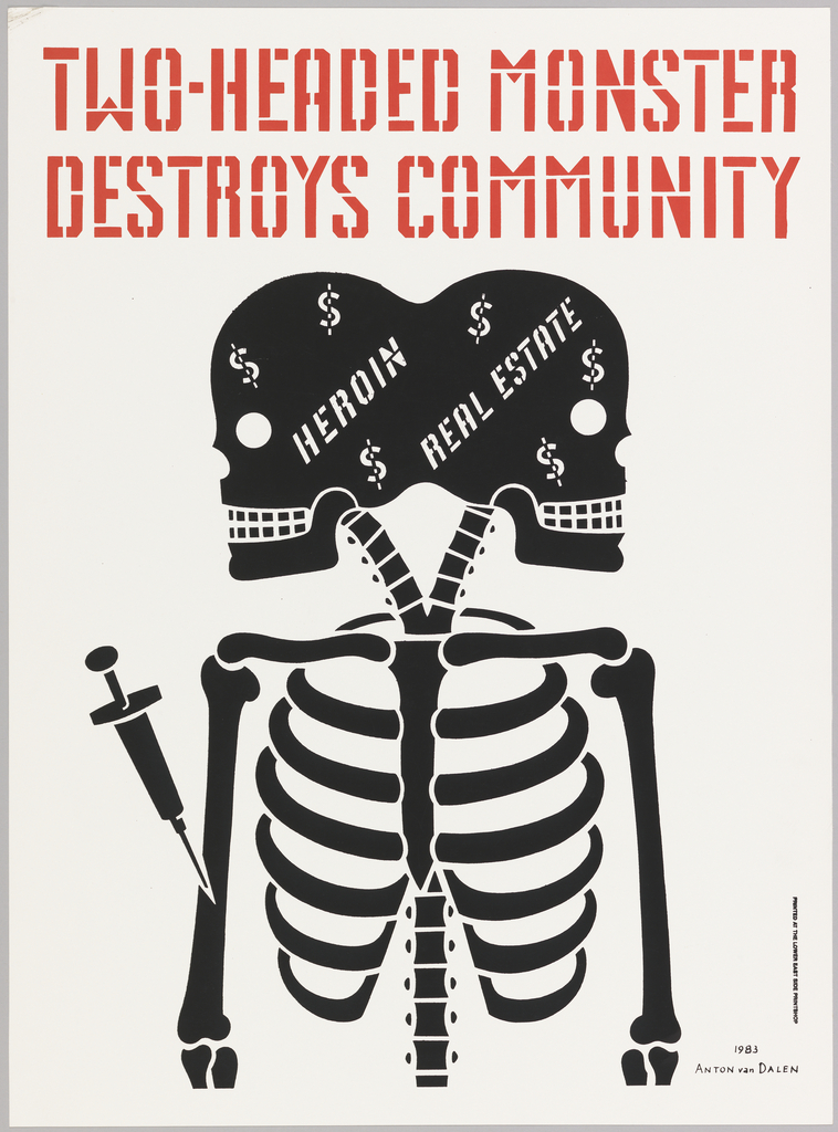
This poster titled “Two Headed Monster Destroys the Community” was designed by Anton van Dalen. It is dated 1983 and its medium is screenprint on white paper. The graphic nature of this poster helps to display the message easily. The dark color of the skeleton contrasts well with the light grey background and makes it stand out well. The bright red headline in a bold stencil styled typeface puts the message at the forefront delivering it without any interpretation needed.
to the simplicity of the Two Headed monster poster this poster titled “Blowing in the Mind / Mister Tambourine Man,” (as seen below) is composed of intricacies.
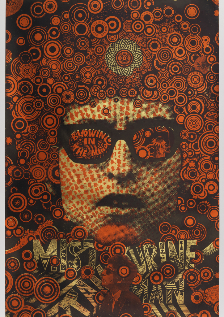
This poster was designed by Martin Sharp and made for Big O Posters Ltd.. Its dated 1968 and its medium is lithograph on wove paper. Along with his music, Bob Dylan is known for his curly hair. This was a clear inspiration for Sharp. The barrage of circles of different sizes and thicknesses give an implication of his iconic hair and at the same time symbolizes the creativity that flowed from his head. These rusty orange circles are highlighted by the dull tan of his face and the lettering. These simple colors also contrast with the level of detail and it is incredibly impressive that so much detail is visible with such a limited color palette.

