Tag: COMD 4900 Internship

Final Thoughts and Evaluation

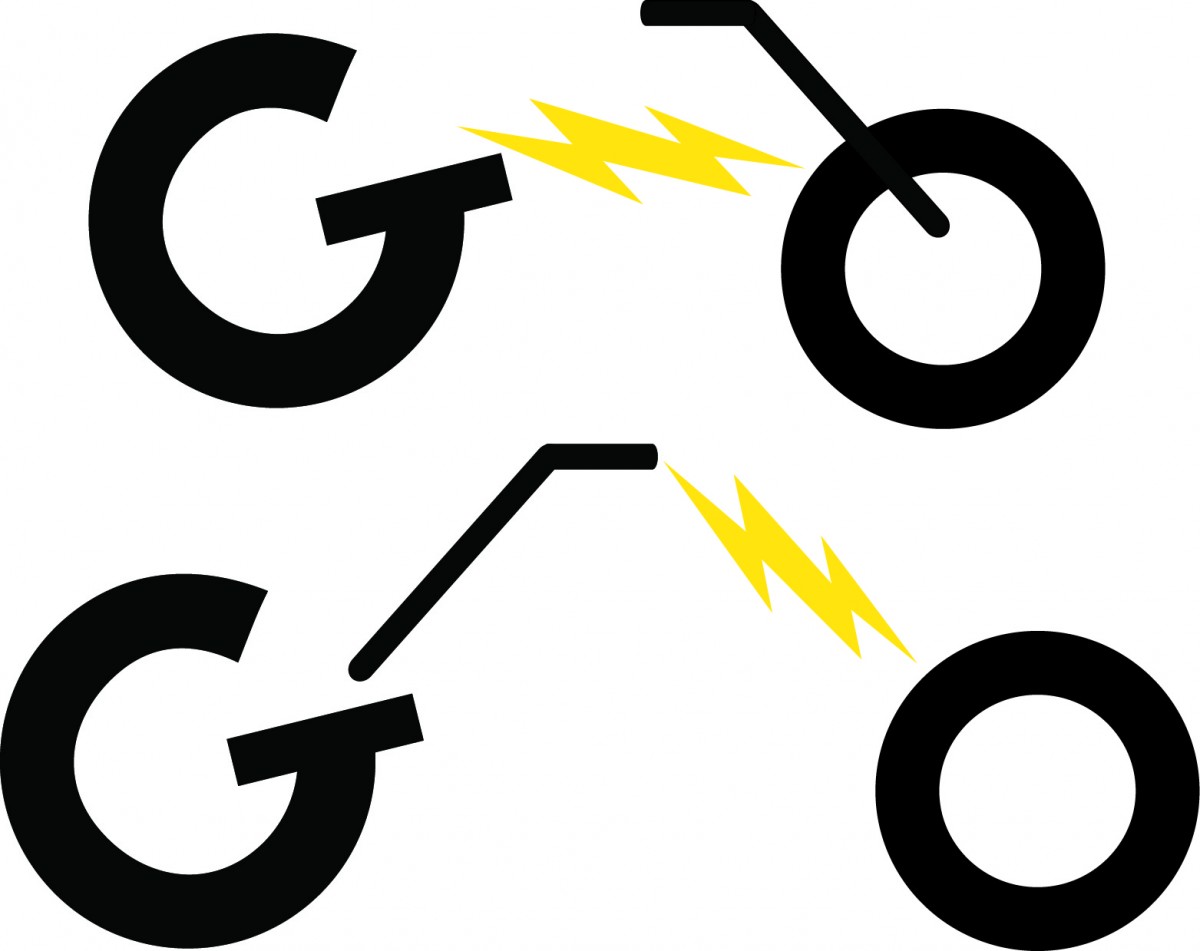
The time has nearly come for my internship at The H Group to end. It’s been a wonderful experience working there, and I got to know a lot of helpful people in the company that are willing to help me through my design career. I’ve helped create an effective advertising campaign for their Go Power Bike brand, and helped it go to a new direction (no pun intended). However, that isn’t to say all the work I’ve done during my time at The H Group was perfect. This helped me to pinpoint some parts that I was good at, and some parts I could use some tweaking upon.

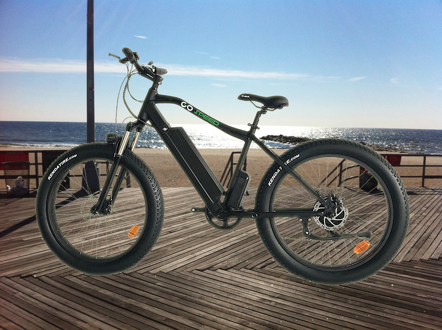
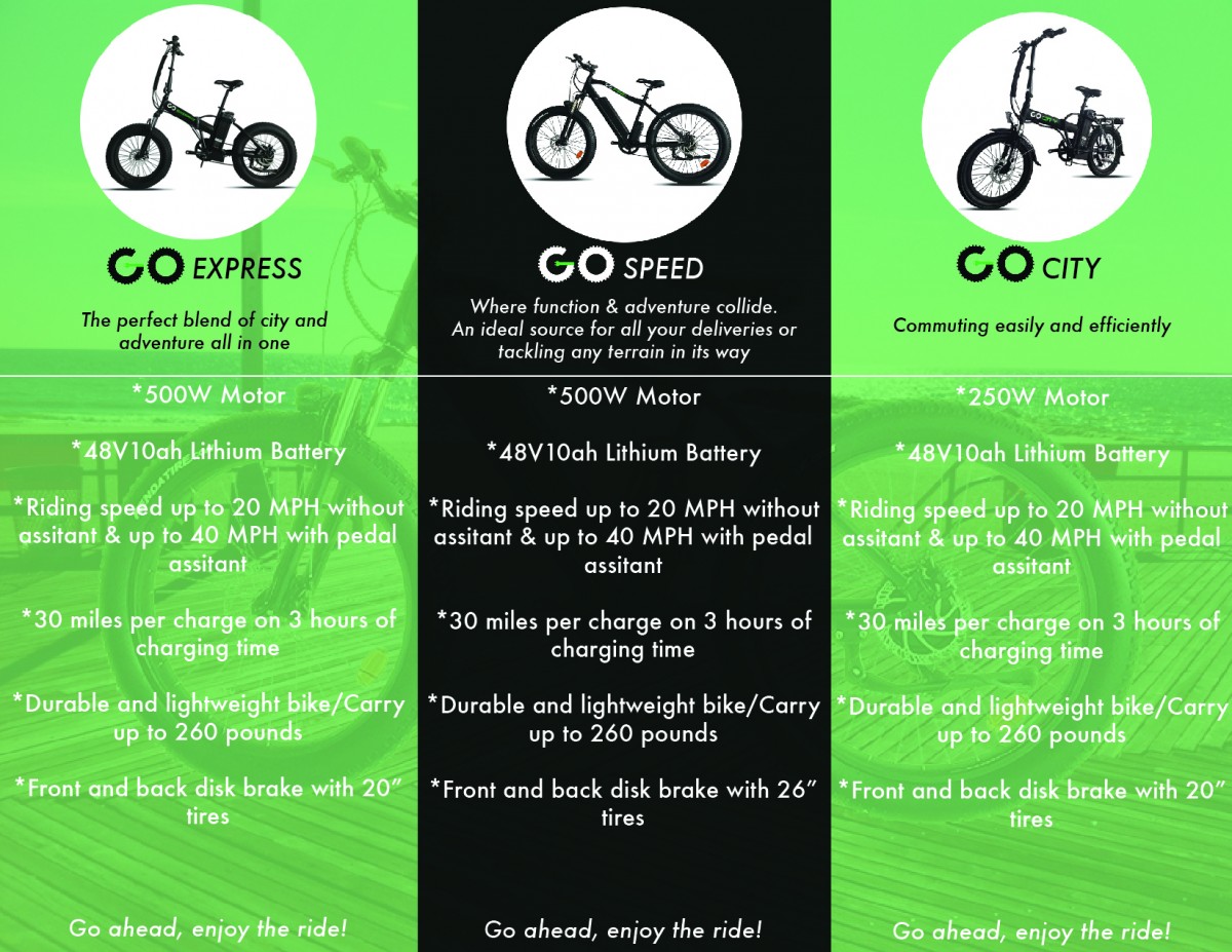
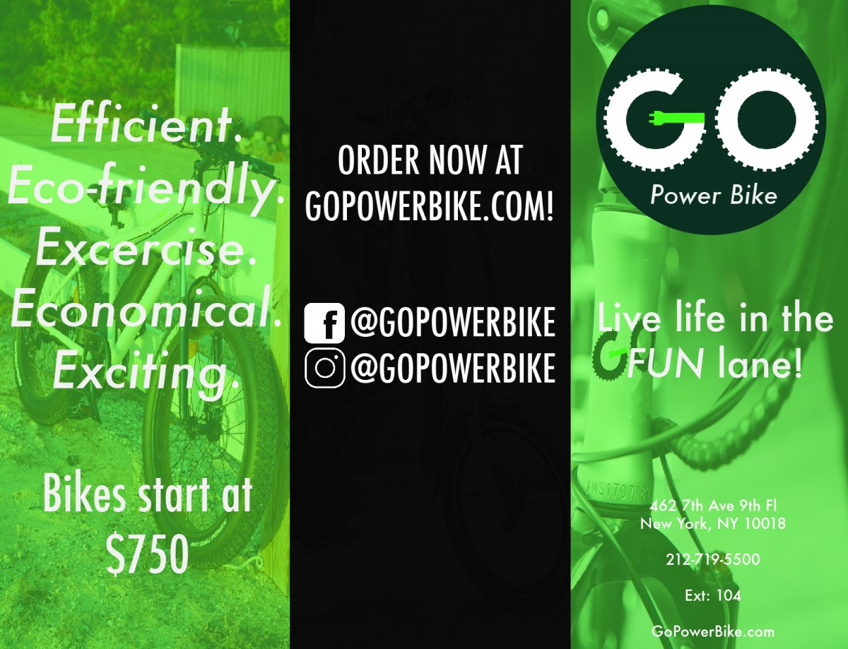
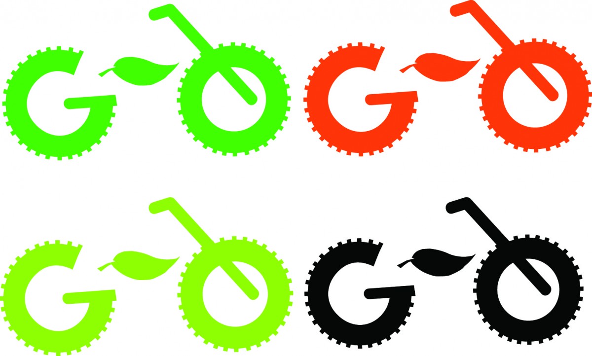
To start off, I was very manageable with my time spent on projects. Whenever I was given a project, I didn’t waste any time and worked on it quickly, yet carefully. I also didn’t make any snide remarks if I found it to be difficult, I accepted it with a smile on my face, and sat down brainstorming on what I need to do to make it work. One example was the brochure project. At first, I didn’t think that I would be able to pull it off with just Photoshop and Illustrator installed on my work computer, and found it to be better crafted within InDesign. However, this gave me time to expand upon my knowledge within Illustrator and make a meaningful and organized brochure within the program. That brings to another point to my evaluation: I found myself to work better in Illustrator than how I used it in the past. As someone who hasn’t frequently used Illustrator for 3 years, I helped myself to relearn the basics within the program, and have gotten a grasp on how it works. It really came in handy when I was developing the Go Power Bike logo and of course, the brochure, which I found to be my most successful project done at The H Group.

Some points that I can improve on are two things. One is that some days, I would come into work late, usually due to the wonderful train services we have here in NYC. However, that doesn’t always give me an excuse, since I do have a lengthy ride from Queens to Midtown Manhattan, and I would sometimes oversleep from my usual wake-up time, making me miss my bus to the train. To avoid this, I would have to wake up a lot more earlier (around 7-7:30 AM), so I can give myself time to get ready, have a proper meal before leaving (which I usually don’t, making me hungry during the day until I have lunch), and make it to the bus stop (and overall, work) on time. Another thing is that sometimes, I would rush through projects so I can get them done through my given deadline, usually not giving myself a second chance to look after them. To improve that, I would need to slow down and take my time doing them, and of course give them a second look before sending. It’s not a race. It’s about making my projects look good, and still manage to send them in on time.

Overall, my time spent working at The H Group was pretty great! If I were given a chance to rate myself, I would give it an 85%. Good projects, met deadlines, though I do need to fix my occasionally tardiness and slow down on projects from time to time, so I can be a great designer in the future!

To see a complete rundown of my time at The H Group, please take a look at my presentation down below!:

Internship Presentation_Samantha Meany

My Helpful Mentor

During my time interning at The H Group, one person that I found to be my role model is my supervisor himself, Jeremy Markovitch. Firstly, Jeremy works as the Chief Technical Officer for the Go PowerBike . He has a great amount of experience within working around the business field of the H Group. He manages the sales, calls, emails, and making sure the Go PowerBike does well within its advertising and sales. Speaking of advertising, he’s very helpful when it comes to providing me details about my design assignments within Go PowerBike.

Even if he is usually busy shuffling around certain duties at the company with his bosses, he’s always willing to help me succeed in my internship. More importantly, he always goes out of his way to make the work I do time-manageable, yet make it look polished and clean for the clients. One particular memory I have of him is when I first started working and managed my hours with him. When I told him about my travel to and from work (I travel from Queens to Midtown Manhattan), he told me that it’s understandable and if I ever find myself in a sticky situation coming in late, just text him and he’ll let my bosses know so I won’t get into any trouble with them. He’s also understanding to this internship being credit-bearing, so he usually lets me finish some of my classwork during my lunch breaks, which I very much appreciate. He’s been through similar situations like myself with internships and schoolwork, and he’s willing to make me excel in both of them.

Overall, Jeremy is one of the best people I could have as my mentor. He’s willing to help me succeed through my design career, and is very helpful and understanding, which is what I truly look for in a mentor.

Digital Ads for All

Another project that I’ve done at The H Group was making digital advertisements for Go PowerBike. These ads would be sent via email to those who are subscribed to the brand’s email. My goal for these ads was to make them simple and advertise within the theme of a certain holiday, such as Father’s Day and the Summertime. The images would sent to me via my supervisor, Jeremy, and I would do the rest of the work via Photoshop. All of those photos are the bikes being placed on the beach, and were absolutely perfect to use on those Summer-themed ads! I used the graphic design principles of “less is more” and “form follows function” for each ad. No flashy text or images, just one photograph and some simple text to keep it simple for the client.

In the first ad, the sale prices are listed for each popular selling bike, and is related to the topic of Father’s Day. I wanted to have a theme of someone’s child giving their dad a special gift for a reasonable price. The prices are put into a fitted rectangle, placed in between the main selling tagline and the small “Online only, from 6/14-6/20” text. This was the final result:

Go PowerBike Ad 1

Go PowerBike Father’s Day Ad

In the second ad, this was meant to advertise the theme of Summertime. The promo code during this flash sale was, obviously, “Summertime.” Again, the price sale is boxed conveniently, but was placed on the bottom of the bike rather than the top of the bike, due to minimal space. However, the Go PowerBike logo and the “SUMMER FLASH SALE!” are placed at the top. I wanted to keep the Go PowerBike logo on the top left corner to keep the ad themes consistent.

Go PowerBike Ad 2

Summer Flash Sale Advertisement

Overall, these ads turned out to be a success, and using the graphic design principles, “less is more” and “form follows function,” helped make these ads stand out!

Go PowerBike Brochure Project

This following assignment I was given during my internship at The H Group is by far one of my favorite projects I’ve worked on. To start off, I was given this task by my supervisor, Jeremy, as he, along with the rest of the H Group, wanted to start advertising Go PowerBike in a wider sense. And what better way to advertise a brand is with brochures?  I took this task willingly, but at the same time, was very skeptical about it, since the only programs I have to work with at my internship is with Photoshop and Illustrator. As most, if not, ALL graphic designers know, most brochures are created via InDesign rather than the two aforementioned programs, so I had that feeling of skepticism going into the project. Luckily, those feelings subsided as I started to work on the project.

Some of the inspiration I gained when I started on the project was two things: One was one flyer originally made to advertised Go PowerBike, which had columns of advertising each bike sold within the brand, and the second was photographic images taken to advertise each, which various examples are shown through the official Go PowerBike Instagram page. Some of those photos are taken place at a beach, so with that in mind, I went into Photoshop, and edited an image of one of the bikes onto another photo of a beach boardwalk:

Go PowerBike on Beach

This particular image would used as a background of the inside of the brochure. From the flyer inspiration, I decided to keep the idea of the columns advertising each bike, but instead of 5 bikes like the original flyer advertised, it would be 3, which are Go Express, Go Speed, and Go City. In between both the background image and text layers would be 3 seperate columns, with two of them being similar to the color used on the electrical in the revamped Go PowerBike logo, and the middle column being black, just to make the color palette within the Go PowerBike brand stand out more.  Underneath the name of the bike is a slogan, just to make it stand out more. After working with Illustrator and making everything click to make everything look organized, here is the final execution:

Go PowerBike Brochure (Inside)

The inside of the Go PowerBike brochure

Note that in the headings where it says “Go Speed/Express/City,” the “Go” was meant to look like the regular Futura font text. But after being looked at by one of my bosses, David, he wanted to get rid of it and replace with the new Go PowerBike logo, and after doing so, it looks a lot better, and is visually striking to the client!

After the inside was completed, it was time to focus on the outside proportion of the brochure. Again, working with Illustrator, I got the gist of making columns within the program and editing everything in. For the outside, I wanted to keep the same colors I used for the inside part, but instead of using one image as the main background, I used three separate images advertising each Go PowerBike on each column, just to make it visually engaging. The right column would be used for the cover, so I added in the logo, address, and another slogan underneath the Go PowerBike logo, the middle column is their social media and website links, and the right column is the eye catching slogan for the client right after opening the brochure, on WHY you should look into the brand. I applied the “Less is More” rule from graphic design when making this, because besides, it would be better to advertise one image with some text in front of it instead of having a WHOLE BUNCH OF IMAGES with the front text. It would make the brand look bad, so I stuck with that principle, and came up with the final result:

Go PowerBike brochure (Outside)

The outside cover of the Go PowerBike brochure

After showing it to Jeremy, it was very well received, and the company would start using it if they wanted to make brochures. Overall, I am very happy with this project, and this taught me a lot of lessons of doing advertising/graphic design work within Illustrator rather than InDesign. It was complicated at first, but after lots of practice, it was very well worth it!

Developing the Go PowerBike Logo

During my time interning at The H Group, I was given the task to revamp one of their brands, Go PowerBike, an electricity-powered bike brand. One of the most essential parts of a brand is the logo, which is usually the first impression a customer would have if they want to look into it more. For instance, this is the original Go PowerBike logo:

Go PowerBike Logo Original

As you can see, it doesn’t have the appearance of an electric-powered bike, and looks more like a regular old biking company. So with that, I was approached by one of the H Group’s bosses, Mike, asking if I can help fix it, and I accepted. One of the other graphic design interns, Wesley, was developing the logo as well, and he sent me the Adobe Illustrator file of the original logo to help finish what he started. After looking at the file, I then came up with the concept that instead of the word “GO” being placed within a horizontal line with the bike pedals in between them, I made it look like a regular bike, with the letters being placed vertically. I also made the idea that since it is an electric-powered bike the company is selling, why not replace the bike pedal with a lightening bolt or a leaf to resemble the idea of saving energy? This was the first set of logos I came up with, experimenting with the color palette used in the original logo:

logo concept 1

logo concept 2

After being looked by Mike, he liked the idea of the leaf, but still wanted to keep the idea of being an electric-powered bike from the lightning bolt idea. I then came up with the idea of an electrical plug being placed within the letter “G,” so I came up with various ideas and color schemes for the logo, while also experimenting with keeping the original vertical pedal within the logo:

logo concepts 3

The “G” came out looking like an “O” rather than a “G”

logo concept 4

Fixed and made it look like a “G,” but placed to look more like a bike

logo concept 5

The idea of using camo-colors was suggested by my supervisor, Jeremy

logo concept 6

Getting closer to what would be the final logo

The last logo was received very well by Mike, but after careful thought, he told me to remove the pedal placed within the “O,” and keep the idea of the electrical plug. Also noted that instead of just the top of the stem within the letter “G” shaped like a plug, make the whole stem look like a plug:

logo concept

The leaf is the bike pedal, and the stem of the letter “G” is an electrical plug

Placing the leaf inside the “O,” and making the stem of the letter “G” look like an electrical plug. This is also close to what would be the final logo


When the last logo was shown, Mike suggested two things to make it prime: Get rid of the leaf inside the “O,” and make the “G” look organized and straight, since it looked out of balance. And voila! The final logo was made:

The final design for the Go PowerBike logo, and what is currently used throughout the brand’s advertising

This whole process took within the span of a week and a half, but I feel very proud that my ideas came into fruition, and that everyone at The H Group guided to make the best logo for their brand.


A Typical Day at The H Group

Workspace

My workspace within The H Group

With working at The H Group, it feels a lot more different than what I expected. The first day I came in, I dressed formally as I would expect at a regular internship or job, but when shown to my supervisor, Jeremy, he told me I can just dress casually: Just a regular shirt with a pair of comfortable jeans or pants. With shoes, I usually wear flats, but sometimes, I would wear sneakers. Most of my coworkers, along with Jeremy, dress up like I do, with the exception of the company’s bosses, who dress formally.

My workspace consists of a Mac computer, but with a PC-like keyboard and mouse, which I don’t mind, since I find it easier to manage with than a regular Mac mouse. The computer itself is equipped with both Photoshop and Illustrator, which are the main programs I use throughout my internship. Surprisingly, thanks to Jeremy’s permission, I can listen to music while doing my work, though I don’t let it distract me, so I always carry a pair of headphones with me and plug them in. Aside from my workstation, the whole area of The H Group is spread out in various rooms. The hallway has a water cooler, which is very convenient for me in case I need a drink, a conference room where the board meetings are held, another workspace area with various computers for other employees, and the bosses’ offices. Down the hall past the other workspace are the restrooms, and a little kitchen space in between the fore mentioned rooms.

I work 32 hours a week between Mondays through Fridays, though my daily hours are a bit different from each other. On Mondays through Thursdays, I work from 10 AM to 5 PM, while on Fridays, I work 10 AM to 2 PM, since most of the staff doesn’t come in those days and they usually leave early like I do. Most days, I work on various projects given to me by either my supervisor or bosses. They all involve the brand that I am revising, Go PowerBike, and I usually make ads, logos, animated GIF’s, and various other advertising and graphic design work via Photoshop and/or Illustrator. My lunch break is usually held around 1:30 PM, and runs for about an hour. During my lunch hour, I usually walk to Times Square, which is a convenient ten minute walk from my internship, and have my lunch around the sitting areas. I also walk around that area to gain inspiration for when I get back to work. I would always see the hustling and bustling crowds around the area, with locals and tourists alike, and, ironically enough, it gives me the vision of who my demographic for Go PowerBike is: Anyone young and old that likes to go, go, go!

Overall, my work days at The H Group are usually very exciting for me. I always get inspiration during my lunch hours, and I’m always inspired to create whenever I’m at work.

My Long (Yet Worthy) Process of Getting an Internship

As stated in my last journal entry, my role within The H Group is a graphic designer, working and creating a new advertising campaign and logos for one of their brands, Go PowerBike. My supervisor within my internship is Jeremy Markovitch, who is also the Chief Technical Officer for the company. But before even working with The H Group, my journey to receiving an internship was definitely not an easy process.

Before finding out about The H Group, I was applying for other internships left and right using the COMD Internship Coordination site here on OpenLab. I either didn’t hear back from the companies I applied for, or just got rejected by them. I was far from ready to quit, as I found a website titled “internships.com,” where they list a multitude of internship applications of any kind. Luckily, they had multiple design-related intern openings for the Summer in NYC, so I applied for a couple of spots that interested me, as well as fitting the job’s qualifications. There, I found out about The H Group, where they had just posted a Graphic Design intern opening by the time I applied for it (May 17, 2018).

Merely 12 hours after applying for it, I received an email from one of the company’s employees (who would then turn out to be my aforementioned supervisor), Jeremy, asking me if I would be available for an interview within the next week. I, of course, was excited, as I finally got the chance to do an interview with a potential client after months of rejection, and replied saying that I would be available the following Tuesday (May 22) at 1 PM. Tuesday came and went, as I dressed professionally and entered The H Group for the first time, and even arrived at least a half hour before my interview was scheduled to begin. After waiting for about 15 minutes, I met Jeremy, and he, along with his boss, sat down with me and began the interview. Both of them asked me what my skills are, what software I use, and what days I am available for work. I even showed them previous work I have done related to graphic design during the years I’ve been at City Tech, which included a typographical poster, an autobiographical mock-up magazine, and a restaurant guide. I also asked them if it would be possible to use this internship as credit-bearing, and luckily, they were willing to comply. They also stated the goals they want to accomplish on rebranding Go PowerBike, and I was ready to do the job for them! Right before I left the interview, Jeremy asked me to email my ideas on how to rebrand Go PowerBike and what I can to do to make it better, and I did just that right when I got home. Both of them seemed very interested in working with me, and I was very hopeful I would land the internship.

After the interview wrapped up and sending my email to Jeremy, I waited for about a week to hear back from the company. Knowing that my Internship class would start within the next week and I didn’t want to come into the class empty-handed, I would anxiously email Jeremy asking him if I can start working, and he emailed me back stating that he would call me to talk about my work hours again. Unfortunately, he would be too busy with other work-related duties that he couldn’t call me. During this time, I applied for other internships at internships.com, hoping that I would hear back from them and be able to conduct more interviews. It was up until the day before class started, and I didn’t hear back from the other internships that I ended up emailing Jeremy again,  reminding him about the internship and if I can use for credit-bearing purposes. He said yes, signed the Internship Agreement form, and I finally started working on June 6, 2018 (2 days after the Internship class started).

And that was how I secured my internship at The H Group. It was a very long, tedious, and anxious process, but with constant communication between me and my supervisor and weeks worth of waiting, it was definitely worth it, and I’m very glad to be working for them.

Intro to Internship- Sports and Graphic Design

The internship that I am currently working at for my Summer 2018 Internship class is The H Group. It is a private manufacturing company that specializes in men’s clothing and sporting goods. Its location is in Midtown Manhattan (462 7th Ave, to be precise), right nearby the Macy’s flagship store in Herald Square, and is also a 10 minute walk from Times Square. The size of the company is roughly 15 to 20 people, myself included.

The H Group have been in the business for over 20 years, and their privately-owned brands include Lotto, REPAIR, and RPX Activewear. According to the company’s Facebook page, their clothing has been worn by famous tennis players such as Kevin Anderson (video source for Kevin Anderson). According to the company’s website, they also state the following:

Since its founding, The H Group has developed and manufactured apparel for a wide network of distribution channels. It applies only the highest social and technical standards to each garment that it produces.

With the support of its partners, whose unparalleled knowledge of fashion and quality helps uphold its aesthetic, [they] work all over the world to build brands and acquire licenses specializing in men’s apparel.

The H Group maintains a strong private label business as well. Comprised of families born into the garment industry locally and internationally, The H Group is committed to both building new brands and adding value to existing ones.

Central to its corporate philosophy is a commitment to maintaining and continuously improving strict quality standards, while offering fashionable products combined with excellent value. The H Group manufactures high quality active wear, formal wear and casual wear for men.

Aside from putting out sports clothing, they own another privately-owned brand that specializes in electric-powered bikes, called Go PowerBike. This leads up to my area in which I work at: I work in the Graphic Design department, developing an advertising campaign for the Go PowerBike brand.