Another project that I’ve done at The H Group was making digital advertisements for Go PowerBike. These ads would be sent via email to those who are subscribed to the brand’s email. My goal for these ads was to make them simple and advertise within the theme of a certain holiday, such as Father’s Day and the Summertime. The images would sent to me via my supervisor, Jeremy, and I would do the rest of the work via Photoshop. All of those photos are the bikes being placed on the beach, and were absolutely perfect to use on those Summer-themed ads! I used the graphic design principles of “less is more” and “form follows function” for each ad. No flashy text or images, just one photograph and some simple text to keep it simple for the client.
In the first ad, the sale prices are listed for each popular selling bike, and is related to the topic of Father’s Day. I wanted to have a theme of someone’s child giving their dad a special gift for a reasonable price. The prices are put into a fitted rectangle, placed in between the main selling tagline and the small “Online only, from 6/14-6/20” text. This was the final result:
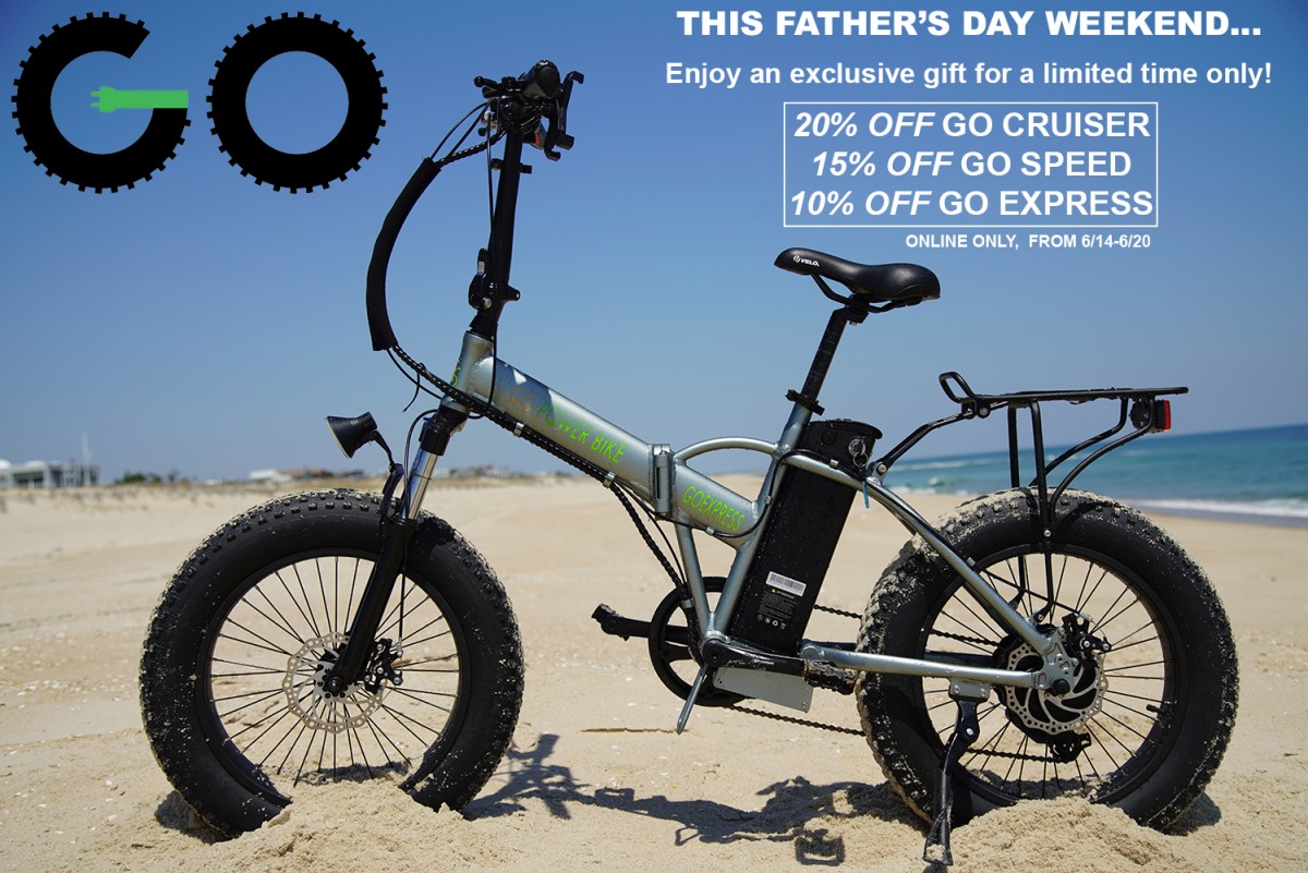
Go PowerBike Father’s Day Ad
In the second ad, this was meant to advertise the theme of Summertime. The promo code during this flash sale was, obviously, “Summertime.” Again, the price sale is boxed conveniently, but was placed on the bottom of the bike rather than the top of the bike, due to minimal space. However, the Go PowerBike logo and the “SUMMER FLASH SALE!” are placed at the top. I wanted to keep the Go PowerBike logo on the top left corner to keep the ad themes consistent.
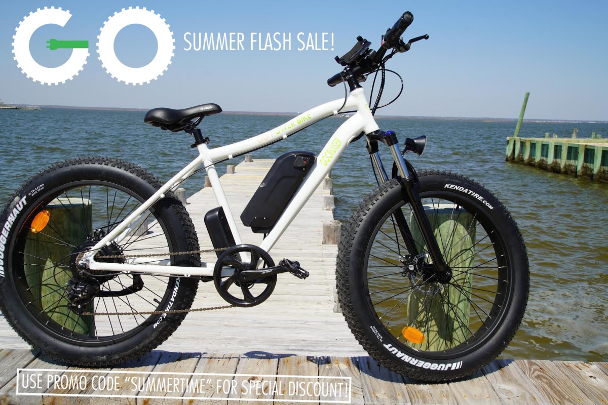
Summer Flash Sale Advertisement
Overall, these ads turned out to be a success, and using the graphic design principles, “less is more” and “form follows function,” helped make these ads stand out!


Leave a Reply