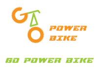
During my time interning at The H Group, I was given the task to revamp one of their brands, Go PowerBike, an electricity-powered bike brand. One of the most essential parts of a brand is the logo, which is usually the first impression a customer would have if they want to look into it more. For instance, this is the original Go PowerBike logo:
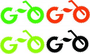
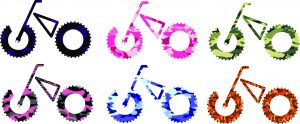
As you can see, it doesn’t have the appearance of an electric-powered bike, and looks more like a regular old biking company. So with that, I was approached by one of the H Group’s bosses, Mike, asking if I can help fix it, and I accepted. One of the other graphic design interns, Wesley, was developing the logo as well, and he sent me the Adobe Illustrator file of the original logo to help finish what he started. After looking at the file, I then came up with the concept that instead of the word “GO” being placed within a horizontal line with the bike pedals in between them, I made it look like a regular bike, with the letters being placed vertically. I also made the idea that since it is an electric-powered bike the company is selling, why not replace the bike pedal with a lightening bolt or a leaf to resemble the idea of saving energy? This was the first set of logos I came up with, experimenting with the color palette used in the original logo:
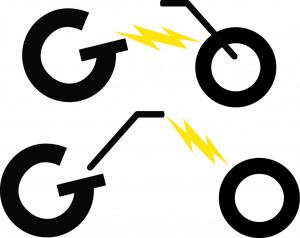
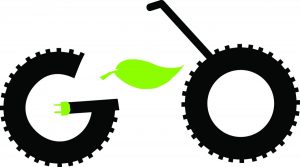
After being looked by Mike, he liked the idea of the leaf, but still wanted to keep the idea of being an electric-powered bike from the lightning bolt idea. I then came up with the idea of an electrical plug being placed within the letter “G,” so I came up with various ideas and color schemes for the logo, while also experimenting with keeping the original vertical pedal within the logo:
The last logo was received very well by Mike, but after careful thought, he told me to remove the pedal placed within the “O,” and keep the idea of the electrical plug. Also noted that instead of just the top of the stem within the letter “G” shaped like a plug, make the whole stem look like a plug:

Placing the leaf inside the “O,” and making the stem of the letter “G” look like an electrical plug. This is also close to what would be the final logo
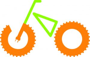
When the last logo was shown, Mike suggested two things to make it prime: Get rid of the leaf inside the “O,” and make the “G” look organized and straight, since it looked out of balance. And voila! The final logo was made:

The final design for the Go PowerBike logo, and what is currently used throughout the brand’s advertising
This whole process took within the span of a week and a half, but I feel very proud that my ideas came into fruition, and that everyone at The H Group guided to make the best logo for their brand.




Leave a Reply