The name of the event was, “Bauhaus Typography at 100: A View from Letterform Archive and Cooper Hewitt.” Although the event was presented by the Letterform Archive and co-presented by Cooper Hewitt and the Smithsonian Design Museum. There were two speakers, Ellen Lupton, senior curator of contemporary design at both museums in New York, and A man named Steven with Letter Form Archive. It discussed and examined the typographic designs of the Bauhaus school, going through its history year by year. There was a QnA session at the end where people would also give their design credentials as well as exchange other professional information.
There was no email of the transcript or the video sadly. Maybe this has to do with my email itself although I’m unsure, but definitely disappointed by the lack of these resources for an event I paid for.
Other links are provided before, during, and after the event:
The Events Details: https://www.eventbrite.com/e/bauhaus-typography-at-100-a-view-from-letterform-archive-and-cooper-hewitt-tickets-246744588707?keep_tld=1
Cooper Hewitt: https://www.cooperhewitt.org/
Digital Walkthrough of Bauhaus designed showcased: https://exhibitions.letterformarchive.org/
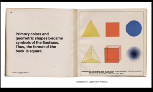
This online event discussed the effects of the Bauhaus designs that continue to influence our art, designs, and typography to this day. Bauhaus typography was based on the principles of finding the truest form and marrying it with utility. The image above shows a page from a book designed by Wassily Kandinsky and László Moholy-Nagy. The yellow triangle, the red square, and the blue circle marry this philosophy and visual geometry in a kind of elementary sequence. The book itself is square to reflect this same principle in the Bauhaus design.
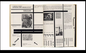
As Maholy-Nage wrote about the concept of the “New Typography,” he visualized this concept through his layout designs, drawing leading lines and forms. The term, “New Typography,” was something he had written about, but didn’t quite get what it would be yet. Unsure how he was going to approach the concepts to define the term he created.
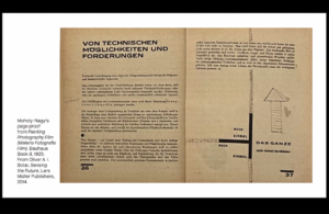
So in this book, you see him figuring it out as he goes. This whole book was experimental, with an unusual shape, layout, and typography, all to show the Bauhaus’ craft and worth as a design institute. With these very long lines, he directed the viewer’s eyes around the page. But here he is launching the new typography, and this is considered the first essay to use that phrase, and it would go on to have a huge influence.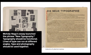
Keep in mind, that this was also the same time period of German Expressionist films that experimented with these same ideas and deeper concepts of storytelling that were not as literal as the films made prior. Artists, designers, and filmmakers were unsure if the viewer could understand these more vague concepts in a visual way. This was the learning period for both the artists and the public. People did appreciate fine craftsmanship when they saw it but the industrial revolution started to shift to become the norm and workers’ civil rights were being GROSSLY overlooked.
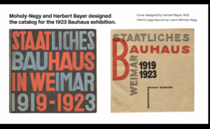
Generic, ill-made, but cheap, goods & items were being made by factories which threatened artists and craftsmen of the time.
Fewer people commissioned them for their quality services and creations because of the expense compared to the factory’s products. This caused a shift in some industrialized areas all over the world. The “Arts & Crafts Movement,” focused on beauty, and forms were the ideal. They produced many things by hand and this also brought attention to their plights, gaining some recognition as well.
The Bauhaus also had a similar history, but they didn’t just create forms. Form follows function, making beautiful, functional things that were appealing and stylish. Their approach to typography was also about these elementary forms and colors.
Industrialization and commercial growth was not the aim of the Bauhaus at this time, but corporations learned just as well as people did. Now any item you can think of can be printed on and customized. The arts & crafts movement wanted artists to be appreciated for these creations, but the people who could invest the money hired those artists and merged the two worlds to give the industry personality. The point of the arts and crafts movement was lost on the cold corporate companies for monetary gain.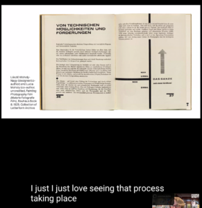
All throughout the event people were writing comments and sharing links to things that related to the topic and what the speaker was mentioning at the time. Some tidbits of information that were not emphasized or a history that was not the focus of the presentation. They are also linked to resources. People were very enthusiastic and even if their questions could not be answered, they were very curious and answered other people’s questions in the comments. the chat section was very active. I save many of their links. Sharing our professional credentials was also useful and I learned about the kind of people who were at the same event I was so excited to be attending.
Many passionate designers, artists, historians, NERDS, & GEEKS were at this event just to enjoy ourselves and be lively despite not being able to speak to each other. I would love to attend another event like this. We all came because we like the Bauhaus and to reexamine that point in history and contextualize it under the context of what we know today, what has happened, and how far-reaching the Bauhaus’ influence reached.
