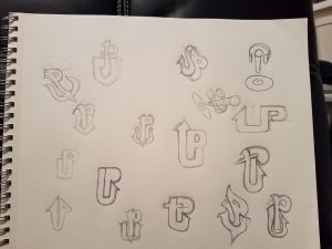
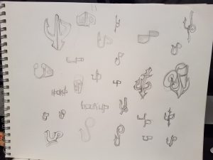
| Currently at my internship my assignment is to create a new design for the company’s logo. Normally I love doing this, however I’m not having as much success as I had hoped. The name of the company is Hookup Studio. My manager specified that he wants to incorporate a ship anchor with the letters U and P as a representation of the word Hookup. After seeing the logo used on their business card I totally understand where he’s coming from but, I’m sure I can do something better looking and more effective. I showed my manager about 40 thumbnail sketches that I developed but, he only liked two of them. I was told to keep working on it but unfortunately i was never given any clear direction of how to further develop the designs he liked. After several emails we agreed on a few changes but we’re still not completely on the same page. For instance, I think the logo should be strong, prominent but clever and sophisticated. My manager on the other hand wants something chunky and heavy, and more on the edgy side. Even though our differences in ideas prove to be a challenge with the design, I must never forget that he is the client… and I will not only give him what he wants but, also what I feel is necessary for marketability and branding. So I guess it’s back to the drawing board! literally | |
Sundiata hill's ePortfolio
A City Tech OpenLab ePortfolio


