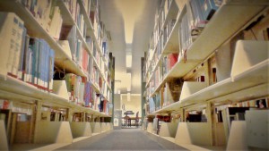
In this picture, you will see a picture of a passageway between two bookshelves in the Library at City Tech. For this photo, I decided to do something a little different, by adding filters. While adding the filters I notice something unique about this photo and it was the Lighting. I notice every time I would just adjust the lighting, by even one level up or down for the brightness, the photo would show a big difference and it would look bad. The colors in this photo also makes the passageway between the bookshelf look kind of futuristic in a way, juxtapose to the original photo, since the books and bookshelves looks neat and a little blended. Also, the books and bookshelves kind of attracts your eyes in way even though it’s not the main focus, because of the camera angle I used to make the bookshelves look big in its width and height, which is another reason why I like this photo.


