Category: Uncategorized
Visually Enhanced Quotes
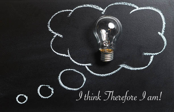
The first postcard (JPEG-1) is a great way that symbolizes my quote. A thought bubble with a light bulb in the middle is a great way to show the power of the human brain. It shows that humans use their brain and without it we don’t exist.
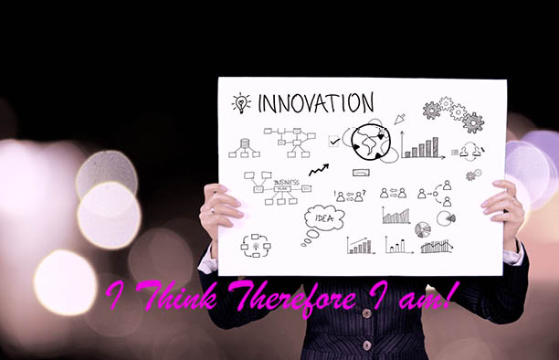
The second image shows the innovation of the thought process of the human brain. Humans are very innovative when it comes to solving problems. We are constantly using our brains to figure where we fit in this cruel world.
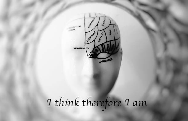
Showing the use of both side of the brain is excellent way to show how the human brain works. Our brain is split into two half. Each half of the brain has its purpose and combine together shows the true power of the human brain. If the brain doesn’t work anymore then we as a human will eventually fade out of existence.
Stefan Sagmeister Research Paper.
Richard Rohoman
Prof. Bauer
Digital Media Foundations COMD 1112, D105
Nov. 20, 2019
Stefan Sagmeister
Stefan Sagmeister is a renowned Austrian-born US based contemporary
graphic designer and typographer. He is the co-founder of the famous design firm,
Sagmeister & Walsh, which he established in partnership with Jessica Walsh. His
intriguing and provocative designs redefined the status of graphic designers. Some of
his notable designs are showcased on the album covers of The Rolling Stones, Pat
Metheny, David Byrne and OK Go. I choose Stefan Sagmeister because he’s an amazing
Graphics Designer. He strives to be a better designer by finding inspiration in things
that he does. He’s not a quitter when it came to pursuing his career as a graphics
designer. I am majoring in either Computer Animation or Graphic Design. Learning
about Stefan Sagmeisterhas helped me to continue to pursue what I want.
On August 6, 1962, Stefan Sagmeister was born in Bregenz, Austria. After
graduation from high-school, he enrolled himself in an engineering college. However,
he later changed his mind and opted for graphic designing course. Since an early age,
Sagmeister had a passion for designing, thus it is as not surprising that he began his
designing career at the age of 15. He worked for an Austrian left-wing youth
magazine, Alphorn. While he was covering Alphorn’s Anarchy issue, he had an
ingenious idea to exercise the D-I-Y graphic for the first time. He persuaded his fellow
students to lie down on the playground forming the letter A, and took a picture from
school roof for the poster of the magazine. At the age of 19, he applied for the
University of Applied Arts Vienna to study graphic designing. Although, at first, he was
refused the admission on the basis of his amateur drawing, his application was
accepted on second attempt. In 1987, owing to his remarkable performance, he
earned a Fulbright scholarship for the New York based Pratt Institute.
For mandatory military services, Sagmeister returned to Austria after
three years of studies in United States. He chose to do community service for refugee
center instead and afterwards remained in Austria for a while. There he continued to
pursue graphic designing and then moved to Hong Kong in 1991. He landed a job
as a typographer in an advertising agency. In 1992, the agency was asked to design a
poster for the 4As advertising awards ceremony. Sagmeister had a strange sense of
humor and never took issues of propriety into consideration. So, when he presented
an inappropriate and unethical poster for the event he was lambasted by the
audience. A few months later, he decided to move back to New York City. In New York,
Sagmeister briefly worked at M&Co studio, which sponsored his green card
application. As the studio was closed and moved to Rome, he set out to establish his
own studio.
Having keen interest in music, he decided to work on music graphics but
only endorsing the music, he prefers. In 1993, he founded the Sagmeister Inc. At first
none of the record labels approached him for the album cover designs. So, when his
friend was about to launch his album he seized the opportunity to design the CD cover
for Zinker’s Mountains of Madness. Using the optical illusion, he made the CD cover
more tantalizing for the consumers, and his incredible zeal for innovative designs
earned him four Grammy nominations for the cover. Inspired by his work, Lou Reed
requested him to design cover for his album, Set the Twilight Reeling, in 1996. It was
followed by the cover he designed for David Byrne’s album Feelings featuring the GI
Joe-style doll.
After forming Sameister Inc., Stefan Sagmeister promoted brands,
music and entertained a diverse range of clients such as the Guggenheim Museum,
HBO, AIGA, Rolling Stones and Time Warner with his captivating designs. For his
stellar achievements he was awarded the Grammy Award thrice and the National
Design Award. He is a long-standing artistic collaborator with musicians David Byrne
and Lou Reed. He is the author of the design monograph “Made You Look” which was
published by Booth-Clibborn editions. His works has been mounted in Zurich,
Vienna, New York, Berlin, Japan, Osaka, Prague, Cologne, and Seoul. He teaches in
the graduate department of the School of Visual Arts in New York and has been
appointed as the Frank Stanton Chair at the Cooper Union School of Art, New York. His
motto is “Design that needed guts from the creator and still carries the ghost of these
guts in the final execution.” He goes on a year-long sabbatical around every seven
years, where he does not take work from clients. He is resolute about this, even if the
work is tempting, and has displayed this by declining an offer to design a poster for
Barack Obama’s presidential campaign. Stefan spends the year experimenting with
personal work and refreshing himself as a designer. Several years ago, he decided to
dedicate 25% of his work to the art world, things like books and publications for
galleries, another 25% to the scientific community, 25% to social causes, and the
remaining quarter has stayed dedicated to the music industry.
Stefan Sagmeister received a Grammy Award in 2005 in the Best Boxed
or Special Limited-Edition Package category for art direction, once in a Lifetime box
set by Talking Heads. He received a second Grammy Award for his design of the David
Byrne and Brian Eno album Everything That Happens Will Happen Today in the
Grammy Award for Best Recording Package category on January 31, 2010. In 2005,
Sagmeister won the National Design Award for Communications from the Cooper-
Hewitt National Design Museum. In 2013 Sagmeister was awarded the Golden Medal
of Honor of the Republic of Austria.
In conclusion, Stefan Sagmeister is an incredible graphic designer whose
works are well knowing in the graphic designing world as well as around the world
through his vision and uniqueness to designing. His style is ingenious and is sought
after from clients that are well known in the entertainment industry and as well as
the business world. He has won many accolades for his outstanding work in graphic
design in the entertainment industry. I respect the fact that he is willing to donate
some of his funds through shows that he has for social issues and the arts. He is a
wonderful artist.
“Stefan Sagmeister: Biography, Designs and Facts.” Famous Graphic Designers, https://www.famousgraphicdesigners.org/stefan-sagmeister.
“Stefan Sagmeister.” Wikipedia, Wikimedia Foundation, 9 Oct. 2019, https://en.wikipedia.org/wiki/Stefan_Sagmeister.
“Work – Sagmeister Inc.” Work – Sagmeister Inc., http://sagmeister.com/work/.
“Work – Sagmeister & Walsh.” Work –, https://sagmeisterwalsh.com/.
Graphis, http://www.graphis.com/bio/3/stefan-sagmeister-1/.
UEFA Research Logo Paper.
COMD 1112, Section D105 9/15/19
Professor Bauer Richard Rohoman
UEFA Logo History Report
The Union of European Football Associations or UEFA was founded on 15
June 1954 in Basel, Switzerland after consultation between the Italian, French, and
Belgian associations. UEFA is the administrative body for association football, futsal
and beach soccer in Europe. UEFA represents the national football associations of
Europe, runs nation and club competitions including the UEFA European
Championship, UEFA Nations League, UEFA Champions League, UEFA Europa League,
and UEFA Super Cup, and controls the prize money, regulations, and media rights to
those competitions.
First played in 1955 (then known as the European Cup), UEFA Champions
League is the top-tier annual football competition in Europe with the top clubs of each
European league competing for the ultimate European bragging rights. I will be
discussing who design the UEFA logo. What was the thought process in developing the
logo? Whether the logo has influenced other logos? What are the typeface and colors
of the logo?
The UEFA Champions league is one of the most prestigious club football
competition in the world. It has been paving a way for club football around the world.
Because of the success of the game the UEFA governing body wanted the logos to pop
out to grab the fans attention every year when the competition is being held. To
further bring out the branding of the UEFA logo, the company has reached out to a few
designers to help make the branding of the logo more spectacular. In 1991, UEFA
asked its commercial partner, Television Event and Media Marketing (TEAM), to help
“brand” the Champions League. This resulted in the anthem, “house colors” of black
and white or silver and a logo, and the “starball”. The starball was created by Design
Bridge, a London-based firm selected by TEAM after a competition. TEAM gives
particular attention to detail in how the colors and starball are depicted at matches.
According to TEAM, “Irrespective of whether you are a spectator in Moscow
or Milan, you will always see the same stadium dressing materials, the same opening
ceremony featuring the ‘starball’ center circle ceremony, and hear the same UEFA
Champions League Anthem”. Based on the research it conducted, TEAM concluded
that by 1999, “the starball logo had achieved a recognition rate of 94 percent among
fans”. Over the last 12 years, the brand had evolved, but the core focus had remained
similar. For UEFA, the question was how can the competition continue to set the
precedent for global sport, while living up to its promise of being ‘the best of the best
on the ultimate stage’. The brand needed to evolve to further inspire and captivate the
audiences around the world. By working with Design Studio, UEFA chose to amplify
the brand and signal a bold step forward for club football’s most prestigious
competition.
When it came to the thought process of designing the logo. Designers
wanted to push the brand’s visual language, while remaining true to what was loved
by so many fans. They wanted to make sure that the new brand identity introduces
vibrant, contemporary design principles that signal a bold step forward for club
football’s most prestigious competition. Branding and graphics agency DesignStudio
have worked with UEFA to rebrand the entire Champions League visual identity, using
light as its core design device. Working with the icon of the football association’s
existing branding, the “starball”, DesignStudio has adapted its aesthetic to appear as
if it’s “crafted from light”, making it luminescent, translucent, and gradated in tone.
This device has then been rolled out across all the identity’s details and applications,
using a gradient of light as a unifying design system in all TV graphics. The starball
behavior and qualities influence every aspect of the brand. The light is the catalyst for
movement and inspires their approach to motion principles across the broadcast
graphics. The approach was to focus on ‘the moments that make the ultimate stage’ –
to hero legendary feats of ability, brilliance and skill on the pitch, while providing
teams and partners a platform to inspire beyond the stadium. In collaboration with
their CGI partners, they designed and built a bespoke stadium and sprawling
metropolis that takes inspiration from the European cities that host the competition.
The UEFA logo has influenced the major impact of European Football.
The purpose of the logo is to give UEFA EURO 2012 a personality of its own, with the
visual identity to be applied across a range of promotional applications from tickets
to web banners. The objective is to help promote the tournament – one of the world’s
biggest sporting events – by providing an easily recognizable identity with a flavor of
the host nations. The logo takes its visual lead from ‘wycinanka’, the traditional art of
paper cutting practiced in rural areas of Poland and Ukraine, as a tribute to the fauna
and flora of the region. Because of its influence the Euro Bloom logo was created to
make European Football stand out from the club football competition compared to
nation against nation in football European Cup competition. The ‘bloom’ logo has a
flower representing each of the co-host nations and a central ball symbolizing the
emotion and passion of the competition, while the stem denotes the structural aspect
of the competition, UEFA and European football. Nature has inspired other features of
the visual identity, with woodland green, sun yellow, aqua blue, sky blue and
blackberry purple being the crucial tones of the palette of colors to figure in official
tournament branding.
Since Soccer is the biggest sporting event in the world every major
company wants to advertised with UEFA. Some of the companies that sponsor the
competition has had there company logo side by side with the UEFA logo in
commercial for promotional use. The combination of the UEFA logo with company
logo has compliment the over style of branding for commercial use. Heineken is the
number sponsor of the UEFA competition in Europe. Heineken theme music starts the
competition when you are watching at home on TV. UEFA European football is the
second biggest competition next to FIFA World Cup. Every major company wants to
advertise with UEFA because of the broad spectrum of audience that it reaches every
year or every four years. Reaching the fans is most important for companies to get
there products out to the fans. The starball allows sponsors to proudly align to the
UEFA Champions League world whilst remaining true to their individual brands.
The Typeface and colors have helped to highlight the brilliance of the
logo. The color palette inspired by a vivid European night sky, with rich accents that
add drama and flair. Typography reflects the precision and elegance of elite club
football. An additional weight of the existing Champions brand typeface has been
crafted to mirror the accuracy and finesse of the world’s best players. This new
version, Champions Light, is centred with wider tracking, aims to “express the
grandeur and scale of the competition.”Upper case titles are centered with wide
tracking, emphasizing the grandeur and prestige of the competition. Dynamic
graphics and titles are led by beams of light that reflect the movement of the starball.
UEFA and design agency Radiant Studios asked Fontsmith to begin exploring the
potential for a bespoke font family for the UEFA Champions League brand identity.
The tournament’s logotype uses a traditional serif font style with a bold and elegant
football that is suggested by a pattern of stars. These elements serve their purpose as
a symbol of the world’s best club football competition. The challenge for us was to
maintain and carry over this prestige into a typographic personality whilst subtly
modernizing and injecting energy into the brand. The new typeface was intended to
be used throughout all Champions League brand communications from publishing,
exhibitions, conferences and onscreen tournament and match infographics.
Fontsmith needed to create a bespoke type design that complemented the existing
identity so they began by playing with several possibilities and questioning sans serif,
serif and brushstroke styles, drawing type into context and over the top of other
brand imagery. They kept returning to the football logo and explored the angles on
the points of the stars to see if they could incorporate them into the letterforms. A lot
of time was spent designing the lowercase ‘g’. We wanted something quirky and
dynamic. It was an important character because it’s in the word ‘League’ and
therefore would be key for brand recognition when the ‘g’ was used in other words.
The final result is a quirky and decidedly European sans serif typeface, crisp and
sometimes spiky. A distinctive look for the numerals was also of prime importance,
and a Cyrillic character set complements the standard Latin alphabet in all fonts.
Champions Regular, Bold, Extra Bold and Headline fonts are exclusive to UEFA and will
further strengthen the brand across all communications.
So, in conclusion the UEFA has been a big impact on the football
competition of the world. The logo has been a big influence on the different style of
branding to help promote European Football whether its club competition or just
nation against nation. The bold typeface and colors have help distinguish the brand
from other logos while maintaining its own style and elegance.
“UEFA Champions League.” Wikipedia, Wikimedia Foundation, 25 Nov. 2019, https://en.wikipedia.org/wiki/UEFA_Champions_League.
“Design-Studio.” Design Studio, https://design.studio/work/uefachampionsleague.
“UEFA Champions League 2018-21.” UEFA Champions League 2018-21, https://uclbranding.uefa.com/.
“DesignStudio Rebrands UEFA Champions League, Using Light as Its ‘Centrepiece.’” It’s Nice That, 8 June 2018, https://www.itsnicethat.com/news/design-studio-uefa-champions-league-rebrand-graphic-design-080618.
“UEFA Champions League – Custom Font Design.” Boutique Type Foundry – Font Foundry London, https://www.fontsmith.com/case-studies/uefa-champions-league.
UEFA.com. “UEFA Official Sponsors and Partners.” UEFA.com, https://www.uefa.com/partners/.
Field Trip
COMD 1112, Section D105 11/24/19
Professor Bauer Richard Rohoman
Topic: Print and Production Process
I have learned that to be a good designer you have to know what the production process is like. A lot of things goes into the production process. You have to talk witht the designers to get the proper file and make sure that the dimensions is right when it comes to the printing process. If you are communicating well with the rest of the department, then the production design process will be executed well. Mechanical or chemical steps used to create an object, usually repeated to create multiple units of the same item. Generally involves the use of raw materials, machinery and manpower to create a product. The processes and methods used to transform tangible inputs (raw materials, semi-finished goods, subassemblies) and intangible inputs (ideas, information, knowledge) into goods or services. Resources are used in this process to create an output that is suitable for use or has exchange value.
The printing process is very important to the production process. There is a lot to learn when it comes to designing for print. A print designer deals with a whole different set of questions and issues than a web designer. It is important to understand the various terms that relate to the printing process and to choose the appropriate printing method and printer for a job. Designing for print media versus designing for the web can be a completely different experience. To better understand these differences, the two can be compared in major topic areas: types of media, audience, layout, color, technology, and careers. Remember we’re looking at the graphic design side of web design, not the technical side.
The main industrial printing processes are:
Offset lithography
Flexography
Digital printing: inkjet & xerography
Gravure
Screen printing
Additional printing techniques were developed for very specific applications. These include flock printing, letterpress, intaglio, pad printing, and thermography.

