
What you will be viewing is my interpretation of an assignment given. The task was to select a poem or quote of our choosing and visually express it’s meaning in three designs. I chose the quote-titled “Autumn” by John Bailey; inspired by the awaiting change of the season from Summer to Fall. It is my favorite time of year where the colors in nature change so quickly that you must take in the yellows, oranges and reds before they are rained or blown away.

The first design is inspired by a single leave. A leave picked up to be admired by its organic shape and colors. In a horizontal format, I built in a lower case knock out f for a drop cap to create a path through the leave and worked it to become part of its overall shape. It is the focal point of the layout. The font is a serif typeface with a downward curve that blends into the leave to form a unique texture. For contrast I selected a black background that bleeds off the page with a gradient of burn orange to a golden yellow that covers the leave. The different color values produces a sense that dusk comes earlier this time of year.
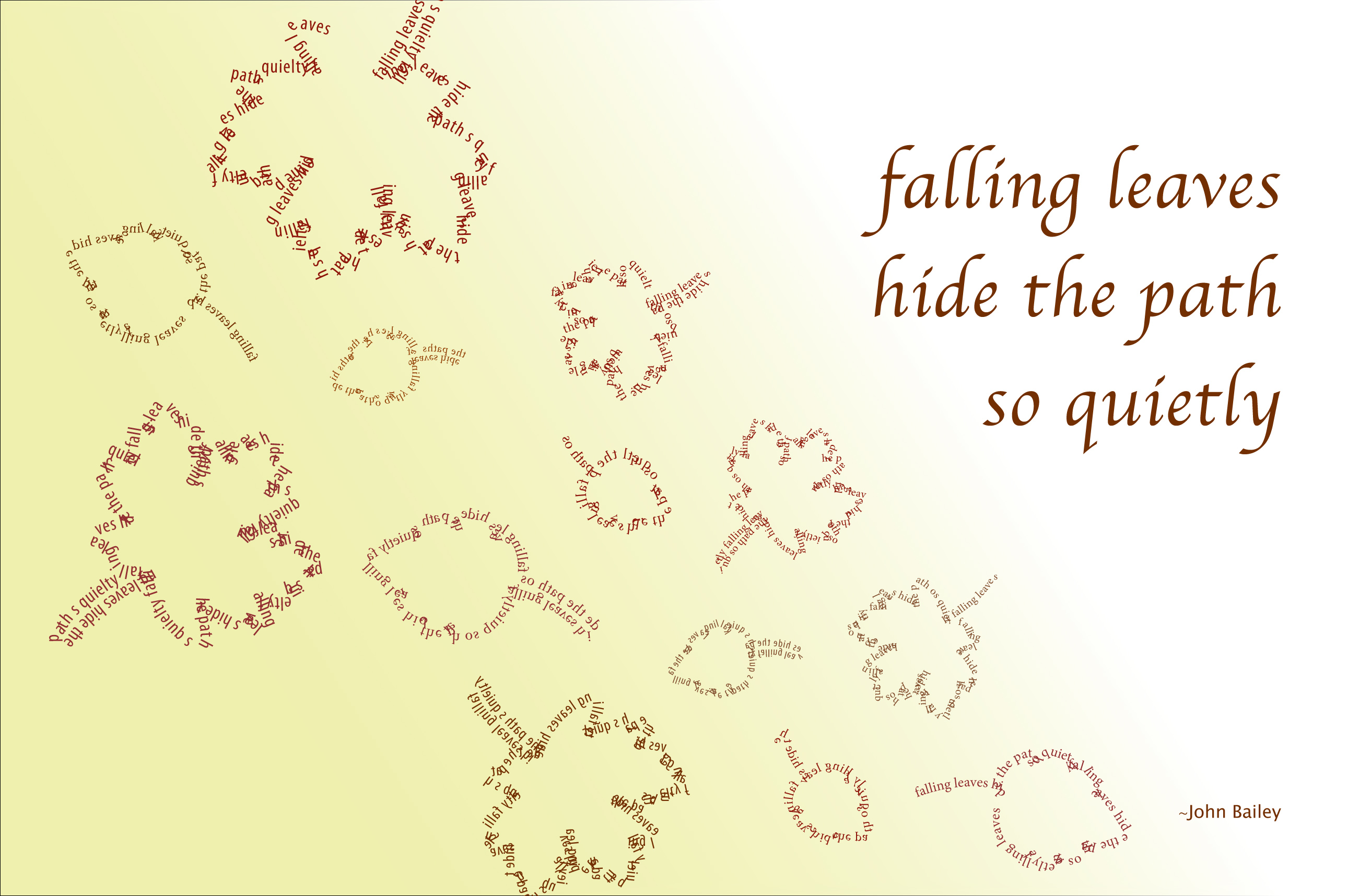
Moving on to the second design, which was done in a vertical format. I visualize a blanket of fallen leaves in various shapes and sizes being blown by a breeze forming a downward path. I’ve placed the quote on the right hand side of the layout, aligned right so it doesn’t interfere with the flow of the leaves. The silhouettes of the leaves are done in a san serif typeface repeating the quote creating an outer texture. The type size varies in height and I’ve adjusted the letter spacing to create contrast. The fading color palette is meant to be soft, giving harmony to the overall feel of the artwork.
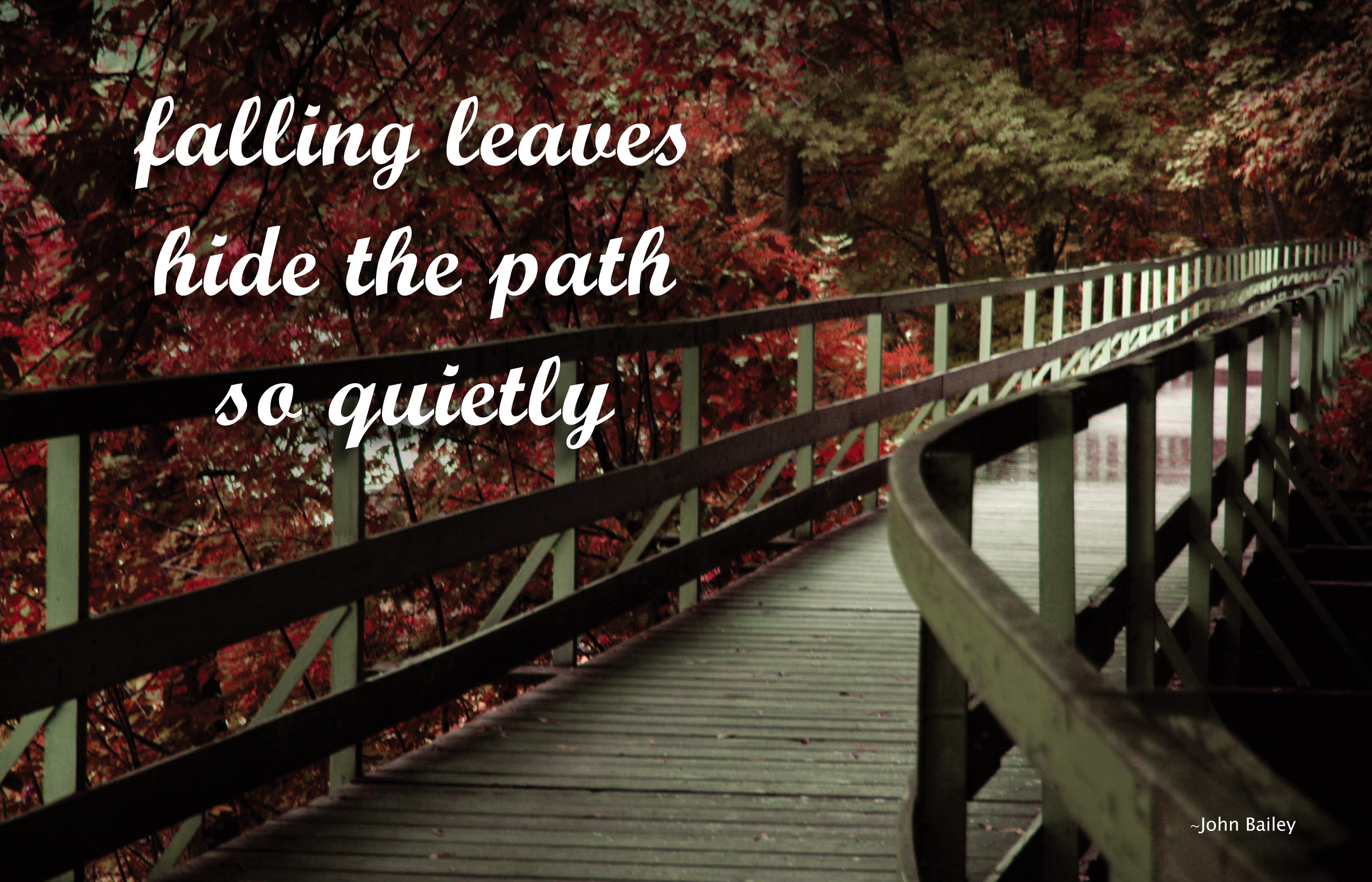
Keeping with the vertical format I decided to give this last design a post care feel. I chose a photo that I shot which captured the change of the season and displayed the colors of autumn. I pumped up the red in photoshop to make it the dominant color. I darkened the frame of the photography to create contrast to lead the eye to the lighter part of the bridge. The contrast between the shaded area and the light area shows that it is a sunny day. The quote is on the top left justified center in a script type to give the illusion of a handwritten note. The layout is simple, clean and to the point.

