About AIGA
As mentioned in the brochure of 365 Design Effectiveness 2011, AIGA is the professional association for design, a nonprofit organization dedicated to advancing design as a professional craft, strategic tool and vital cultural force. Founded in 1914, AIGA today serves ore than 22,000 members through 66 chapters and 200 student groups across the United States. AIGA stimulates thinking about design, demonstrates the value of design and empowers the success of designers at each stage of their careers. Learn more at aigo.org/About.
Now that you know a little about AIGA, allow me to share my views on three of the pieces of artwork I saw at the national design center in New York City.
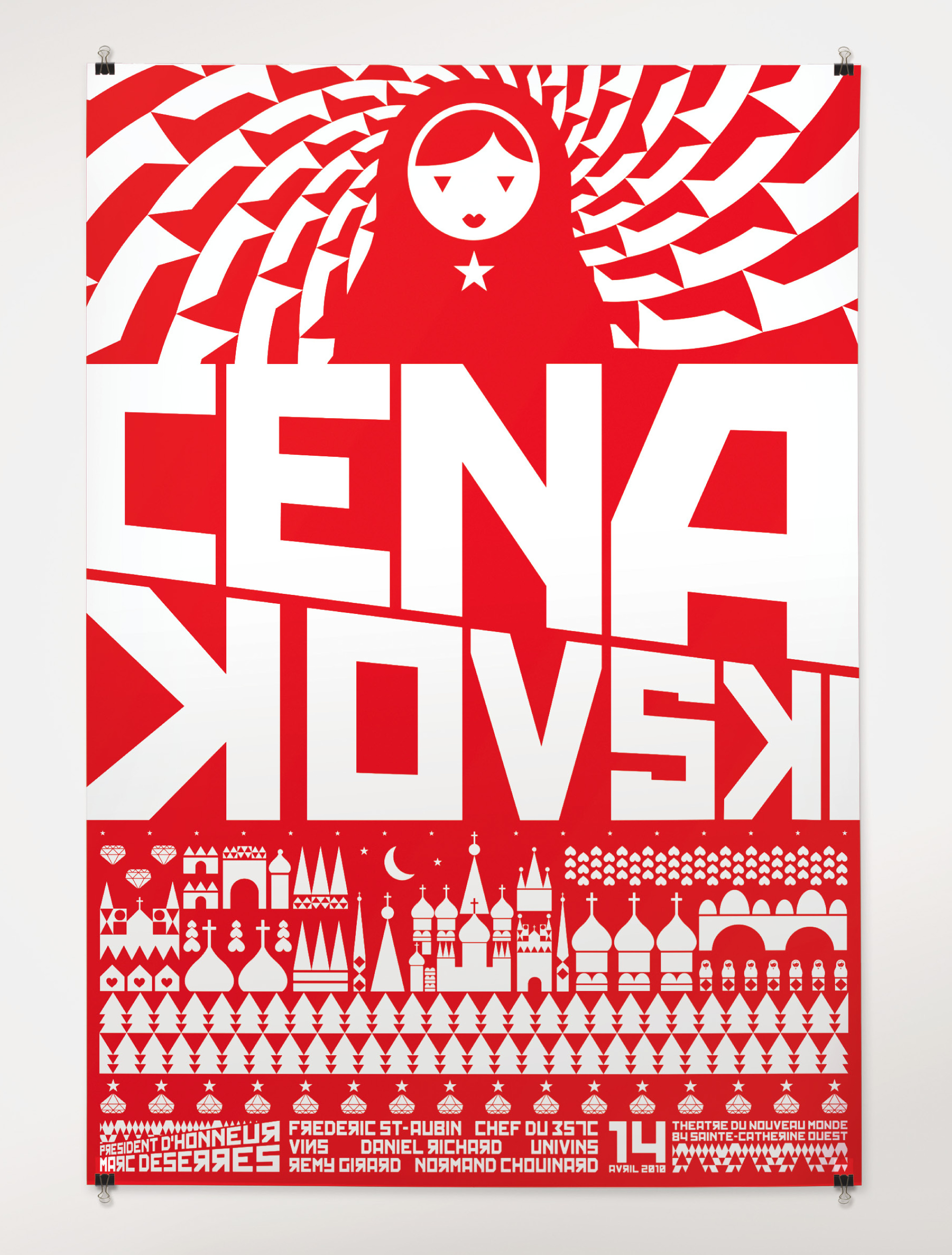
Collections: AIGA 365: Design Effectiveness (2011) Discipline: Promotional design and advertising Format: Posters Credits Design firm: Cossette/Identica, Montréal Creative directors: Michel De Lauw, Barbara Jacques Art director: Marc-André Rioux Designers: Isabelle Allard, Marc-André Rioux Illustrator: Marc-André Rioux Production artists: Nathalie Boucher, Daniel Cartier Copywriter: François Forget Project manager: Sylvie Giroux Client: Le Théâtre du Nouveau Monde
What drew my attention to this particular design was the representation of the nested doll created in geometric shapes with a white star centered on her chest. The overall fluorescent red and white color fills the poster. The design is a double-sided monochromatic poster, 27 x 39 inches, and layout in four horizontal parts. From top to bottom: the doll with a pattern backdrop, next a bold white capitalize text done in a san-serif font that is skewed, then Russian architecture similar to the Kremlin and last the events information. The use of the Russian symbols and font style is so effective and powerful at first glance. There is no question that this is a Russian theme.
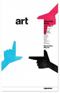
Collections: AIGA 365: Design Effectiveness (2011) Discipline: Promotional design and advertising Format: Posters Credits Design firm: Design Army, Washington, DC Creative directors: Jake Lefebure, Pum Lefebure Art director: Pum Lefebure Designer: Charles Calixto Printer: Fannon Fine Printing Client: Signature Theatre Company
When I first saw the hands on the poster creating a frame, it reminded me of how I was taught to see as an art student. I learned to view and isolate a particular part of an object or subject that I was painting, drawing or photographing. Placing attention to the specific area I wanted to focus on. The hands are colored in cyan, magenta and black three of the four ink colors used for printing; yellow is missing. The text “art” is done in black and in lower case san-serif font serving as a corner to the frame. The individual hands and the word “art” layout suggest a blank canvas left to our owned interpretation. The poster was created to promote a story revolving around three friends and how their views on life can change how they relate to each other. I find the design to successfully deliver the message, three different views with many possibilities.
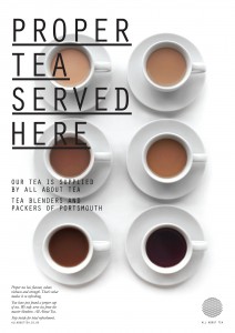
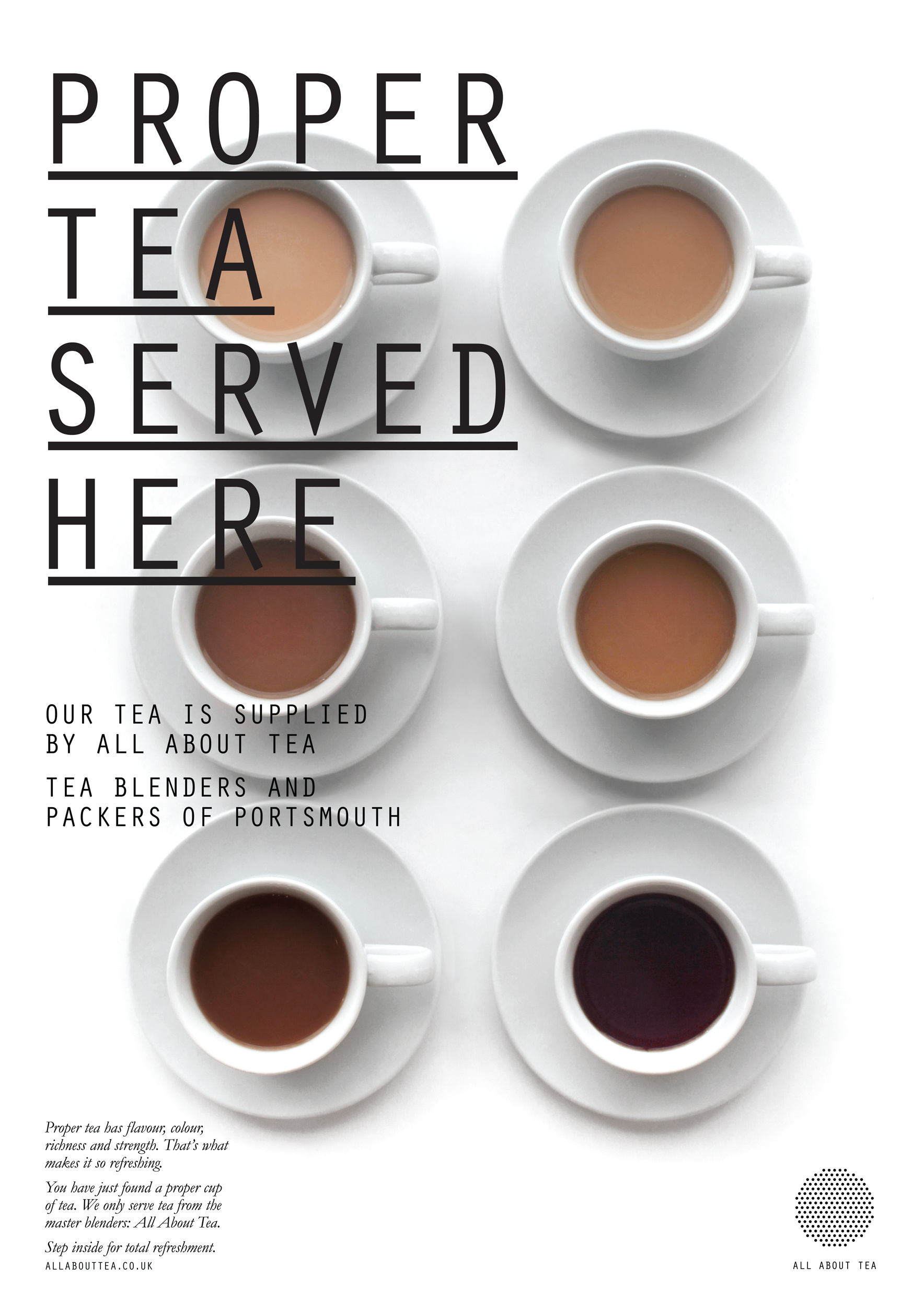
Collections: AIGA 365: Design Effectiveness (2011) Discipline: Brand and identity systems design Format: Brand and identity systems, Brand identity, Package, Label Credits Design firm: Moving Brands, San Francisco Creative director: Ben Wolstenholme Designer: Marian Chiao Project manager: Graves Englund Client: All About Tea
Being a coffee drinker the white cups caught my eye but there was something different in the shades of the liquids. Then I read the title, “Proper Tea Served Here”, I thought how clever and yet how appropriate. If you understand the art of making a good cup of tea, you can also understand there is a science to blending tea leafs. The message was loud and clear on the poster, we know what we’re doing and we do it right. From top to bottom: the light teas, the medium teas, the dark teas are all the different strength of a tealeaf. The way the tea liquid is being represented works well as a palette of colors, from a light to a dark. I love the way the cups are symmetrically displayed, all handles facing the same direction sitting on a white background. To add to the clean layout, a thin sans serif font was used. All text is flushed left, and non intrusive to the image. I think this is a well-done design.
 About AIGA