https://drive.google.com/file/d/14W07g1Bc41MyQVV55M9Ib9h6QfvpXBrH/view?usp=sharing
Author Archives: Rich
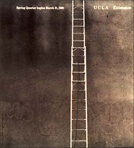
I think this cover is particularly interesting because it is very minimalistic. The ladder serves as a leading line to the top of the page where it says UCLA and it directs the readers’ eyes towards it. I also really like the dark and monochromatic theme of the image. Another interesting thing about this image is that the focal point is not in the middle, but slightly off to the right.
This image is very interesting because it has such a high contrast in the color. In this image the focal point is on the left rather than the right. All of the grey lines create a sense of verticality to the image. This can create the illusion that the lines are moving.
Welcome!
This is the first post on your Learning Blog. Edit or delete it, then start blogging!
The ePortfolio is both a Learning Blog and an Academic Career Portfolio. Use the Learning Blog to document your learning experiences and class assignments each semester. As time goes by, add content to the Academics and Career sections to show your department, graduate institutions, or future employers how well prepared you are for your chosen career.
NOTE: Remember to add appropriate Categories and Tags to your posts. This will help your professors and other visitors find the content they are looking for. The Categories “Coursework” and “Field Trips” and the Tags “OpenLab” and “City Tech” have already been applied to this post. Feel free to make changes!


