
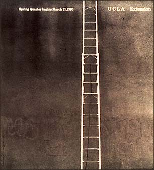
I think this cover is particularly interesting because it is very minimalistic. The ladder serves as a leading line to the top of the page where it says UCLA and it directs the readers’ eyes towards it. I also really like the dark and monochromatic theme of the image. Another interesting thing about this image is that the focal point is not in the middle, but slightly off to the right.
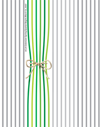
This image is very interesting because it has such a high contrast in the color. In this image the focal point is on the left rather than the right. All of the grey lines create a sense of verticality to the image. This can create the illusion that the lines are moving.

