
AIGA’s 365: Design Effectiveness (2011)
The American Institute of Graphic Arts (AIGA) holds an annual competition to judge the best graphic designs of the year. Books, boxes, bottles, and more, there is a wide range of media represented at this year’s 365 | Design Effectiveness exhibit. Beyond just aesthetic beauty, the distinguished panel of judges looks for how effective the piece was in meeting the client’s needs. Of the 135 works included, there were three that stood out to me as being especially effective.
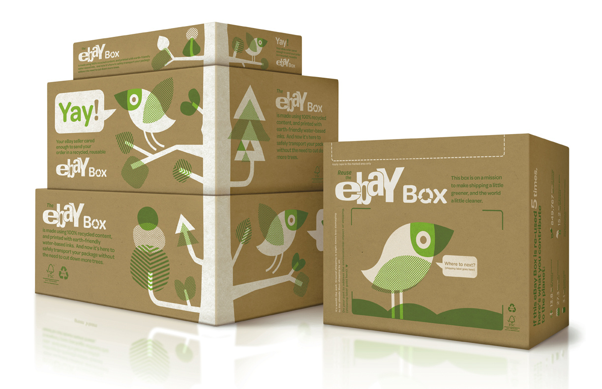
Reusable eBay boxes
The San Francisco based creative studio, Office, entered to AIGA their “green” boxes for the online marketplace company, eBay. The boxes, pictured here, were the work of two designers, Rob Alexander and Richard Perez. Made of recycled materials and printed with water-based ink, the boxes are constructed to minimize the amount of tape needed to seal them and maximize their ability to be reused as many as five times – all in an effort to minimize the effect on our environment.
The designers chose a sans serif typeface that pairs nicely with the iconic eBay logo. Naturally, the color green is used to signify the environmental-conscious purpose of the box, which is further illustrated by the tree and playful little bird. The repetition of shapes found in the leaves and the way the tree extends to seemingly link one box to the next completes the design like a finished jigsaw puzzle. The natural act of opening a package serves to draw the viewer’s eye to the rest of the design that lives inside the boxes. There are six fields of white that provide space for each recipient of the box to tell a little bit about where the box has been (check out how to track these boxes here) and what it has carried. The aspect of this design that really appealed to me is how they took something as simple as a cardboard box and made it both personal, interactive, and most importantly, better for the environment.
Another great design from this year’s exhibit is the Espolón Tequila bottle by Anastasia Laksmi and Tony Rastatter of Landor Associates, San Francisco. The client for this project was SKYY Spirits who recently acquired the Espolón distillery with the understanding that a great deal of marketing would need to take place throughout the United States for this formerly unknown brand.
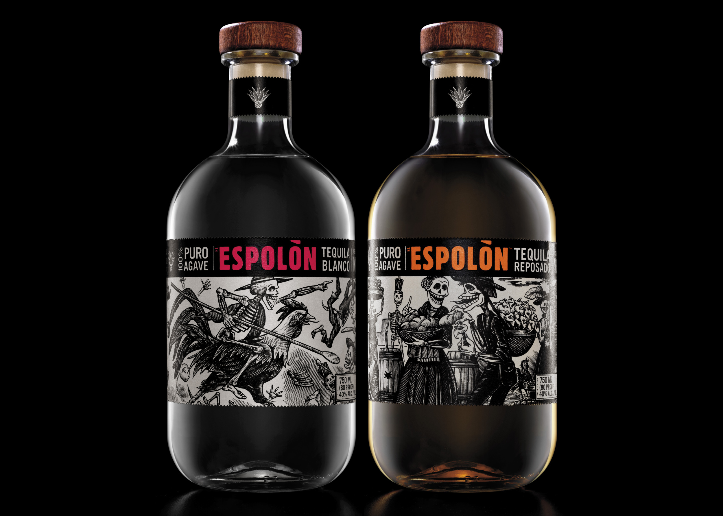
Espolón Tequila bottles
This design is essentially made up of the story that is told by its illustrations of life in Mexico during the 19th century. One of the great features of this concept is its ability to remain fresh by simply displaying a different aspect of life. The scenes are in black and white and depict the characters as skeletons. This is reminiscent of El Día de los Muertos (Day of the Dead) and other elements of Mexican culture. The iconic rooster, for example, named Ramón after the master distiller, appears on each bottle. He is a symbol of national pride, similar to the American Bald Eagle. The cultural communication and connection is what the designers were really striving for; to present the product as something real and personal.
The typography found on these labels is secondary to the images, but is nevertheless critical to the overall design. The bright colored brand name appears in stark contrast on the black background. A bold, sans serif font makes the word “Espolón” pop, giving it as much of the viewer’s attention as the highly detailed illustrations.
One final design that I enjoyed at this year’s AIGA 365 | Design Effectiveness exhibit is from the Levi’s, Go Forth marketing campaign. The campaign makes use of the slogan, “We are all workers,” as seen on the very unique billboard pictured here. The designer, Jessica Walsh, of Sagmeister Inc., NY, worked with production coordinator Atomic Props and Effects to create an image that proved very effective.
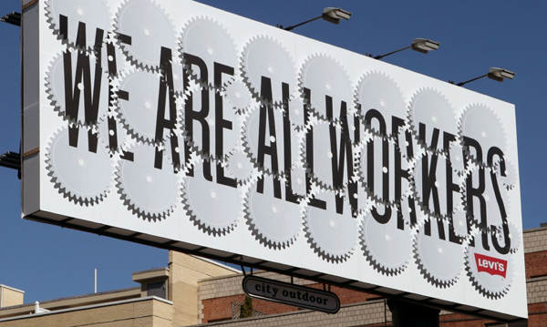
"We are all workers" billboard
The design itself is very simple; a single phrase in black, sans serif type on a plain white background. In relation to the iconic red Levi’s logo, the scale of the type is very large and dominates the space. What pushes this design to the next level is the use of twenty four cog wheels that rotate every twenty seconds to reveal and hide the message. The repetition of the cogs as well as their rotating cycle is almost mesmerizing. When seen from the street, it is not the message that grabs the viewer’s attention, rather its unusual quality. It isn’t until the cycle is completed that the message is delivered, but at that point the billboard has the potential customer’s complete attention. That quality of the design, its ability to immediately capture a viewer’s complete attention is what makes this such a successful work.

