
Visual Quotation
For this assignment we were asked to choose a quotation and create three designs that would enhance its meaning. I decided to use a saying that is credited to Lily Tomlin, “The road to success is always under construction.” This quote appeals to me because of my construction background and the fact that I am constantly working toward a goal. Lily Tomlin is a Tony, Emmy and Grammy Award winner, as well as an Academy Award nominee. As such, she is clearly a person who knows a thing or two about the road to success. Below are three concepts I developed in a vain effort to visually convey the quotation.

The first concept I came up with was to make use of a photo depicting road construction barrels extending into the distance and out of focus. The image conveyed the idea of a road and construction, but also that as we look to the future, our sight of what’s out there becomes unclear. Originally, I left the photo unaltered and simply added the quote using a script typeface. To make the design more interesting, I used Photoshop to add a “cutout” effect, adjusted the colors, and used a text that appears more hand written. I have been playing with other artistic effects on this photo, but decided to submit this particular example.
Here is an earlier draft of the first design: Construction Barrels Early Draft
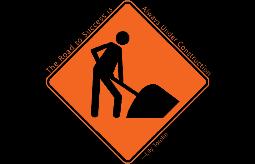
For my second design, I chose the very common image of a road work sign in orange and black. The idea of construction is conveyed by the black figure with shovel in hand. To maintain simplicity, I left the background a solid field of black. The quote runs along the top two sides of the diamond-shaped sign in an orange sans serif typeface. I had considered putting the text inside the sign to give it an enclosed feeling,as though the whole concept could be enclosed within the actual sign, but decided against it.
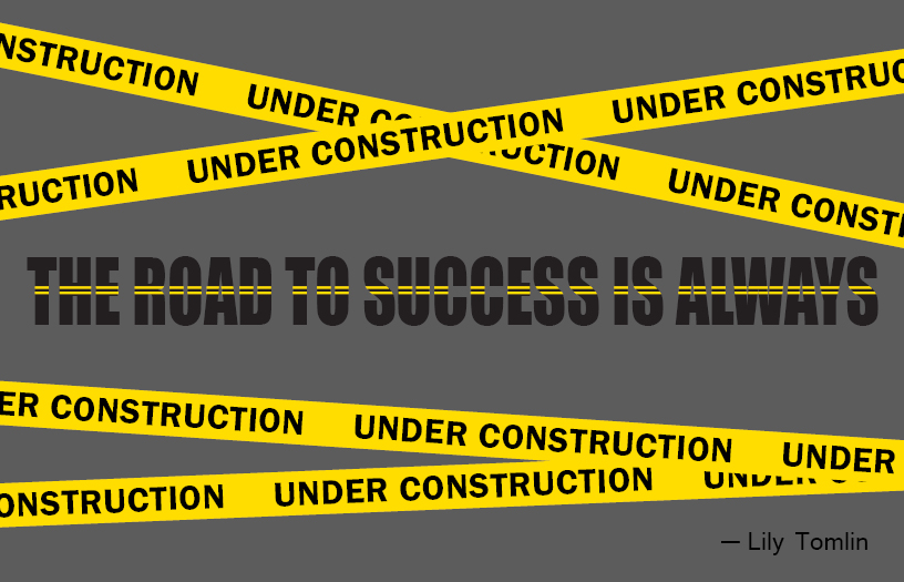
My third design is primarily typographical. I decided to use a sans serif, block-like font in black for the first part of the quote. I added two yellow lines to give the text the appearance of being a road. Above and below the “road” is “construction tape” that completes the quotation. The background is a dark gray that makes the yellow lines pop out. My original idea was to transform “UNDER CONSTRUCTION” into something that looked like a construction barrier by adjusting the angle and spacing of the letters. Ultimately, I decided that the current design was more clear.
Here is one of the earlier drafts of the third design: Quote Text Early Draft

