Design Project Guide
Design Journal entry #27
Process color:
The most common method of achieving color in printing is referred to as CMYK, four–color process, 4/c process or even just process. To reproduce a color image, a file is separated into four different colors: Cyan (C), Magenta (M), Yellow (Y) and Black (K).
During separation, screen tints comprised of small dots are applied at different angles to each of the four colors. The screened separations are then transferred to four different printing plates, one for each color, and run on a printing press with one color overprinting the next. The composite image fools the naked eye with the illusion of continuous tone.
Source: https://www.pantone.com/spot-vs-process-color
spot color:
Source: https://www.pantone.com/spot-vs-process-color
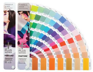
Colors created without screens or dots, such as those found in the PANTONE MATCHING SYSTEM®, are referred to in the industry as spot or solid colors. From a palette of 18 basic colors, each of the spot colors in the PANTONE MATCHING SYSTEM is mixed according to its own unique ink mixing formula developed by Pantone. You probably mixed yellow and blue paint to get green in your youth. Creating a PANTONE Spot Color is similar in concept, but with the added need for precision.The precision begins with the printing ink manufacturers who are licensed by Pantone to manufacture inks for mixing PANTONE MATCHING SYSTEM Colors. To retain their license, they must annually submit samples of the 18 basic colors for approval by Pantone. Printers can then order the colors by number or mix it themselves according to the ink mixing formula in a PANTONE® FORMULA GUIDE. A PANTONE Chip supplied with the ink and/or job ensures that the printer achieves the color desired by the customer.

hex triplets:
Source:https://www.techopedia.com/definition/29788/color-hex-code
Definition – What does Color Hex Code mean?
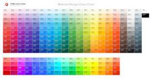
A color hex code is a way of specifying color using hexadecimal values. The code itself is a hex triplet, which represents three separate values that specify the levels of the component colors. The code starts with a pound sign (#) and is followed by six hex values or three hex value pairs (for example, #AFD645). The code is generally associated with HTML and websites, viewed on a screen, and as such the hex value pairs refer to the RGB color space.
Techopedia explains Color Hex Code
A color hex code describes the composition of a certain color in a specific color space, usually RGB. In the case of RGB, the first value pair refers to red, the second to green and the third to blue, with decimal values ranging from 0 to 255, or in hexadecimal 0 to FF (#RRGGBB). RGB is an additive color space, meaning that when all three colors are put together the result is white (white light). For example, the color hex code for white is #FFFFFF or in decimal 255, 255, 255; and at the opposite end is black #000000. Yellow is made up of red and green, so its hex code is #FFFF00. Other color spaces using hex codes include:
- HSL
- HSV
- CMYK
- Hunter Lab
- CIE-Lab
The codes can also be represented in a three-digit code to represent double values in CSS. For example, #FFFFFF can be abbreviated as #FFF and #00AA55 as #0A5. This is defined in the CSS specifications, so it only works under the “<style >” tag when used within HTML. The notation reduces the palette to 4096 colors (12 bits) as opposed to 16,777,216 colors (24 bits) for the six-digit coding
color inventory:
Design Journal #18 Google Images
Proportion: Proportion refers to how one part of an object relates to whole object in size, such as the size of an arm in relation to the rest of the body.
Informal: It is similar to scale.
Source:https://www.reference.com/art-literature/proportion-art-da87fb5057fc8fd2
rule of thirds: The rule of thirds states that if you divide any composition into thirds, vertically and horizontally, then place the key elements of your image either along these lines or at the junctions of them, you’ll achieve a more pleasing arrangement and more interesting and dynamic compositions.
Informal: Guides to help center the focus of a composition.
Source:http://www.creativebloq.com/art/how-use-rule-thirds-art-21619159
Golden Rule:
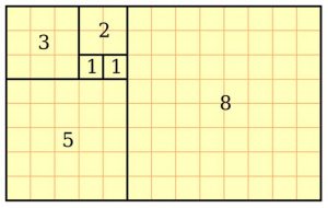
Closely related to the Fibonacci Sequence (which you may remember from either your school mathematics lessons or Dan Brown’s novel The Da Vinci Code), the Golden Ratio describes the perfectly symmetrical relationship between two proportions.
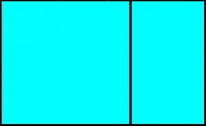
Approximately equal to a 1:1.61 ratio, the Golden Ratio can be illustrated using a Golden Rectangle: a large rectangle consisting of a square (with sides equal in length to the shortest length of the rectangle) and a smaller rectangle.
If you remove this square from the rectangle, you’ll be left with another, smaller Golden Rectangle. This could continue infinitely, like Fibonacci numbers – which work in reverse. (Adding a square equal to the length of the longest side of the rectangle gets you increasingly closer to a Golden Rectangle and the Golden Ratio.)
Informal: Geometric compositions leading to infinite repetition in shape.
Design Journal 17 & 19: 3 Companies In NYC
Links: 1:http://sms.playstation.com/careers/163/senior-vfx-artist/
2:http://www.insomniacgames.com/careers/job-openings/
3: https://www.fiverr.com/categories/graphics-design/create-cartoon-caricatures?source=gallery-listing&page=1&filter=rating
Why? These are my top three choices because growing up i was exposed to the art styles and felt an appreciation for it. I always wanted to draw as a career. So when ever I saw other peoples art and admired their work, I made a mental note of their techniques. I say to my self one day ill be at that level. The first 2 companies have been with me growing up and i play a lot of their games. The last is more of a place where i see my art not being constricted.
Design Journal #17 Google Images
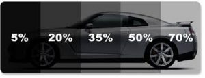
Low key: In a low-key painting, the majority of values are darker then middle gray. Light values are saved as accents to highlight the important elements in the painting. Low-key paintings feel mysterious and contemplative.
high key:In a high-key painting, the majority of values are in the lighter than middle gray. Then, dark accents are used to lead the eye around the important areas of the painting. High-key paintings feel light and airy.
Source:https://spencerhallam.blogspot.com/2011/02/low-key-vs-high-key-paintings.html
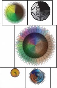
narrow range and broad range in regards to value: Prismatic narrow/broad range value, the top representing a range of narrow prismatic color value while the bottom represents patterns of a more broad range of prismatic color.
Source:https://openlab.citytech.cuny.edu/dcintron-eportfolio/2013/11/11/prismatic-narrowbroad-range-value/
texture density: gradient is the distortion in size which closer objects have compared to objects farther away. It also involves groups of objects appearing denser as they move farther away. Also could be explained by noticing a certain amount of detail depending on how close something is, giving a sense of depth perception.
Source: https://en.wikipedia.org/wiki/Texture_gradient
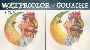
gouache ɡwäSH,ɡo͞oˈäSH :a method of painting using opaque pigments ground in water and thickened with a glue like substance
.
Source: Google.com
Cooper Hewitt Images
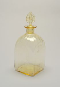
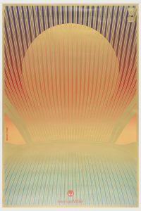
I chose these three images because their transparency is apparent in the images. Glass is naturally a transparent object, and the fact that the glass also has color gives you a sense of transparency in the color yellow. As for the art piece of the sun that gives you a sense of transparency as if your looking through a mesh object or window to see the sunset. I think its very effective in the sense it tricks the mind in to thinking its looking through something.
Design Journal #16 Google Images
Tonal progression: A tonal progression is a succession of color mixtures proceeding from dark to light. In addition to value change, tonal progressions also vary in hue and chromatic intensity as well.
Source:http://anthonyryder.fineartworld.com/displayCustomPageCtl.php?custPageID=318
Shade:A shade is a hue or color with black (or any other dark color) mixed into it. This creates a darker version or a darker tone of it. You can have more than one shade of a color, depending on how much has been mixed into it. The opposite to a shade is a tint.
Source:https://www.thoughtco.com/definition-of-shade-2577728
Tint:In color theory, a tint is the mixture of a color with white, which increases lightness.
Source:https://en.wikipedia.org/wiki/Tints_and_shades
Tone:Tone is a quality of color. It has to do with whether or not a color is warm or cold, bright or dull, light or dim and pure.
Source:https://www.thoughtco.com/tone-definition-in-art-182471
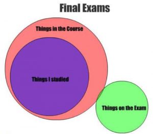
Venn Diagram:1940-45; named after John Venn (1834-1923), English logician, a diagram that uses circles to represent sets and their relationships.

