
The keep new yorkers safe ad clearly has a hierarchy defined by text size.

This one has a hierarchy defined by text size too. Just before the very bottom there is also a picture added to the hierarchy.
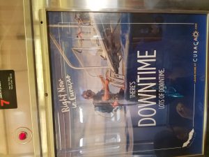
This one is similar to the one before it but the picture is above most the text in this ad.

