POSTCARDS
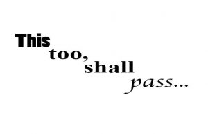
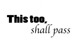
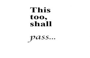
These were my postcards with a quote that I visually enhanced. I wear a bracelet that has this quote on it on my right hand. I never take it off and the quote means a lot to me. I first learned it a couple years ago and used it to help me through hard times in my life.
I tried to show the meaning of the quote by the way I visually enhanced it. The script like font helps convey gentle passing and ease while the bolder text shows the hard times and feelings that will eventually pass. I also always put the “shall pass” portion of the text lower then the start of the quote to help show passing.
Rami Boukabache
LOGO Design
Starbucks LOGO
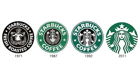
Starbucks is a coffee store that has grown to become one of the most well known brands of the united states. Inside their circular logo rests a woman with long flowing hair. But there was something I hadn’t noticed when i first saw the logo. It actually took me some time before i finally noticed that the woman in the logo was actually a twin tailed mermaid. As if the idea of a twin tailed mermaid isn’t strange enough her pose make it weirder. She is sitting down and holding up each of her tails in each of her hands. The name of the mermaid is “the Siren”.
The logo has so far gone through 4 different versions over the past 40 years, but something that always remained the same was the heart of the logo, “the Siren”. The original was created in 1971. It was then revised for the first time in 1987. Then again in 1992, and then once more for the last time in 2011. Something i have noticed about the slow progression of the logo is that as it has been revised its made so that you see less details of the mermaid which makes it less clear about what exactly the logo actually is.
A very common trend in logos and just in overall design these days is simplifying everything and using simplistic designs with less details and starbucks is clearly following that trend. I personally find the newest logo the most appealing. In the latest logo they also have removed the words from the logo. Them doing this shows that starbucks has clearly grown to become such a large brand that they don’t even need to have their name near their logo for people to know what it is.
The first starbucks logo was made in 1971 and has the words ‘STARBUCKS COFFEE TEA SPICES” in a circle around the center. In the center there was the iconic twin tailed mermaid in detail. Unlike the newer logos it showed her entire body while the newer logos cropped most of her tails out. It was also made entirely using the colors white and brown.
The second logo was made in 1987. They changed the words that surround the Siren to “STARBUCKS COFFEE”. The mermaid also looks very different. She still has her signature tails but she is a much more simplified illustration. Lastly they completely changed the colors that make up the logo from brown and white to green, black, and white.
In 1992 they became a publicly traded company and changed their logo again. This time is was a very subtle change. Instead of showing the mermaids full body they zoomed in on her and completely covered her crotch and belly button along with covering the majority of her tails.
The last change they made was in 2011 which was their 40 year anniversary. They completely removed the words in their logo making it just a green circle with the mermaid illustration done in white. I believe they took away the words “STARBUCKS COFFEE” from their logo because they have become such a massive company that they are identifiable from just their iconic mermaid the Siren.
 Citations:
http://www.starbucks.com/blog/so-who-is-the-siren
http://www.adweek.com/news/advertising-branding/how-topless-mermaid-made-starbucks-cup-icon-160396
http://famouslogos.net/starbucks-logo/
http://www.logodesignlove.com/starbucks-logo-evolution
Link to word doc:

