In both videos, their conversations included information about the movie and JJ Abrams. But the two videos show us different content and information.
The feeling in the first video was that their conversation was fast, and J Abrams also answered the host ’s questions quickly. The focus of this video is mainly to talk about the problems in the movie.
In the second video, I think they discuss more professional issues. J Abrams uses his own case and professional perspective to tell the answers to those questions. In the content of their chat, I grabbed light and dark, elements and postproduction. JJ Abrams also said that the focus should be on thinking about the deep meaning of the film rather than the plot of the story.
In Apple’s advertisements, the entire advertisement uses a lot of colors, which makes me think that the advertisements they use are relatively bright. When those colors are beating, they are complementary colors. The combination of music and color is wonderful.
In James Bond’s advertisement, the way it expresses color is represented by dots. In this advertisement, I think it is more expressed in the same color system, such as red and brown put together, yellow and orange put together. Various colors follow the rhythm of the background music, and the overall feeling really comfortable.
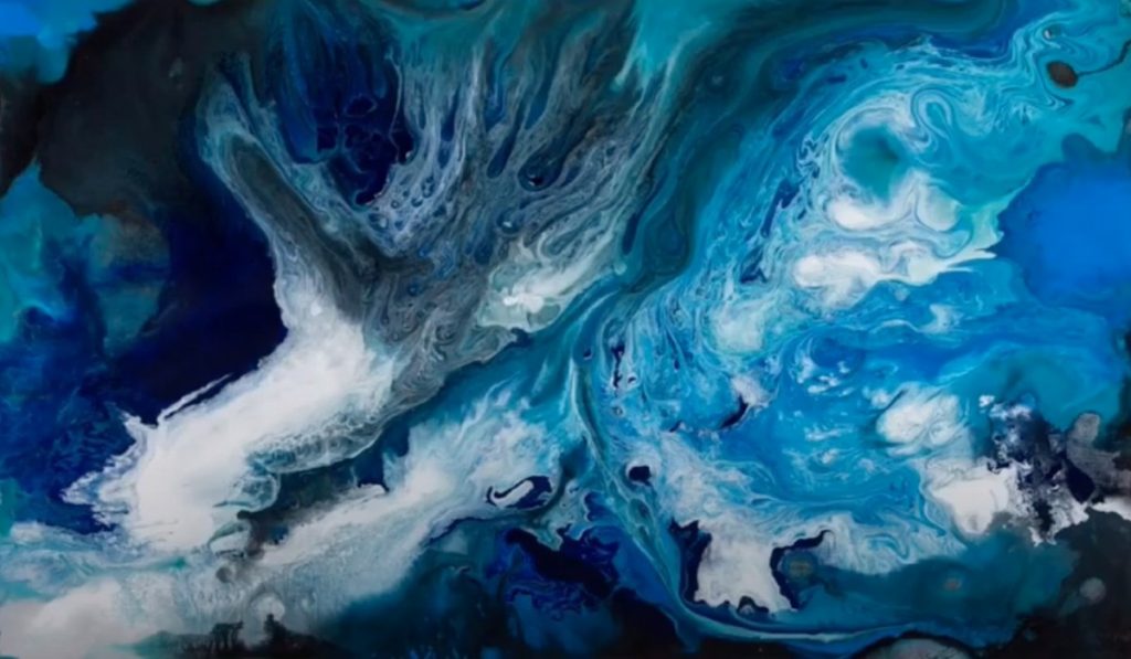
Today we visited the virtual “Blue” exhibition at Nassau County Museum of Art. I really like Cao Jun’s paintings. His blue painting is very abstract. The whole work is dizzy with different blues. I think the painting looks like a sea, and the white part is like a spray. The dark blue part seems to be in the deep ocean, it looks mysterious. The light blue part on the right makes me want to enter there. There is a special attraction.
This work is from Cooper Hewitt on Fifth Avenue.
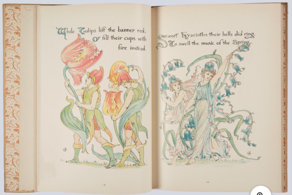
The name of the first work is A Masque of Flowers. It was written by Walter Crane. It is dated 1902. This book mainly tells the story of the goddess Flora awakening all the flowers in the garden. When I saw this page, I liked the color contrast between the two pages. On the left is a warm color, on the right is a cool color. On the left, I think two lively men are enjoying the parade. On the right are two noble women enjoying the baptism of flowers. In addition, their details are great. The green on the men’s clothes on the left is complementary to the red of the flowers. The women’s clothes on the right have blue flowers and green vines of the same color.
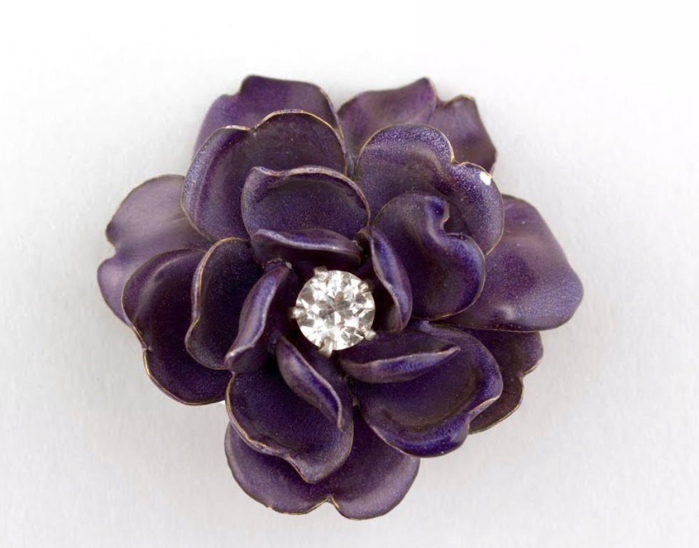
This brooch is made by Tiffany. It was produced around 1889–1890, it is the Gift of Isabel Shults. When I first saw this brooch, I was attracted to it. It is the shape of a purple flower. What surprises me most is that there is a diamond in the middle. The brooch expresses a mysterious atmosphere in purple. Each petal has a golden edging. The purple color of the brooch is the color of the Milky Way. I think this brooch should be used as a reference for jewelry design for those who specialize in jewelry design. Which girl doesn’t like such a charming brooch?
Jin Daiqiang, born in Panyu, Guangdong in 1942, is an international graphic design master, founder of the Jin Daiqiang Design Award, and AGI member of the International Graphic Design Alliance. Jin Daiqiang’s works have won numerous awards in China and overseas. He is the first Chinese to be listed in the Who’s Who of Graphic Designers in the World, and the United Kingdom was selected as an outstanding artist and designer of the 20th century. Jin Daiqiang’s artworks are often exhibited overseas, and he has planned and held so many personal exhibitions in the United Kingdom, the United States, Germany, Finland, Japan, South Korea, Singapore, and China.
Jin Daiqiang emphasizes the professionalism of the designer. He believes that beautiful design is not necessarily good design. The best designs are those suitable for enterprises and products. Jin Daiqiang is the creative director of Jin and Liu Design Consultants. Jin and Liu Design Consultants is a first-class design company in Hong Kong. He has designed packaging for countless companies. The emblem of the Bank of China designed by Jin in the early 1980s is still regarded as a model.
The design of the Bank of China embodies the Chinese characteristics to bring people a simple feeling, but also has a modern atmosphere due to the simplification of graphic elements and shows extremely strong Chinese cultural characteristics. The whole logo is shaped like ancient coins, simplified to form the current bank logo. At the same time, there are many good meanings in this sign. The copper coin hole in the sign and the vertical symmetrical vertical line show that the Chinese word “中” represents China; the overall circular outline of the sign represents the meaning of the earth, meaning the Bank of China It is an international bank facing the world. This design won the American Communication Art (CA) Yearbook Design Award.
Ink painting is regarded as a traditional painting in China, which is a representative of Chinese painting. Therefore, ink painting has a great influence on the Chinese people. Jin Daiqiang advocates integrating the essence of Chinese traditional culture into the concept of Western design. Jin Daiqiang emphasized that this integration is not a simple addition, but a fusion of a profound understanding of Chinese culture.
This is the poster of Jin Daiqiang’s opening exhibition at the East-West Gallery in Germany.
He painted Tai Chi figures with ink and pastel. Half of the ink and pastel have a certain contrast, but emphasized the differences but coordinated to form a whole. Reflects the theme of the fusion of East and West, and injects new ideas into the ancient images.
The source of creation is Chinese traditional culture. Jin Daiqiang believes that any designer or artist must not forget his roots. Hong Kong is a part of China, and he must find his roots in Chinese culture.
(Beijing 2008 Olympic poster)
In 1997, when Hong Kong returned to China, the famous French silverware Quentin hoped that Mr. Jin Daiqiang specially designed a set of souvenirs to record this historical moment. The idea of the work expresses the meaning of mother and child, heart to heart, holding hands. Borrowing the Buddhist aesthetics to shape two large and one small hand, synthesizing the shape of holding hands, separating the two hands into a beautiful small container. The work is limited to 30 sets in the world, which is extremely valuable for collectors and is very popular among collectors. It was sold out before Hong Kong returned to China in 1997.
Jin Daiqiang’s works use many ink painting as a design element, which later turns into a realistic style. Most of the materials come from Chinese landscapes. His works are a combination of the practicality and artistry of the text and refer to the combination of calligraphy. Which integrates design and art, landscape and calligraphy. From a distance, it is the cursive script font in calligraphy. From a close view, it is the landscape of peaks and turns. Jin Daiqiang said that he has always loved the mountains and the water of nature. As early as 1981, he has traveled to Huangshan to appreciate the clouds and mists of Huangshan. Later, he also went to the snow-capped mountains, Niagara Falls, and the Grand Canyon in Europe. Waiting, he always loves the wonders of nature, landscape, stones and so on. His work does not show a certain mountain clearly, but writes the scene of nature in his heart in the painting, and reflects it in an abstract way.
Gucci has a long and interesting history. Founded in Florence in 1921, Gucci is famous for its creation, So it is famous in Italy. About the end of the 19th century, the founder Guccio Gucci began to be in contact with fashion. Like many brands, Gucci also experienced a period of low tide. With the help of designer Tom Ford and president Domenico De Sole, they worked hard to bring Gucci back to the international peak. As early as 1906, Guccio Gucci started to make fine leather goods with his name(GUCCI). Because of their unique design ideas and high-quality leather, Gucci became very popular. In just a few years, the first store attracted customers from different countries. Gucci relied on this huge success, Guccio Gucci opened its first branch in Rome in 1938.
By the middle of the 20th century, Gucci had become a mature luxury goods company. But in a time when Logo consciousness was still weak, Gucci had no brand logo. Until Aldo who was the son of Guccio, joined the family business, He used his father’s initials in an interlocking design. so the cross double “G” style was born. Because of the ambiguity of the UK’s intellectual property laws, Gucci’s logo failed to renew in the UK in 2012.
The Gucci logo was not immediately recognized as two letters put together. As an aesthetic appeal, this design goes beyond the meaning of the two capital letters G. Nevertheless, these two Gs are still important tribute. No doubt this is what Aldo Gucci thought of when designing the logo to include his father’s initials.
The Gucci logo is usually displayed in gold as a tribute to the luxury and luxury of the Gucci brand. The logo also has a Gucci name clearly spelled above the double G logo, ensuring a reorganization of the logo and showing the importance of the brand name. Gucci’s style elements also include green and red canvas. In addition to gold, this is the most classic representative of Gucci. Even if there is no obvious logo on Gucci products, when people see green and red, they can quickly identify that it is a Gucci product.
Since 2015, Gucci’s creative director Alessandro Michele and president and CEO Marco Bizzarri have been working hard to contribute to the definition of Gucci. From the autumn and winter 2015 women’s clothing series, GUCCI has entered the era of Alessandro Michele. This brand, which has maintained its decades of saddles and double G patterns, has finally ushered in a different moment. Alessandro Michele has never failed in every series he has joined. Because of the design of Alessandro Michele, the brand has won countless praises.
This overlapping double “G” logo appeared in 2016, and Gucci uses such a logo only on various items. “The transformation of the brand’s classic double G logo from the original reverse design to the “overlapping” version may symbolize that Gucci will officially enter a new era and further serve the intellectual style and retroism advocated by Gucci.” “The old “double G” logo is a two-letter “G” deformation that tends to be a positive circle, overlapping each other in a centrally symmetrical manner, creating a positive and negative space. The latest “Double G” is also an overlapping “Double G”, but the arrangement has changed from symmetrical to repetitive, creating a sense of rhythm.” It first appeared in the GG Marmont series released in 2016. When it was launched, it became a hit and has almost become a “sub-LOGO” level.
My name is Qing Zhang and I am studying at the New York City College of Technology. My major is communication design. Before choosing this major, I was curious about this major and wanted to challenge myself to try to become a designer. I haven’t studied high school in the United States. In fact, I didn’t like studying in China so my English foundation is very poor. On the other hand, I also hope that this major will improve my English.
I didn’t have any art foundation before I chose this major. So when I started to take a professional course, it was difficult for me to communicate with other people, and it was difficult for me to learn to draw. I don’t have a great goal. I hope that I can learn every lesson I have and that every lesson is rewarding. When I can successfully complete all the courses, I will try to work towards a designer.
We had to pick a quote and create a 5.7 by 8.5 Postcard that represented our quote. In the movie Dark Night, The Joker said “Why so serious?” From the previous story about Joker’s own scar history, we know that Joker is not an orphan, has a father and a mother, a complete family, but a rather unfortunate family. The father is an alcoholic plus a pervert, and he abuses his mother and him all day long. It is this family that has created Joker’s dark and ugly character. Joker spent his gray childhood in extreme fear, leaving him never able Abrasion marks (scars on the mouth).
Why is a boy with an extremely distorted psychology so serious?
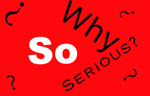
concept 1
1st draft
I used the red background for this concept. When Joker spoke this word with his bright red mouth. In this concept, I want “so” to be the focus, so I used white and bold fonts as the focus. I think Joker was more scornful when he said this, so I used a lot of question marks in this concept.
2nd draft
In my second draft, I changed the typeface to the same. I also cut out part of the word.
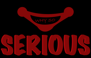
final draft
This is my revised concept. I cut out a part of words. Because joker’s character is incomplete, I hope this concept also looks incomplete. I also changed the question mark to white to highlight the focus of “so”.
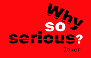
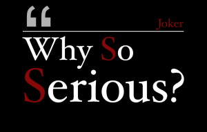
My second design was to make a Joker’s mouth, and the background was black, and it turned into sharp contrast with the red. I think red represents blood, and there were a lot of killings in the movie, so this design means that Joker speaks very seriously.
2nd draft
In this concept, I focused on “serious”. I removed joker’s mouth. I didn’t turn the whole “serious” word into red, only the letter “s” is shown in red. I think this looks serious with a sense of non-seriousness.
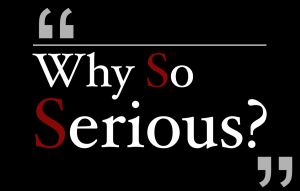
final draft
In my final draft, I removed one of the double quote mark. I mean that there is only one double quote mark. I want to make this sentence not serious enough.
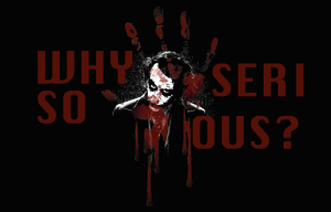
My third design was using pictures of Joker. The red palm and text wanted to express that it was a bloody war. Joker’s expression was indifferent, no one could give him love, he just wanted to ruin the world. In this concept, I want to emphasize blood
2nd draft
This is the second time I am modifying this concept. I just changed the font, I still want to express the concept of “blood”.
final draft
In my third concept, I removed the bloody palm and I kept the image of the Joker. But I changed the overall style. In last concept, I want to express the feeling of blood. But in this concept, I make it look messy. I used a black background and Joker images. I want everyone to feel very dark at first. The second feeling should be messy. Because joker itself is very distorted. So I used a lot of lines to echo his heart.


 (Beijing 2008 Olympic poster)

 Mourning Paul. RAND (1997)
 Caring for nature (1989)