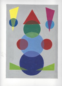
For this Project, I had to create a piece by choosing two colors and mixing them to create a middle mixture, where placing that middle mixture in between the two colors would create an illusion of transparency. For example, if I would place a cyan color transparent plate half way over a green color plate, looking down it would make the green color lighter, which is what this project represents. This Project was very interesting because creating those three colors and actually putting it on the paper made even more amazing result then expected.
I didn’t have many challenges with this project because I had already worked with color previously and had a basic understanding of what I had to do to get the desired hue or tone. The only challenge that I had with this project was picking the right amount of paint to mix, because if you use more of the darker color then the lighter color, the resulting color will be darker then expected, and unrealistic for the theme. Working on this project, I had a good practice with color and I also learned more about color then I already knew.
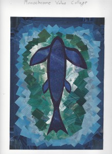
For this project, I had to pick a color and find adds made using that chroma, which I would then use to create a collage of my choice. Flipping through magazines, I saw many adds made with different tones of the blue that I chose, so looking at all the blue adds, most of them represented liquids so I chose to create a fish in blue sea. Starting from the outer frame and the sea, I tried to create flow in color and avoid making a sudden shift between colors, which was not so successful but still made the final piece presentable.
I had more challenges with this project because I had never done a monochrome collage before. I had a hard time putting together all the pieces in the right order, trying to make a gradation from dark to light. After finishing the project, I realized that putting green after the dark blue would of created a better gradation and made it a better piece.
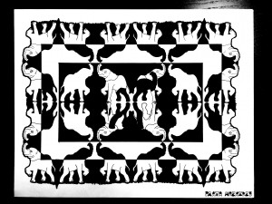
For this project, I had to pick an organic object or an organism as a theme, find a photo of it and then make an illustration drawing and image related graphic, which I would then use to make a piece representing symmetry. After choosing an elephant as my theme, I was inspired by the examples that were shown in class by professor, and chose to create symmetrical duplicates of an elephant all over the page. To make it more interesting, I chose to create white and black rectangles from center to out, painting parts of elephants in a way to outline the edges of rectangles.
I didn’t have much of the challenges with this project because I designed it digitally, which enabled me to change things around at ease, and then copied it to a Bristol paper using a printout of the piece and a light table. The process of shading the copied outline was very interesting, because as I shaded rectangles, I discovered new elements that could be added to the piece. I added a shadow of an elephant in the center by painting inside the outlines of the middle four elephants, and changed the outer outline to wavy line instead of the original solid line.


