
A Video Project About A Day Of My Life In 5 Minutes
https://www.youtube.com/watch?v=fxmIZLhYbZw
A Logo Research
Starbucks Logo Evolution
Starbucks is an American, multibillion-dollar corporation, with thousands of coffee shop locations around the world. Starbucks was founded in 1971, in Seattle, Washington. It has become very popular for the variety of coffee options and its delightful taste. There are millions of people around the world who start their mornings not with just a coffee, but Starbucks coffee. The famous logo that defines Starbucks has changed several times since it’s development in 1971. In this essay I will talk about the history of the logo, the thought process behinds its development and the meaning it holds.
The story of the Starbucks logo began in 1971, as the three founders of the newly opened store hired a consultant to design a logo that would capture the history of Seattle and give an unique meaning to their shop. Terry Heckler, the consultant that was hired, started searching through old marine books, which were very popular at that time, for a clue to the new logo. He finally decided on the myth that he found about a two-tailed mermaid, or Siren, which was accompanied with mystery and affection. “There was something about her – a seductive mystery mixed with a nautical theme that was exactly what the founders were looking for” says Steven M. on (starbucks.com), to describe the Siren.
However, there were also some problems associated with the publishing of the logo, a negative response from people. “The mermaid was exotic. She was also topless. At first, and despite some complaints, Starbucks just rolled with it” says Robert Clara in his article on (adweek.com). The original logo had a mermaid with her breast visible, which caused lots of complaints but Starbucks still went with it ignoring it all, because it was not visible due to the size of the logo. But as the time changed and the scale of the logo got larger on advertisings, like the posters on delivery trucks, mermaids breast became too noticeable and they stood out, so it was the time for the logo to change.
The main modifications of the logo happened in 1987, 1992 and 2011. The 1987 modification hid the mermaids breasts by restyling her hairdo, changed the color to green and white, and changed the typeface to bold with two stars separating the words in between the circles. In the 1992 version of the logo, only the scale of the mermaid inside the rings changed, making it larger and more visible. The latest modification of the logo in 2011 was done by the international branding firm Lippincott, removing the rings and the typeface, replacing the black background with green and increasing the scale of the Siren to fill the circle. “Our new evolution liberates the Siren from the outer ring, making her the true, welcoming face of Starbucks” says Steve M.
The Starbucks logo, the Siren holds a special meaning to the company, to its staff and all of the costumers around the world. She’s a storyteller that carries the history of Starbucks on her shoulders, inspiring and pushing people through hard times. Even though everyone perceives her differently, she is a sign of hope “to find what we’re looking for, even if it’s something we haven’t even imagined yet.” (Steven M.) The latest modification makes her the true face of Starbucks and begins the new chapter of history. The redesigned product of new color shape and the Siren has given the logo a totally different look, branding it and making it more eye catching.
Sources:
Jennifer Farley – http://www.sitepoint.com/starbucks-logo-evolution/
Steven M. – http://www.starbucks.com/blog/so-who-is-the-siren
Robert Clara – http://www.adweek.com/news/advertising-branding/how-topless-mermaid-made-starbucks-cup-icon-160396
Visual Quotes
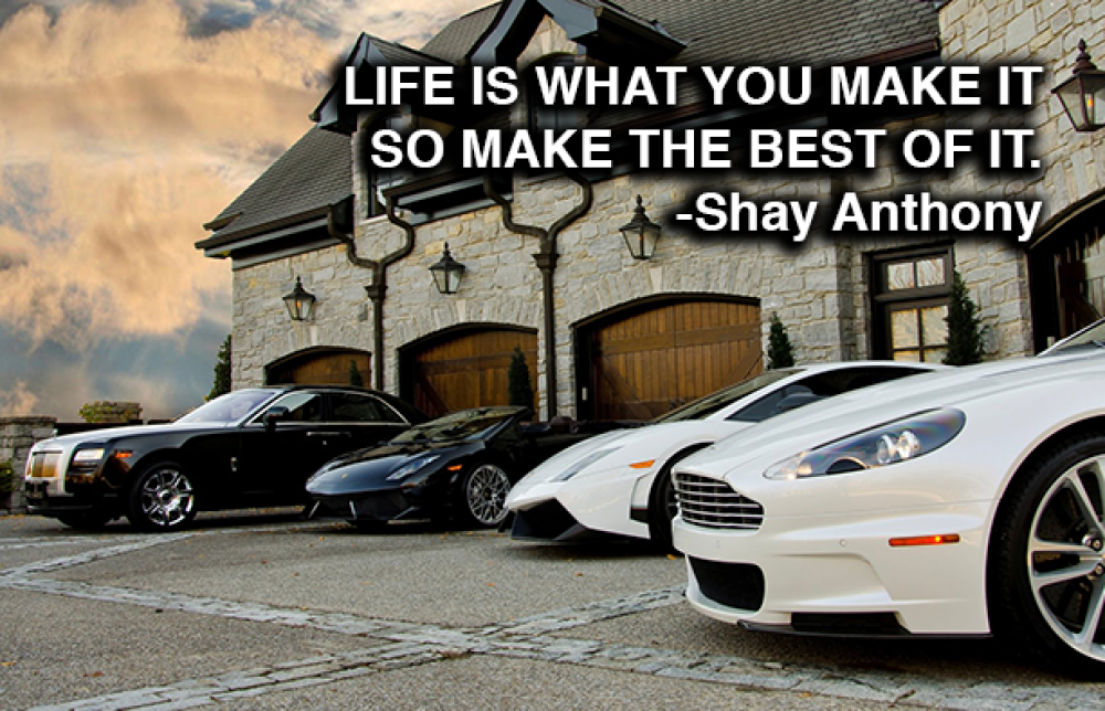
I used Arial Bold to design this visual quote, and I used a background of a mension with very luxurious and very expensive cars parked in front of it. I chose this quote because I believe that anything is achievable with a right mind set, so if you dedicate yourself to achieving your goal in life, you can “make the best of it.” I chose this background because many people make their goal to become a wealthy man, or women, so if you work hard enough to put yourself above others, and work harder then others, the work will eventually pay off.

I used Adobe Garamond to design this visual quote, and I used a background of wolf headed kind sitting on a throne. The quote again portrays my moto that the amount of work you put in life, is the same amount of results you get back. I chose this background because I believe that becoming a king, a leader, is highest status a person can acquire, which takes immense amount of work and dedication. You should use the full capacity of your abilities and talents to make the best of your life.
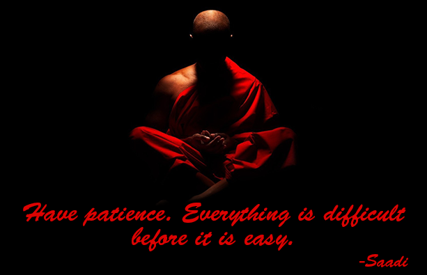
I used Brush Script to design this visual quote, and I used a background of a monk meditating. I used this quote because I believe that patience is the key to everything, rushing through and being anxious will get you no where and will give you sloppy results. It takes time to get results from anything you are working on and sometimes time can be ver frustrating, but having patience will give to the best of the result. I chose this background to support the quote because I believe monks are the most patience, meditating and working on their mind and spiritual self.
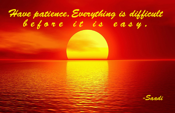
I used Brush Script to design this visual quote, and I used a Background of sunset with all the beautiful red and yellow colors. This quote again, portrays my belief that patience will get you through everything, giving you the best results. I used this background because watching the sunset can be very relaxing, and being patience also means being relaxed. Becoming patience will help you get rid of stress, and become more relaxed.
A Person Who Inspired Me In My Work

As an artist, there are many benefactors that contribute to the development of one’s career and success. There are times when you experiment with your style, trying to find the form of art that feels the most comfortable to you, there are also times when you mimic others art to develop and improve your own, but there are times when the work and style of one person inspires you to entirely develop an unique style of your own. Stan Lee is that person who has inspired me since my childhood, influenced the development of my own style and inspired me to turn my hobbies into a career. In this essay I will talk about who Stan Lee is, how his work is related to COMG and how he has inspired me to become the person I am.
Stan Lee is an American comic-book writer, editor, publisher, media producer, television host, actor and former president and chairman of Marvel Comics. Stan Lee was born as Stanley Martin Lieber on December 28, 1922, in New York City. Being born and raised in a Romanian emigrant family, he spent most of his childhood during the Great Depression, watching his parents struggle through hard times to support the family. As a child, he was inspired from book and movies, especially by the heroic characters and events. As he became a teenager, he started working several part time jobs, including writing small articles for newspapers, or delivering sandwiches to offices in Rockefeller Center. After graduating high school at an early age in 1939 and changing jobs several times, Stan Lee was hired in a writing company, which soon after became Marvel Comics, as an assistant to clean and change the inkwells where the ink pan was dipped. He then was moved as an editor and writer to help develop new characters. Moving up the ranks he was assigned to create a new group of heroes with an artist Jack Kirby, lunching the first Fantastic Four comics in 1961, and soon after creating new comic book characters such as: Spider-Man, the X-Men, the Hulk and Thor, which changed the course of comic book history. He also wrote short stories of different variety of genres, teaming up with his colleague Dan DeCarlo, he produced the syndicated newspaper strip, My Friend Irma, based on a radio comedy.
After DC comics lunched a hit title Justice League of America, the head of Marvel comics called Lee to create new series that would compete with it. Being influenced by Sir Arthur Conan Doyle and Jules Verne, and also taking into consideration his wife’s encouragements, he created Fantastic Four, a group of four astronauts who gain super powers after going out in space. Lee started changing up the way characters were represented in comics by adding imperfections and daily problems and obstacles to characters. By making characters more relatable to the reader, Stan Lee’s comics became very popular. In 1971, he was asked to write a story that would address the problem concerning the drag abuse, and he decided to write an issue of Spider-Man that would include the topic. The Comics Code Authority was against it because there was code that prohibited addressing drugs in comics. However, Lee and his partner Goodman still went with, publishing the story in their comics. The story soon became very popular and famous, and people started thanking Marvel for spreading a message about such an important problem. The Comic Code Authority soon abolished the code, permitting writers to address such issues in their stories, which soon after skyrocketed Marvel’s fame. From 1975, he became the face of Marvel, attending the comic book conventions and lectured at colleges around America, soon later becoming the chairman emeritus of Marvel comics. His role to the company became even bigger when he was assigned as the director, however, he found the job overwhelming and he stepped down to become a publisher, preferring to work on the creative side. Film adaptations based on Stan Lee’s co-created series such as X-Men and Spider Man, lunched blockbuster franchises that earned billions of dollars to the company and started the evolution of comics into film.
Stan Lee’s accomplishments are related to COMG, since style in which comics display the message, is the very first form of communication in the history of graphic design. Style of comic books is the same way pictographic images were used to communicate ides by painting series of actions on cave walls. It was important to inform others of any danger and how to stay out of harm’s way, or to spread knowledge about such things as hunting and gathering. Centuries after, alphabet, a visual representation of sound was developed to make the information recording process easier. Soon enough paper was invented and record keeping was made a lot quicker and simpler. As the visual art and alphabet was developed and improved over centuries, people started to experiment by combining both of them to create stylistic books, advertising and posters to display messages. As people became aware of many possibilities that could of been done with visual images and alphabet, comic books started to appear in 18th century, which were mainly short stories accompanied with text. It involved into different genres, finally coming to United States in 1930s, and introducing heroic characters with superpowers to the industry.
As I was growing up in a foreign country, I didn’t know what comic books were at that time, but I remember Spider-Man animated series being introduced in the early 2000s, which was very fascinating to me. They used to air the show once a week and I couldn’t wait another week to watch the next episode. As my cousins lived in United States, they brought me few issues of comic books and I discovered that there very more characters just like Spider-Man and it was not long after when I came to states myself. I was more on the animated side of the fictional stories rather than comic books, but I learned a lot about comic book characters, about Marvel and DC, and that is when I learned about the legend of comics, Stan Lee. I found out that all the characters and stories that I loved were created by him and since I liked to draw I started mimicking his style of drawing. Many of his stories were made into movies, with all the fascinating visual effects and 3D animations which made me realize that I could also do something like that, and all it was going to take was enough dedication and hard work. As the time goes, better and better effects are introduced into film, with all the new equipment which enables them to do so, but all the fundamental still play a big roll, since the story is the most important parts of either an animation, or film. Stan Lee has inspired me that creativity in the key to creating a story or a character that will make a remarkable impact on society.
In conclusion, being born in a poor family didn’t get in the way for Stan Lee to become a successful person he is now. He worked several jobs which gave him a lot of experience, finally joining the company that he worked for many years. He created many remarkable characters that brought him fame and respect. His stories were soon made into animations and film, becoming an idol to many upcoming artist. Artist don’t usually make us much profit as other professionals might, but doing what you love to do is better than any jobs. However, if you work hard enough and create something that will greatly impact the audience, you will become idol yourself and inspire many. As it is said by Drake, “work so hard that your idols become your rivals.”
Sources:
http://www.biography.com/people/stan-lee-21101093#synopsis
http://www.thefamouspeople.com/profiles/stanley-martin-liebe-2883.php
http://www.britannica.com/biography/Stan-Lee
Field Trip To UFT
The field trip to United Federation of Teachers, was very interesting to me since I didn’t know all the work that went into printing before it was delivered as a newspaper, magazine or a flier. I learned lot of things about printing and enjoyed the trip with my classmates. Even though It looked like a regular building from outside, there was a whole factory inside it, printers, old and new, were located on the lower floor, each with a different function for different purposes, which was really impressive. One of the printers called Combination Press, is designed and perfectly ideal for a wide range of applications including, films, foils, labels, cartons, printed electronics, lottery tickets and others. One other printer that caught my attention the silk screen printing, it gave me an inspiration and made me think of new ways to approach my art work. The silk screen printing is a printing technique where a mesh is used to transfer ink onto a substrate, except in areas made impermeable to the ink by a blocking stencil. Also Gravure printing is a type of intaglio printing process, which involves engraving the image onto an image carrier. In gravure printing, the image is engraved onto a cylinder because, like offset printing and flexography, it uses a rotary printing press. These were some of the printers that I thought were really Impressive.
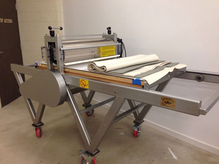
Combination Press

Gravure Printing
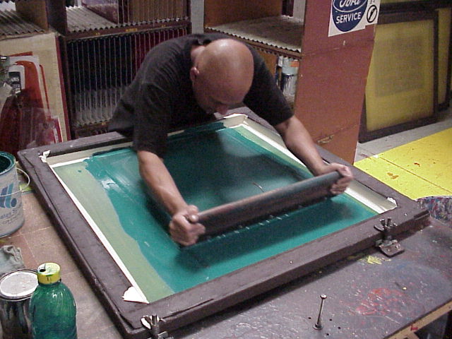
Silk Screen Printing

