Beginning of “Orlando: A Biography” by Virginia Woolf

CHAPTER 1.

He–for there could be no doubt of his sex, though the fashion of the time did something to disguise it–was in the act of slicing at the head of a Moor which swung from the rafters. It was the colour of an old football, and more or less the shape of one, save for the sunken cheeks and a strand or two of coarse, dry hair, like the hair on a cocoanut. Orlando’s father, or perhaps his grandfather, had struck it from the shoulders of a vast Pagan who had started up under the moon in the barbarian fields of Africa; and now it swung, gently, perpetually, in the breeze which never ceased blowing through the attic rooms of the gigantic house of the lord who had slain him.

Orlando’s fathers had ridden in fields of asphodel, and stony fields, and fields watered by strange rivers, and they had struck many heads of many colours off many shoulders, and brought them back to hang from the rafters. So too would Orlando, he vowed. But since he was sixteen only, and too young to ride with them in Africa or France, he would steal away from his mother and the peacocks in the garden and go to his attic room and there lunge and plunge and slice the air with his blade. Sometimes he cut the cord so that the skull bumped on the floor and he had to string it up again, fastening it with some chivalry almost out of reach so that his enemy grinned at him through shrunk, black lips triumphantly. The skull swung to and fro, for the house, at the top of which he lived, was so vast that there seemed trapped in it the wind itself, blowing this way, blowing that way, winter and summer. The green arras with the hunters on it moved perpetually. His fathers had been noble since they had been at all. They came out of the northern mists wearing coronets on their heads. Were not the bars of darkness in the room, and the yellow pools which chequered the floor, made by the sun falling through the stained glass of a vast coat of arms in the window? Orlando stood now in the midst of the yellow body of an heraldic leopard. When he put his hand on the window-sill to push the window open, it was instantly coloured red, blue, and yellow like a butterfly’s wing. Thus, those who like symbols, and have a turn for the deciphering of them, might observe that though the shapely legs, the handsome body, and the well-set shoulders were all of them decorated with various tints of heraldic light, Orlando’s face, as he threw the window open, was lit solely by the sun itself. A more candid, sullen face it would be impossible to find. Happy the mother who bears, happier still the biographer who records the life of such a one! Never need she vex herself, nor he invoke the help of novelist or poet. From deed to deed, from glory to glory, from office to office he must go, his scribe following after, till they reach whatever seat it may be that is the height of their desire. Orlando, to look at, was cut out precisely for some such career. The red of the cheeks was covered with peach down; the down on the lips was only a little thicker than the down on the cheeks. The lips themselves were short and slightly drawn back over teeth of an exquisite and almond whiteness. Nothing disturbed the arrowy nose in its short, tense flight; the hair was dark, the ears small, and fitted closely to the head. But, alas, that these catalogues of youthful beauty cannot end without mentioning forehead and eyes. Alas, that people are seldom born devoid of all three; for directly we glance at Orlando standing by the window, we must admit that he had eyes like drenched violets, so large that the water seemed to have brimmed in them and widened them; and a brow like the swelling of a marble dome pressed between the two blank medallions which were his temples. Directly we glance at eyes and forehead, thus do we rhapsodize. Directly we glance at eyes and forehead, we have to admit a thousand disagreeables which it is the aim of every good biographer to ignore. Sights disturbed him, like that of his mother, a very beautiful lady in green walking out to feed the peacocks with Twitchett, her maid, behind her; sights exalted him–the birds and the trees; and made him in love with death–the evening sky, the homing rooks; and so, mounting up the spiral stairway into his brain–which was a roomy one–all these sights, and the garden sounds too, the hammer beating, the wood chopping, began that riot and confusion of the passions and emotions which every good biographer detests, But to continue–Orlando slowly drew in his head, sat down at the table, and, with the half-conscious air of one doing what they do every day of their lives at this hour, took out a writing book labelled ‘Aethelbert: A Tragedy in Five Acts,’ and dipped an old stained goose quill in the ink.
Accessibility Screencast Sample Post

Example of Plain Language

Before:

When the process of freeing a vehicle that has been stuck results in ruts or holes, the operator will fill the rut or hole created by such activity before removing the vehicle from the immediate area.

After:

If you make a hole while freeing a stuck vehicle, you must fill the hole before you drive away.

Writing Styles that Help Comprehension

The writer’s tone can aid reader comprehension.

Build Credibility

Avoid language that tries to add too much excitement. (“This will be the best tool ever for your classroom!”). Site visitors want to get the straight facts. Also, credibility suffers when users perceive that the author exaggerates.

The use of external site links can help site credibility. Links to other sites show that the authors have done their homework and are not afraid to let readers visit other sites.

Help Boost Memory with Metaphors

Reduce the need for readers to remember things from one part of text to another by creating a metaphor or comparison which helps the reader visualize what you are describing.

Example:

“When working on the OpenLab, your site dashboard can be compared to a kitchen: experiments happen here, and sometimes things are messy, but all your tools exist here for you to create content for the front end of your site. The front end–what visitors to your site see–can be compared to a dining room, where the table is nicely set and beautiful dishes are served.”

Organize Information to be Scannable

Research on how people read websites found that 79 percent of test users scanned web pages; only 16 percent read word-by-word. As a result, Web pages should use scannable text. In general, use half the word count (or less) than conventional writing, especially when writing for mobile users.

Highlight Keywords and Subheadings

Hypertext links can be one form of highlighting keywords; others include typeface variations and color. When you choose a highlight color, make sure that it creates a high contrast with the background so that it can be easily seen. You can use an online tool to check color contrast, such as the WebAIM Color Contrast Checker.

Subheadings, or section titles, throughout the page help orient the reader. Choose subheadings that are understandable and descriptive of the content, rather “clever” or complicated.  Headings and subheadings should clearly contrast with the rest of the text (by being bolder, larger, etc).

Chunking Text

Presenting content in chunks makes scanning easier for users and can improve their ability to comprehend and remember.

The key to effectively chunking content is to keep related items close together and aligned. White space and line breaks between chunks of content will separate one section from another.

Some methods of chunking text content are:

  • Bullet point summaries
  • Ample line breaks (“white space”) between paragraphs
  • A horizontal line (“horizontal rule”) between long sections of text
  • Short lines of text (around 50-75 characters)
  • Distinct grouping in strings of letters and numbers. For example, write a phone number as (973) 555-1234 instead of as 9735551234

Organized Paragraphs

Organize the structure of paragraphs to help users scan through the text.

  • Use one idea per paragraph. Readers will often skip over any additional ideas if they are not caught by the first few words in the paragraph.
  • Start paragraphs with the most important point. Each paragraph should use an inverted-pyramid writing style: start with an overview of the main point. People relate better to secondary points when they already know the basics.

Avoid Italics and Underlining, to Improve Readability

  • Italic fonts are more difficult to read than regular fonts and should be avoided when possible
  • Underlining interferes with lower case letters and should be avoided for emphasis. It can also be confused with hyperlinks
  • Only use underlining for links, to web pages and email addresses
  • Use bold for emphasis, not italics or underlining

Avoid Sentences in all UPPERCASE Letters

A sentence written with a combination of upper and lower case letters is easier to read. The word shape provides mental reading clues to speed up the process of reading.

It may make sense to use all uppercase in some instances, such as short headings, titles with a maximum of two words, or when text is used as a graphic image. However, uppercase can give the impression of shouting at the reader and therefore should be avoided where possible.

If the intent is to convey a shout, an exclamation point may be better. Screen readers generally do not read text differently if it is in all upper case letters, so listeners will not know that the author is shouting. Screen readers do change the voice inflection with exclamation points.

Also, upper case acronyms should have periods to allow screen readers to properly interpret the text as an acronym and not a word. For example, A.O.D.A. is more accessible than AODA.

Explain Graphics, Tables, Charts and Maps Using Text

All graphic elements that contain information relevant to the document require a text explanation. The explanation needs to be written by the same person responsible for writing the document. Having someone else describe the graphic elements may provide an incorrect interpretation.

When explaining complicated visuals, be sure to identify the type of visual (chart, graph, map, etc.) along with the title, purpose, and the meaning of the data.

The text explanation can be provided in the text of the document or in a caption.

How to Explain Graphics, Tables, and Other Visual Elements 

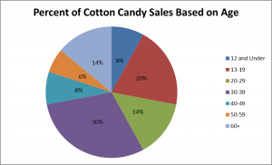
The pie chart below, titled “Percent of Cotton Candy Sales Based on Age,” illustrates data collected to measure sales of cotton candy by age, ranging from 8% of sales to people age 12 and under to 30% of cotton candy sales to people aged 30-39. The pie chart splits up the ages included into seven distinct groups and uses various bright colors to illustrate the percentages. 

Pie chart that illustrates sales of cotton candy by age
From SurveyMonkey

Design and Visual Legibility

Detailed instructions for design and style choices can be found on the OpenLab blog post Making your Work Accessible.

Legibility tips from that document include :

  • Use pre-set heading styles to create a clear visual hierarchy:
    • H1 for page titles
    • H2 for subtitles
    • H3 for section titles
  • Use informative and specific wording for links
  • Use common, recognizable fonts and avoid small font sizes
  • Avoid low-contrast fonts
  • Include alternative text (“alt text”) for all images
 
Viewing Highlight
Loading...
Highlight
Close
Add Comment
Loading...

Cancel