Recent Posts
Revisions of the Final Draft of Visual Quote Project
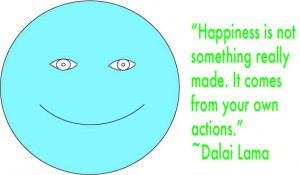 This is my first concept. I made a happy face and typeset the quote to the right using Myriad Pro. I used arcs to make the eyes and smiley face. I used Futura for the typeset in this concept because I felt like that could be a better typeface for this concept than using Arial Regular. I chose green because I consider green as a happy color and it is my favorite color. Quote Concept 1(Final)
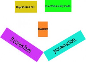
This is my second concept. My goal for this concept was to use rectangles to make a happy face.I used happy colors for the boxes. I used Myriad Pro because if I had used any other typeset for this concept, clients wouldn’t have like that idea. I typeset some words in a larger point size because I tried to fit the words inside the box and I didn’t want the words to outside of the box.
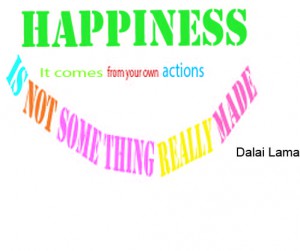
This is my third concept. The only difference between this concept and my previous one is that there are no rectangles. I also changed the color of the text. I used different typefaces for some words because I wanted to use different typefaces just to make this concept more creative. There are words that are suppose to be together such as “Something” but instead I made it into “Some Thing” so I can make the words into an smiley face. I didn’t used any tracking or kerning to fit into a smile.
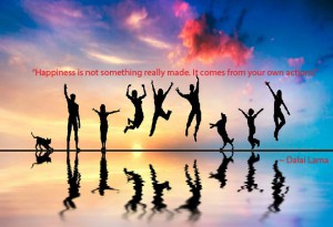
This is my final concept. I searched up an image on google about happiness but I wanted it to do something different than the first three concepts by using an image that doesn’t show a face or a smile. I used Myriad Pro for the typeset in the concept because it is the only good typeset that I can use for this concept. I chose red because seeing the red, purple, or a little yellow sky made me feel like red can be a good color for the text. I put the text under the sky and above and side of the people(black color) so people can read it.
