About the Museum:
“Cooper Hewitt, Smithsonian Design Museum is the only museum in the nation devoted exclusively to historic and contemporary design. Cooper Hewitt educates, inspires, and empowers people through design by presenting exhibitions and educational programs and maintaining active publications. Amy, Eleanor, and Sarah Hewitt—granddaughters of industrialist Peter Cooper—as part of The Cooper Union for the Advancement of Science and Art, founded the Museum in 1897. A branch of the Smithsonian since 1967, Cooper Hewitt is housed in the landmark Andrew Carnegie Mansion on Fifth Avenue in New York City. It is the mission of Cooper Hewitt’s staff and Board of Trustees to advance the public understanding of design across the thirty centuries of human creativity represented by the Museum’s collection.”
For more information about Cooper Hewitt Visit CooperHewitt.org
My Trip:

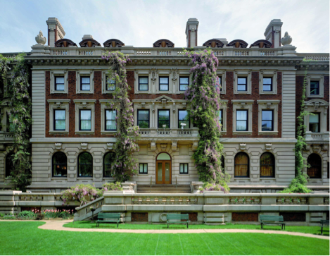
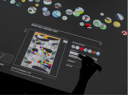
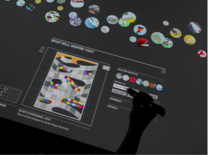
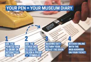
I was feeling happy because I had the opportunity to visit the Cooper Hewitt Museum so I can learn more about the design field. Based on the things I had seen at the exhibit was pretty amazing. After entering the exhibit, the museum employees offered me a pen where I can create my own designs on their display screens and save any work from the exhibit so I can view them online using the code on my ticket to claim my visit. I like the way the Museum looks especially the garden outside the museum. It’s like as if spring season was here. The garden outside around the museum looks so beautiful and it feels like as if it’s a perfect place to have a picnic. There is large “Cooper Hewitt” text logo that sits on the gates and actually reflects the suns light brightly and makes it presence prominent. The interior of the Cooper Hewitt Museum is like as if a dark wood was there.
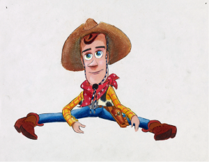
The first type of work that I saw at the exhibit was Woody from Toy Story even though the name of the work is called “Concept Art, Woody, Toy Story, 1995.” It was made in 1995 and it is a concept art, which was created by Bud Luckey and Ralph Eggleston. It is an original work from Pixar Animation Studios. In my opinion, it looks like it was sketch out a little bit and then used Illustrator or Photoshop to do this type of work. The Medium of the work is mixed media on paper. Toy Story was one of my favorite Disney Pixar movies since I was a little child. Pixar’s design process often requires many iterations of its characters to arrive at a final design. For Toy Story, once Woody’s overall appearance was settled on, Pixar artists continued to adjust details like the color and pattern of his shirt and scarf. Throughout these changes, his big eyes and slight grin maintained his appeal.
The second type of work that I was able to see at the museum was the interior of a cafeteria even though the name of the work was “Drawing, Cafeteria Interior With Seating, CA.1950s-60s.” This work was made in the 1950s-1960s even though the museum bought it in 1988. This work is a drawing, which we know as obvious by looking at the picture. The work was from the office of Donald Deskey Associates and was drafted by Earl E. Hoyt Jr. The Medium of the work below is brown, black magic marker; green, blue green pastel; white gouache; black crayon; graphite support: white heavy paper. It is part of the Drawings, Prints, and Graphic Design department.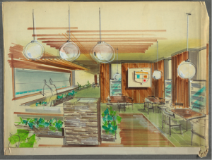
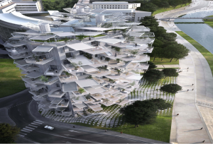
I would like to mention one of the works that capture my attention very much. The name of the work below is called “Rendering, Montpellier Apartment (L’Arbre Blanc), 2014.” It was made in 2014 and designed by Sou Fujimoto Architects. The work below is a rendering, which is a work of visual art, especially a detailed architectural drawing. The medium of the work is digital print. The building resembles an alien tree plucked from a work of science fiction. I like the fact that it used architectural forms especially the building.
I’m glad I had an amazing experience in the museum especially for my digital media foundations class trip. I have a feeling that I have learned more about the design field. I’m very happy to travel to museums like the Cooper Hewitt, which one-day I will go back again if I like. I am thankful for choosing the right major that’s right for me even though I was upset because I had a class after we was done with the trip but it was worth it.
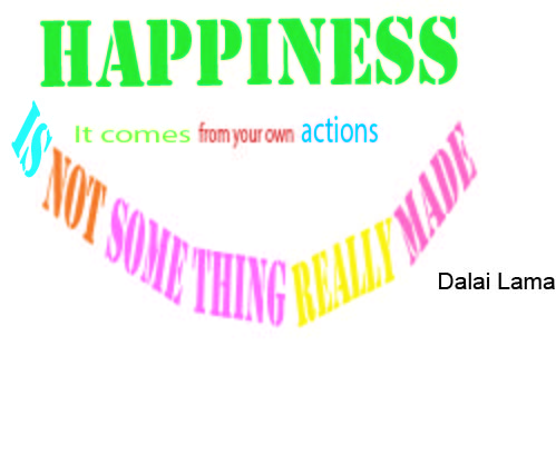
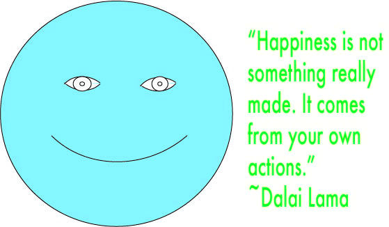
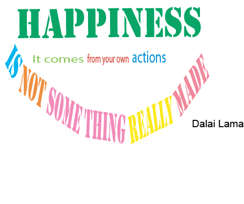
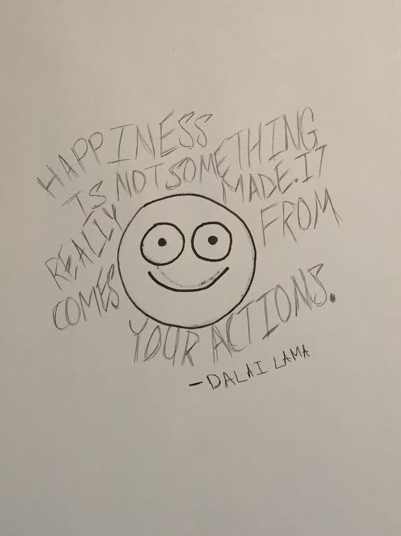
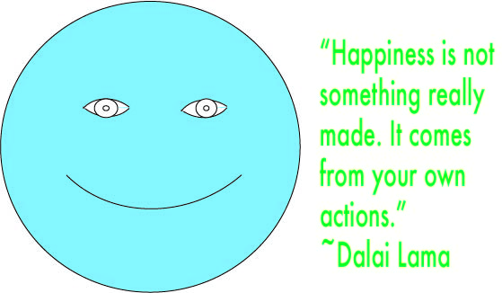 This is my first concept. I made a happy face and typeset the quote to the right using Myriad Pro. I used arcs to make the eyes and smiley face. I used Futura for the typeset in this concept because I felt like that could be a better typeface for this concept than using Arial Regular. I chose green because I consider green as a happy color and it is my favorite color. Quote Concept 1(Final)