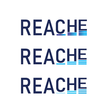
In the second week of my internship, our team of five designers, along with our team leader, met via Zoom. We presented our initial versions of the REACHE logo. Our team leader provided feedback on each design, and she particularly liked my concept of people in a circle, saying it was close to what she envisioned. Despite this, she encouraged us to develop more versions with new concepts.
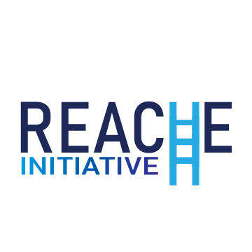
After the meeting, I brainstormed further and came up with two new ideas. One concept involved manipulating the letter “H” in REACHE to resemble a ladder going up, symbolizing progress. I made multiple versions of this design, using a different shade of light blue for the “H” to make it stand out. My other concept focused on equity, where I placed a rectangular box step under some minimized letters to align their height with the normal-sized letters, illustrating the idea of equity.
I created multiple versions of these two concepts and shared them in our internship submission Google Drive folder, eagerly awaiting our next Zoom meeting to present them.


Citation(s)
Nour Mohsen. (2024). REACHE Logo Designs [Graphic design]. Personal collection.


