Self-Assessment: Internship at Brooklyn College

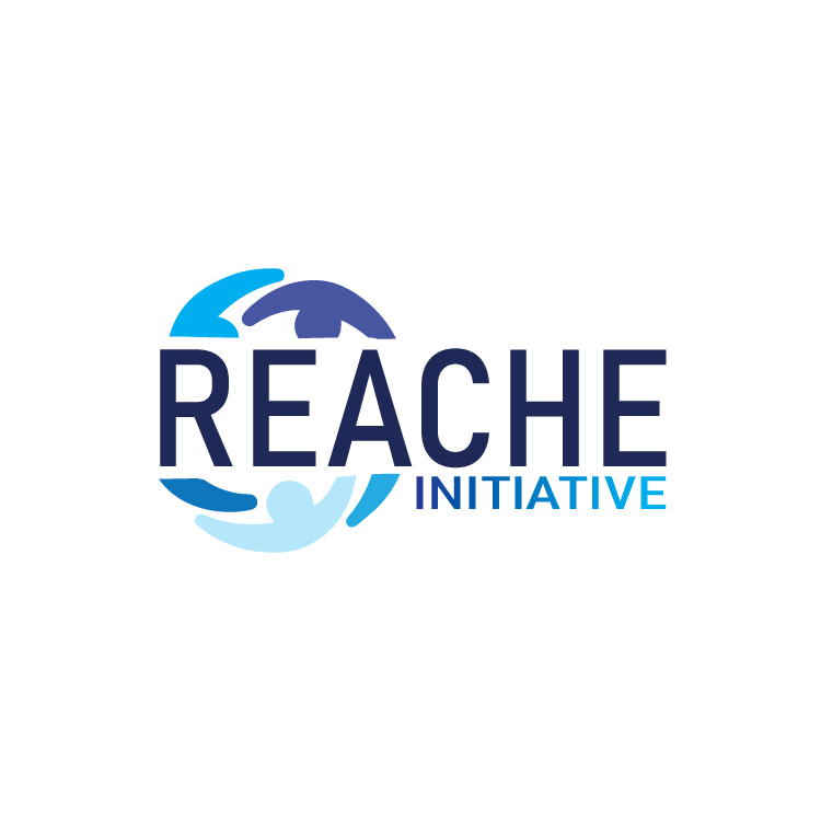
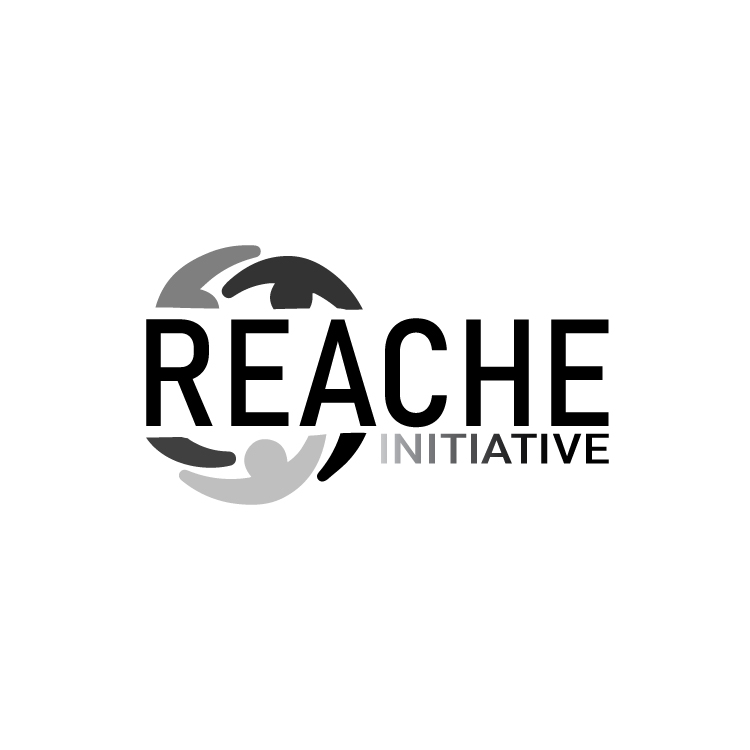
Throughout my internship at Brooklyn College, I have received consistent and positive feedback from my supervisors, which has affirmed the quality of my work. The feedback has not only been encouraging but also instrumental in refining my projects. One particular instance that stands out is the REACHE logo design project.

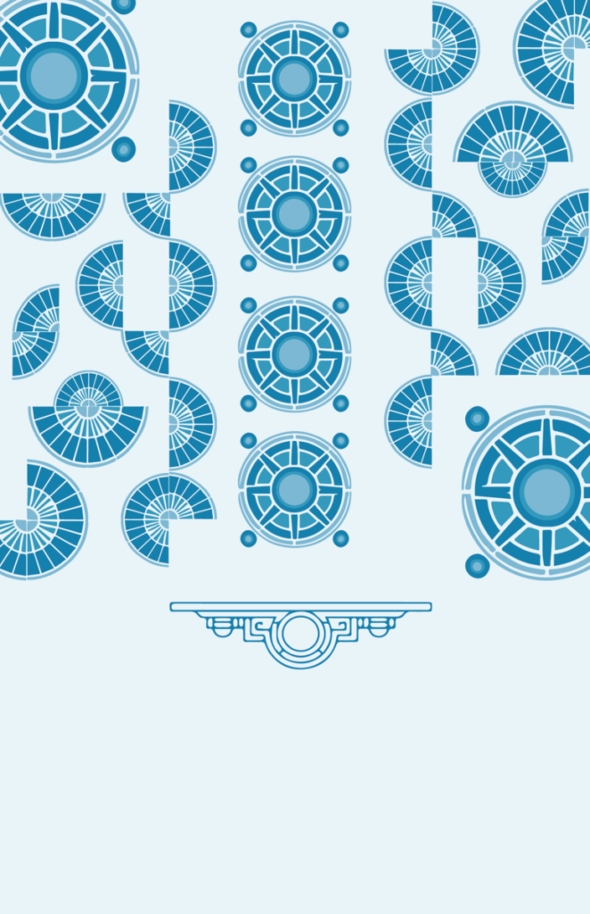
In the initial weeks, I brainstormed and developed various concepts, including the “H” as a ladder and the boxes symbolizing equity. My designs were well-received, and one of my concepts was selected by the client. This positive feedback boosted my confidence and validated my creative approach.

In subsequent weeks, I took on new challenges, such as creating report cover designs. I experimented with different styles, including architectural shapes, bold rectangular strokes, and simple triangular designs. The collaborative feedback sessions with my team were incredibly beneficial, allowing me to refine my work and learn from my peers.

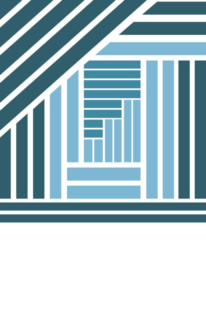
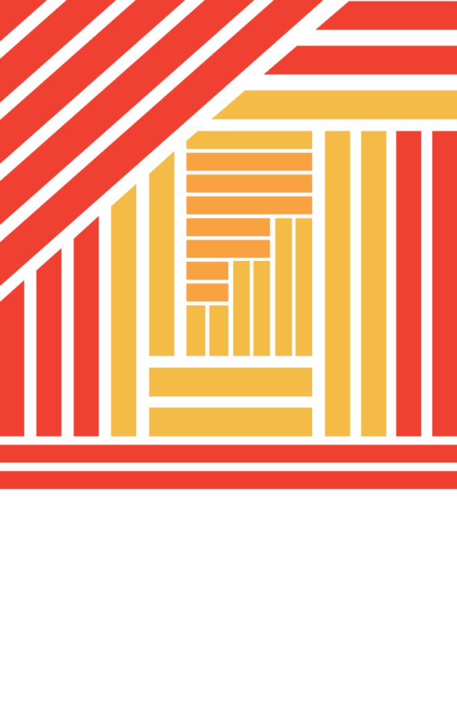
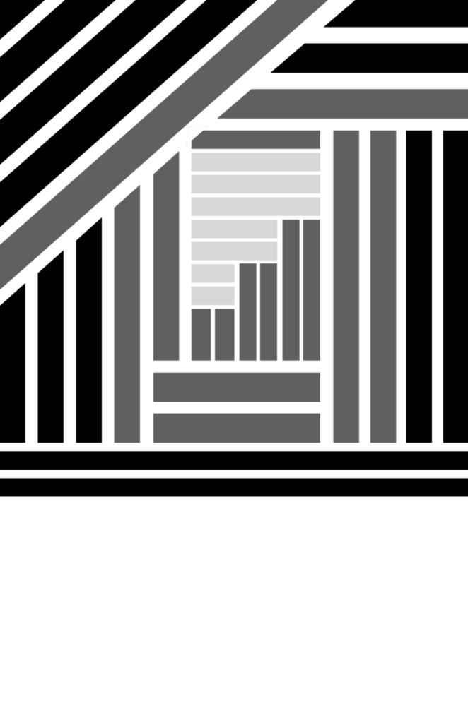
During my final week, I was tasked with creating vertical cover designs, a new and challenging direction. After brainstorming, I developed and submitted four versions, receiving specific feedback to adjust the colors. This iterative process taught me the importance of adaptability and attention to detail.

Overall, this internship has been a profound learning experience. The projects allowed me to apply and expand my design skills while the feedback from my supervisors helped me grow as a professional. My ability to incorporate feedback and produce high-quality designs that align with the organization’s values has been a significant achievement. I am confident that the skills and insights gained during this internship will greatly benefit my future career in design.

Final Week: Wrapping Up and New Challenges

In my last week as an intern at Brooklyn College, we had our final Zoom meeting to showcase our report cover designs. Each of the five designers presented multiple versions. Our team leader praised several designs, stating they were ready without any negative feedback. One of my co-designers created an exceptional cover, and I agreed it was simple and effective.

Before concluding, she assigned me a challenging task to create vertical cover designs, as we had been working on horizontal ones. After brainstorming, I developed four different vertical versions and uploaded them to our Google Drive. A few days later, I received feedback via email: “The color is too cool; please try to match it to the PDF reference file. That’s the only note!” I’m currently working on adjusting the colors to finalize the covers and will upload the revised versions soon.

This final task has been a great learning experience, pushing me to adapt and refine my designs further.

Citation(s)

Nour Mohsen. (2024). Cover Report Designs [Graphic design]. Personal collection.

New Task Designing For a Cover Report

This week, I focused on finalizing the logo that the client selected, creating versions in black, white, shades of gray, and the original blue. Simultaneously, I began working on the report cover designs. I developed three different concepts: one with an architectural feel and busy shapes, another with bold rectangular strokes in various colors, and my favorite, a simple design featuring triangular shapes. I created multiple versions of each design in different colors. After finishing all these tasks, I exported the files and uploaded them to our internship Google Drive folder. This week has been creatively fulfilling and productive.

First Design

Second Design

Third Design

Citation(s)

Nour Mohsen. (2024). Cover Report Designs [Graphic design]. Personal collection.

The Client Chose my REACHE logo !

This week, our team leader informed us that the client has chosen the logo design featuring the people in a circle pattern. I’m thrilled to know that my concept was selected! I will now create versions of the logo in blue, black, gray, and white.

In her email, our team leader also introduced our new project: designing report covers. She uploaded a reference cover from the past spring to our Google Drive. We are required to create these covers in various colors—green, yellow, red, and shades of gray/black/white. Additionally, we each need to develop two alternative cover options. The covers should be 8.5×11 inches, use the same font as the reference, and be saved as editable PDFs to ensure the text and logos can be modified.

This new task is exciting as it allows us to expand our creativity beyond logos and work on another vital aspect of the project’s visual identity. I look forward to experimenting with different color schemes and creating unique designs that meet the client’s needs.

Citation(s)

Nour Mohsen. (2024). REACHE Logo Designs [Graphic design]. Personal collection.

One Last Version for REACHE logo project.

This week was all about deep brainstorming and creativity. After our team meeting and the insightful feedback from our supervisor, I dedicated a lot of time to coming up with one last concept for the REACHE logo project. I stared at the word “REACHE” for what felt like hours, trying to see it from different perspectives. Suddenly, inspiration struck—I realized that the letter “A” could be transformed to resemble a rocket. This idea resonated with our supervisor’s previous comments about incorporating elements of a rocket or something symbolizing upward movement and ambition.

With excitement, I opened Adobe Illustrator and began redesigning the “A” to look like a rocket ready for launch. As I was refining this concept, another idea came to me. By adding strokes to the sides of the “A,” it started to look like a pencil tip. This felt like a perfect fit since pencils are a strong symbol of education, aligning well with the REACHE initiative’s goals.

I was thrilled with these new directions and created multiple versions of both the rocket and pencil “A” designs. After finalizing them, I exported all the designs and uploaded them to our Google Drive folder for the team to review. This week, I felt a deep sense of accomplishment and excitement for the feedback from my team and supervisor in our next meeting.

Citation(s)

Nour Mohsen. (2024). REACHE Logo Designs [Graphic design]. Personal collection.

Collaborative Brainstorming and Introducing New Task

This week, we had our regular meeting to showcase our progress on the REACHE logo. I presented my new concepts: the “H” as a ladder and the boxes under the letters symbolizing equity. Our team leader found these ideas interesting and provided valuable feedback, along with feedback for my teammates on their concepts. At the end of the meeting, she assigned us a new task: designing a cover report, with more details to follow via email. She encouraged us to stay on the Zoom call to brainstorm and critique each other’s work.

We spent about half an hour discussing our progress and exchanging ideas. This collaborative session was incredibly beneficial. It allowed us to see different perspectives and approaches, which helped refine our designs. It was my first experience having an in-depth discussion with other designers in a professional setting, and I found it incredibly insightful to talk about different logos and design concepts. The exchange of ideas and feedback not only improved our individual designs but also fostered a sense of teamwork and collective creativity. Additionally, our team leader instructed us to work on one new concept for the next meeting, ensuring continuous innovation and improvement.

Citation(s)

Nour Mohsen. (2024). REACHE Logo Designs [Graphic design]. Personal collection.

Brainstorming Picture, https://in.pinterest.com/pin/629167010474767436/

Refining REACHE Logo and Brainstorming for more concepts

In the second week of my internship, our team of five designers, along with our team leader, met via Zoom. We presented our initial versions of the REACHE logo. Our team leader provided feedback on each design, and she particularly liked my concept of people in a circle, saying it was close to what she envisioned. Despite this, she encouraged us to develop more versions with new concepts.

After the meeting, I brainstormed further and came up with two new ideas. One concept involved manipulating the letter “H” in REACHE to resemble a ladder going up, symbolizing progress. I made multiple versions of this design, using a different shade of light blue for the “H” to make it stand out. My other concept focused on equity, where I placed a rectangular box step under some minimized letters to align their height with the normal-sized letters, illustrating the idea of equity.

I created multiple versions of these two concepts and shared them in our internship submission Google Drive folder, eagerly awaiting our next Zoom meeting to present them.

Citation(s)

Nour Mohsen. (2024). REACHE Logo Designs [Graphic design]. Personal collection.

My Responsibilities or Role

As a graphic designer intern at Brooklyn College, my primary responsibilities include creating various design works, with a strong focus on logos and poster layouts. I work closely with the team to develop visually appealing and cohesive designs that align with the college’s brand guidelines. My role involves brainstorming ideas, drafting initial concepts, and refining designs based on feedback. We meet once a week through zoom where we share our work with each other as a team and we start discussing what works and what is not working and why. Additionally, I ensure that all design projects effectively communicate the intended message and meet the college’s high standards for quality and consistency. This experience is enhancing my skills in visual communication and brand identity.

 About the organization

Brooklyn College Overview

Brooklyn College, part of the City University of New York (CUNY) system, is located in the heart of Brooklyn. Founded in 1930, it offers a wide range of undergraduate and graduate programs. The college is known for its beautiful campus, diverse student body, and strong emphasis on liberal arts and sciences. It provides a supportive environment that encourages academic excellence and creative expression. My graphic design internship here has given me valuable hands-on experience and exposure to professional design practices.

Images Credits

Poetry Foundation. (2013, January). Do I contradict myself?. Retrieved July 17, 2024, from https://www.poetryfoundation.org/harriet-books/2013/01/do-i-contradict-myself

First week as an intern

During my first week as an intern, I had the opportunity to meet my fellow co-designers. Our team consists of five members, including myself. We had an introductory meeting with our team leader, who briefed us on our first project. The project involves creating a logo for an educational initiative called REACHE, which aims to support diversity, equity, and inclusion efforts in higher education.

Our team leader provided us with an older version of the existing logo and tasked us with developing new concepts. To facilitate collaboration, she set up a Google Drive folder where we could share our work and discuss it in our next meeting.

I spent some time researching the project and brainstorming ideas. I managed to come up with two logo concepts. One of my ideas featured a circular graphic of people connected to each other, integrated into the REACHE name, and following the designated blue color scheme. I’m excited to present my designs and see the feedback from my team.