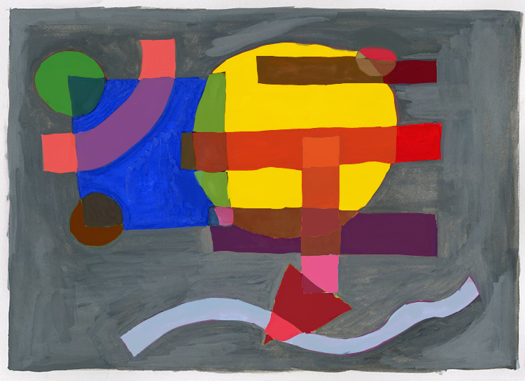
For the transparency project I would face a lot of unique challenges from creating tracing paper layouts to the colors I would insert into each shape along the way. A main goal of mine when creating the placement of the shapes was how can this look both appealing and new to the viewer. So after many trials and errors I finally came up with a design I was pleased to start painting. A new bump in the road was figuring out which colors I would use as well thinking about which colors would look attractive next to each other. I knew I wanted them to compliment each other without using the same shades of one or two main colors but be able to expand upon many variations of colors I was using all over the shapes. After I decided which colors to use twice, I had to learn how to mix these colors correctly to seem as if they are actually over lapping.
After placing many color ideas on strips of bristol paper I soon learned that mixing these weren’t going to be as easy as I thought it would be. I would often think about how I am mixing or if the colors are being mixed correctly at all on this. So without over or under mixing the colors, I was very pleased to see the new outcome of my project and how the colors and shapes interact with each other on the gray background. Something new and interesting that really had me thinking a lot about how I would place colors on a surface in future projects and ideas.

