Category Archives: Uncategorized

Museum Report

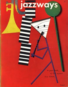
The Museum of The City of New York is full of unique features such as decorative use of words in the staircase, or the lights that can be seen as a sculpture from an angle. Two current exhibitions that are worth a look at are the photographs of greats such as Janette Beckman, Joe Conzo, and Martha Cooper. While one floor below is a look at the legendary Paul Rand and his revolutionary designs and logos. An example of a great design Rand created was for the “Jazzways Magazine” volume 1 from 1946. A very simplistic layout as well as idea, he creates fun and imaginary imagery from just a variety of shapes. Triangles, circles, rectangles and others are used to make bodies and instruments used to play jazz music. By using the technique of minimalism he is able to attract an audience that enjoys the type of music, those are curious what the cover means and the major amount of red in the background can pop out in a rack full of mostly white covers. In the 1940s covers often were either black or white with just a pinch of color since the printing industry was still on its baby steps. By making the letters in the title lower case it can give a feeling of relaxation and the type face being a regular san serif, it welcomes anyone to pick the issue up. The issue was very well received and praised for the unique imagery that was not very common at the time and still being able to look attractive to those who aren’t very open minded.

PR1

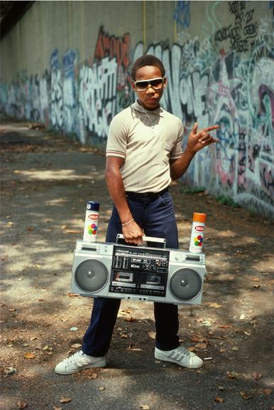
Photographer Martha Cooper was in charge to photograph brick dancer Little Crazy Legs. The stylistic shot was taken during the early stages of hip-hop music reaching the masses. She would take this photograph at Riverside Park, Manhattan in 1983, a huge area where many up and coming street artists would roam and the best of use of the surroundings. She took this to her advantage by having him stand in the middle with the effect of a long road behind him covered in colorful letters. A small but very effective trick she did here but having him perfectly positioned in the brightest section of the park. It’s all natural light and by not adding any extra light his skin and cloths are perfectly bright enough and makes him the main attraction with a great supporting backdrop.

Littlecrazylegs_Cooper

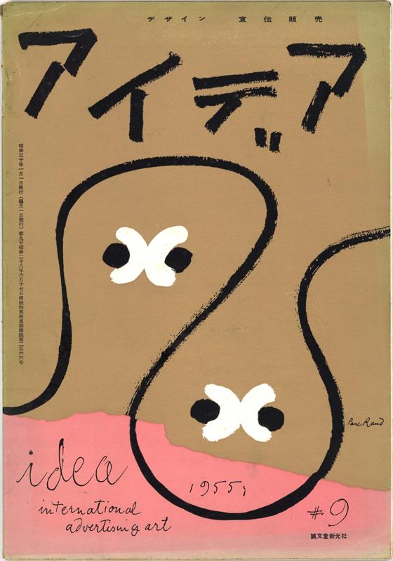
Another well received magazine cover by Paul Rand is the one he created for “International Advertising Art Magazine” volume 2 from 1955. The piece, which is part of a private collection, is targeted towards the Japanese demographic. Using a mix of charcoal and paper he is able to create a simple yet diverse design and idea. A few swirls and words over a piece of ripped paper can make of people think and guess upon what is being seen in front of them. Around the time this cover was created, American audiences weren’t very open to other cultures nor were they willing to take the time to make up what these signs mean but he managed to make it a successful issue and was able to inspire an entire generation to be more open to new ideas and views.

P9

Both artists have created memorable pieces whether through a camera lens or a piece of paper, to this day designers and photographers go back to see how things started and how they can influence the current generation of artists. The museum is a great stop on the list of museums located in New York City, and will inspire anyone who walks in at any day.

Quote Meaning

kurtcobainssuicidenote.com_suicidenote

The quote “Its Better To Burn Out Than To Fade Away” was originally a line from the Neil Young song called “Hey Hey, My My (Into the Black)”. Young’s lyric would go on to have a life of its own after April 8, 1994. Nirvana frontman and musical mastermind Kurt Cobain would be found with a self inflicted shotgun wound to the head. The news would go on to shock him bandmates, family, fan, and the entire world both in and outside of music. Being seen as a major icon before releasing a third record, Cobain’s words. performances and music would be the voice and soundtrack of the young and reckless Generation X. Many people chose not to believe this tragedy but start theories about him being murdered instead. Weeks following his death, partial images of his legs, crime scene and belongings would surface. Mose infamous of the surroundings are an R.E.M tape, a chair, and a letter. This letter would confuse many and anger more people as new fans would see this in front of them. Not only did it address his childhood imaginary friend but would be seen as very trivial. Cobain being a fan of Young would use his words to express his feelings and when this was his last time, it became almost influential in a unique way. Thousands of people would use this lyric to quote Cobain since he made it more famous then the song and album it came from. Even Young to this day still declares an infamous Cobain quote. Now other then the situation it came from, journalists often highlight this as the summary of the letter which addresses his marriage, new born daughter, Nirvana, music, drugs and more. “Its Better To Burn Out Than To Fade Away” is exactly what happened, Cobain left when he was the king of the 90’s grunge and music scene and did not fade one bit. In 2015 he is still talked about as if he is very much active just to be praised for the material he released and countless influences he left. A film named “Montage of Heck” was released showing the life of Kurt were never saw was released at the Tribeca Film Festival in 2015. With the film a shocking news of a solo album that was never heard of or released will finally see the light this summer, showing his legacy is alive and still burning.

Quote Final 1

QUOTE 1-1 QUOTE 1-2

Before                                                   After


This concept was created be taking an image of the guitarist and bring it into Illustrator and going over it with the pen tool. By turning the finished shape white I knew it will pop off of the fire background I already had waiting on Photoshop. The background was also tweaked a bit by lowering the brightness to make the fire come off as more fierce and dramatic. By changing the stripes from green to yellow, I was able to make both the letters and layout come together even more. By altering the type face to a more classic one, the concept become a major homage to the Cobain’s rebellious early days in music.

Quote Final 2

QUOTE 2-1 QUOTE 2-2

Before                                                   After

When updating this concept, there was not a lot of ideas coming into it. Other then the minimalist approach and gray background, the entire first concept was more towards experimenting. The idea of making the background the fret board to a guitar neck came late into the design processe. Following the fret board idea, I made sure I made each block more skinnier and tighter to look more like a guitar. Adding the circles and lines to the background really gave this concept more life and energy. Lastly the words became more organized instead of randomly being different shapes and angles. Just giving them a perfect flow of reading was the main goal and turning the “Away..” into a warp effect with a fade was the cherry on top.

Quote Final 3

QUOTE 3-1 QUOTE 3-2

Before                                                   After

All three concepts serve with a unique point of view on these infamous words. One to show the glory, another during the meltdown and now the aftermath. Kurt Cobain said wrote these words on a letter that would lie next to his dead body and began to burn into the memories of all types of people. By taking the entire background out and focusing on just the words, the viewer can get a sense of tense and harmful feelings coming off this piece. White can be represented as anything such as the light, heaven, or the shotgun blast. As well as the flames being seen as burning background or even hell. This piece represents the career we weren’t finished seeing. Being this huge what if? factor that we will never know would become.

IMG_1783


One of the earlier projects that was created is the Textures we did. Something that I have never done before was get the textures from under our shoes and or from trees and other parts of nature. It was a whole new mind set and a project that I had no real mind set going into. After getting the twelve textures It was all about time and being steady with the fine point sharpie. So many areas of full black and white yet so much patience so you don’t go over the small sections of the shoe such as lines or dots. Adding the 50/50 to to individual squares was a great pleasure since I had no idea was going to become of this. So much excitement was felt as I continued to place each mark on the paper. After spending a solid few hours I finally was able to see the final outcome.

A whole piece created with just textures from objects and a sharpie. It was a great feeling seeing come together. A lot of time and effort alone went into getting textures and even though I placed the tracing paper in reverse I feel like my piece would not have had such an interesting impact if I kept it the correct way. Some points were taken and it simply became another lesson learned about keeping attention and knowing what to do before diving headfirst into a whole new project.